Cookies and Scream
The devolpement of a small business in London from concept to cult favorite
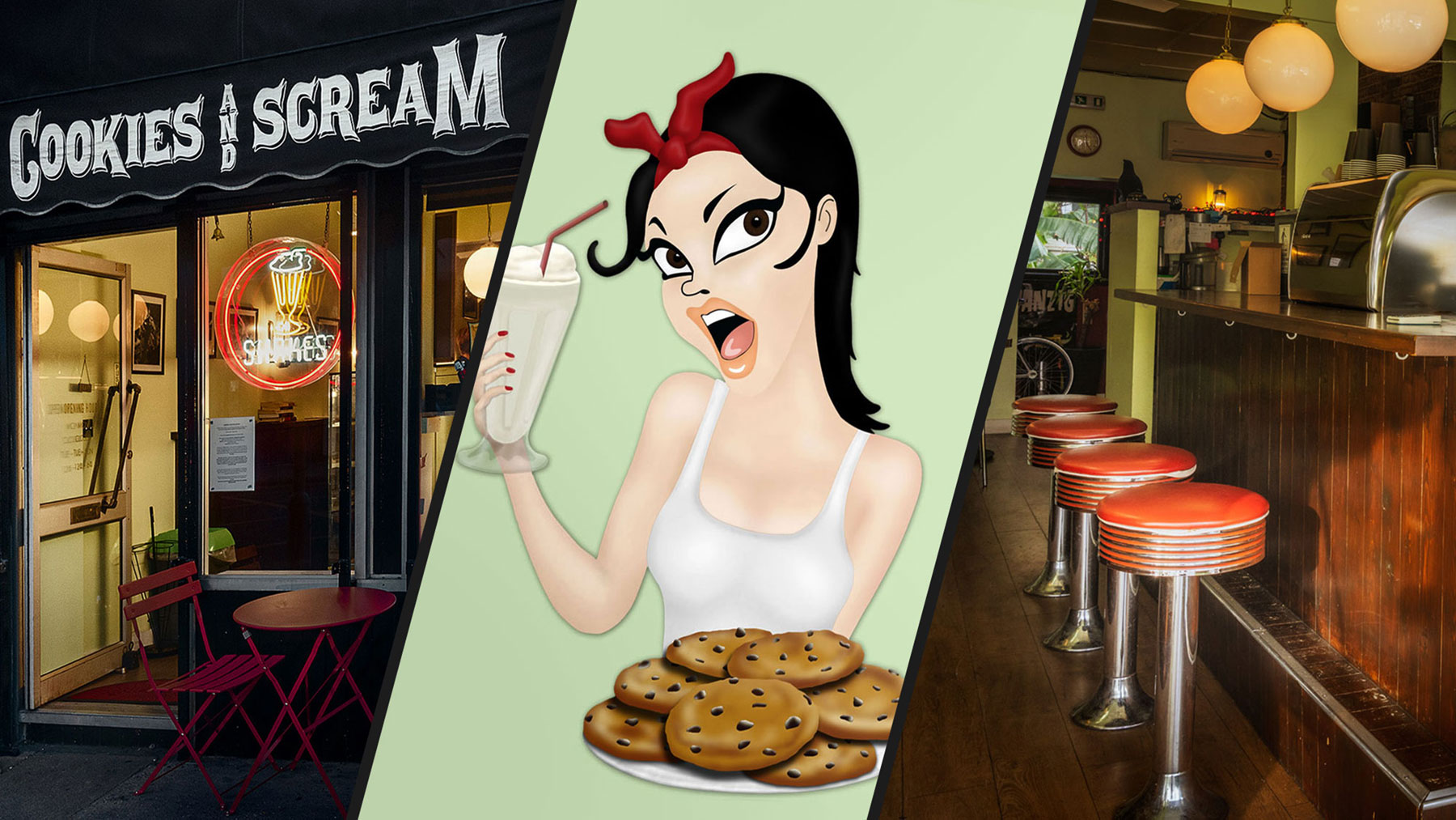
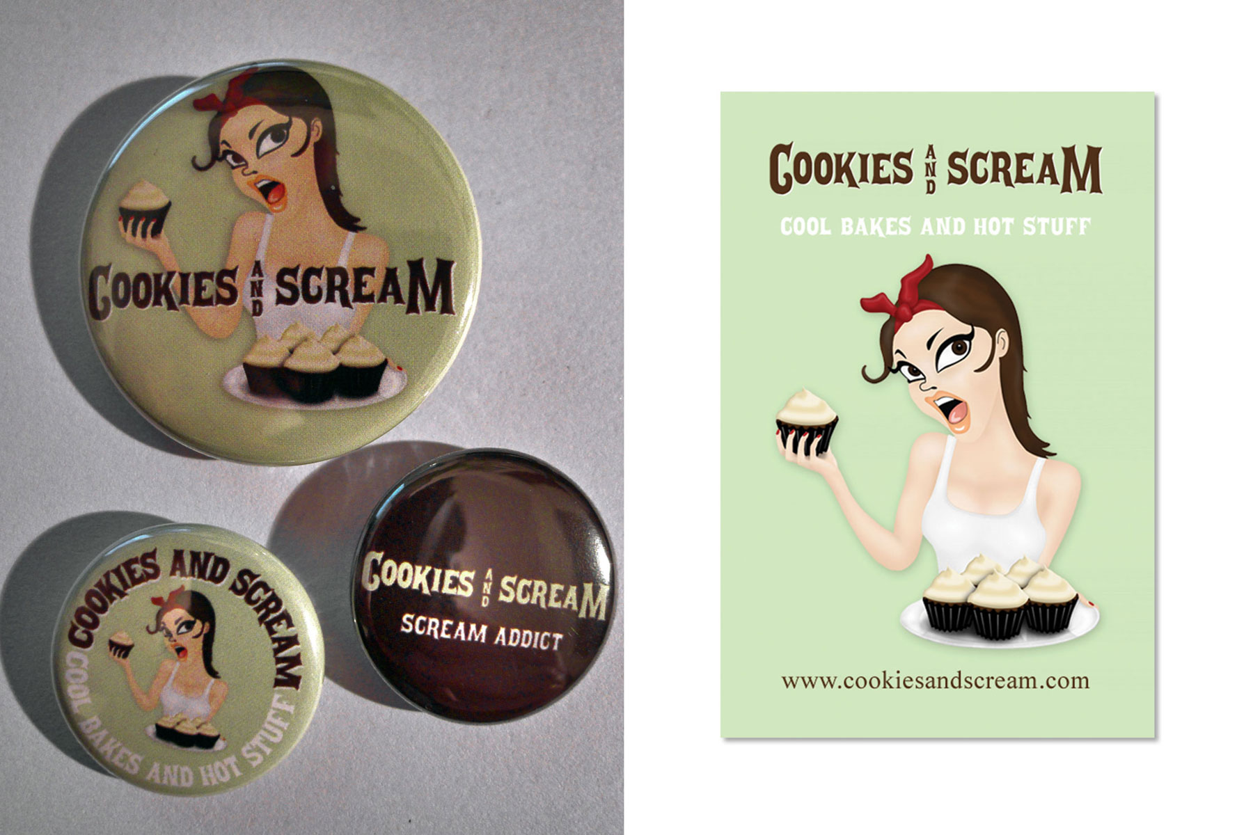
Cookies and Scream: Cool Bakes and Hot Stuff!
In 2010, an evening chat about my wife Chrissie’s home-baking experiments sparked a sudden flash of inspiration. I sketched out a logo of her holding a tray of bakes, suggested the name Cookies and Scream, and a 16 year journey began.
What started as a home kitchen experiment evolved into a beloved London institution, growing from a market stall into two thriving shops. Together, we navigated highs and lows, from building a fiercely loyal community to surviving property fires and the COVID-19 pandemic.
While rising city costs and a changing market eventually brought our chapter to a close, the resilience, creativity, and community we built remain unforgettable. I spent those 16 years working full-time elsewhere but living this adventure behind the scenes. This is the story of our journey.
Logo and Identity
The visual identity of Cookies and Scream was born in 2010 from three things Chrissie and I loved: her quirky collection of Mexican Día de Muertos ornaments, the distinct green of our kitchen, and our shared love for retro design and fashion.
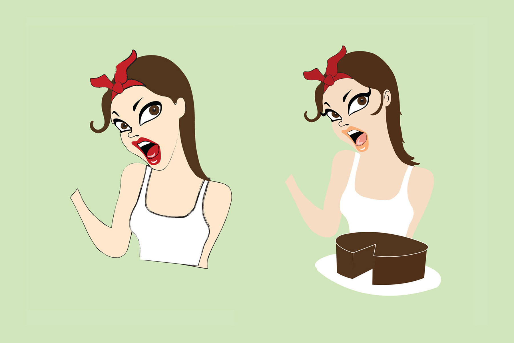
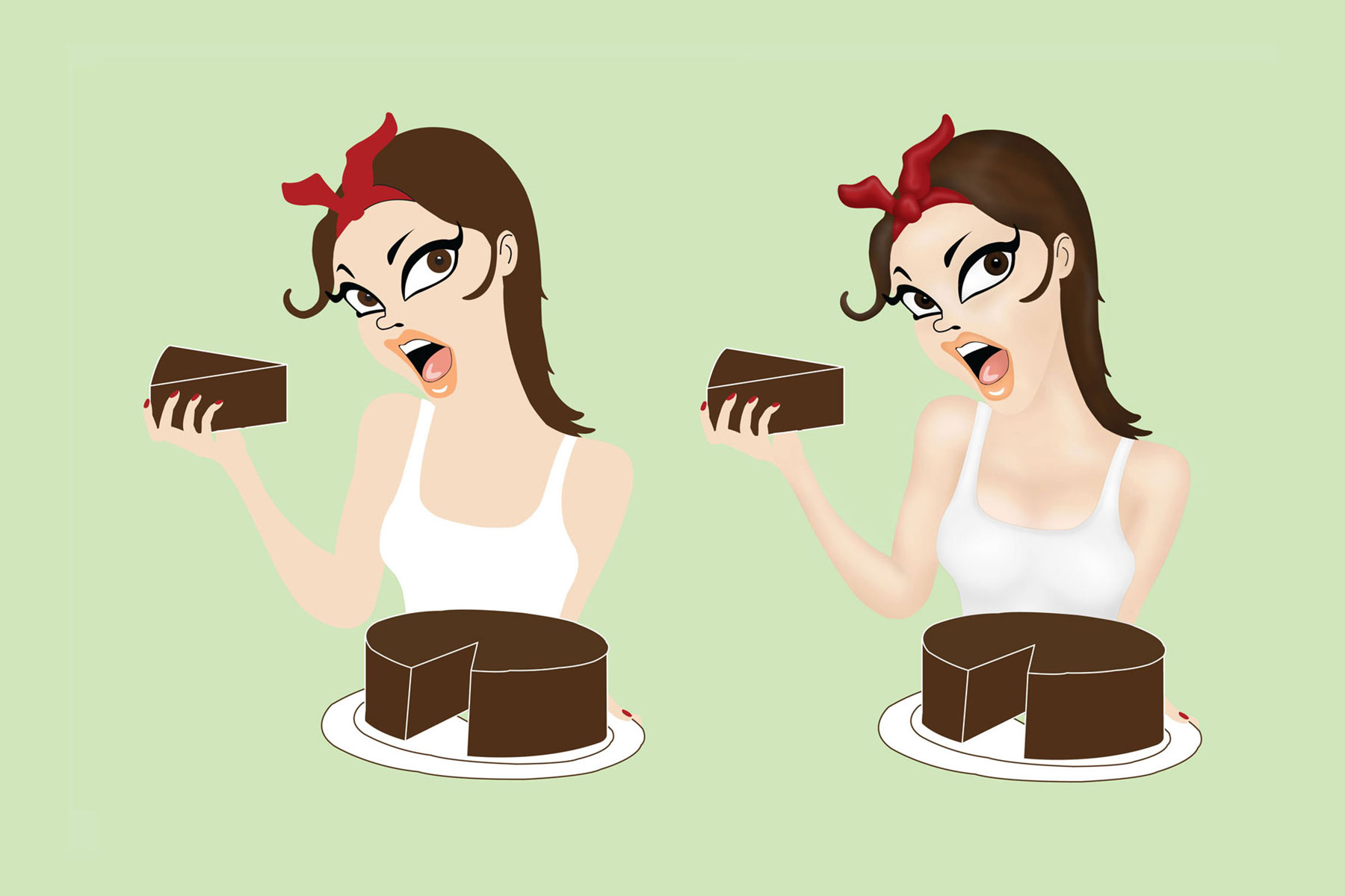
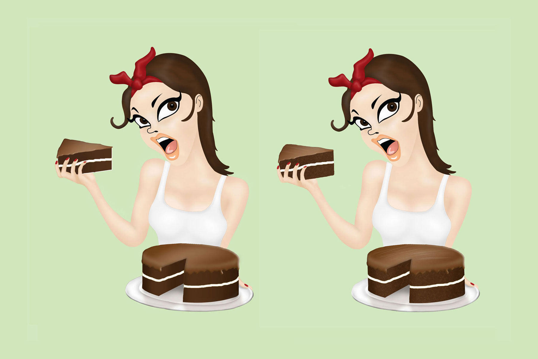
The Cookies and Scream wordmark came together fairly quickly, using a modified P22 Posada font. Our signature screaming “Chick” logo, as we later came to call it, took much longer to develop.
Colour logo, used most of the time
Black and white variation, used occasionally
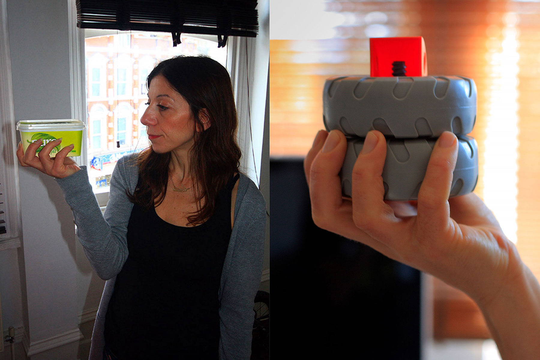
Developing the “Chick” logo began with a series of photos of Chrissie holding various household objects, which I used as stencils in Adobe Illustrator. To nail the retro aesthetic, I researched 1950s pin-up illustrations, sketching out concepts until I found the right blend. Crucially, the character had to look like Chrissie, right down to her signature baking bandana.
After several iterations, I brought the vector artwork into Photoshop to finish it with an airbrushing technique. The logo evolved with the business; over the next 16 years, I revisited the design to adjust her hair color and redraw the items she was holding.


Camden Town
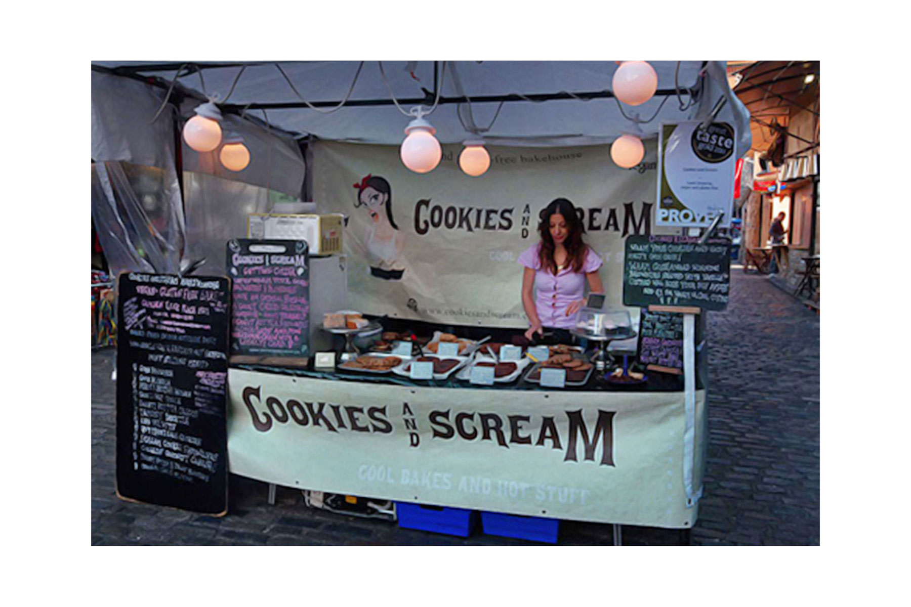
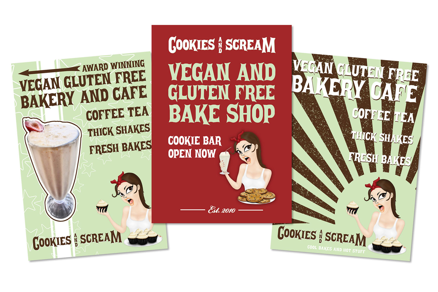
After initially selling from home, exhibiting at major trade shows, and winning several prestigious Great Taste awards, we took the leap and secured a stall at London’s Camden Market. This meant baking everything at home late into the evening and transporting it for sale the next morning. The stall itself was a simple setup, brought to life by our fresh new banners and some carefully chosen lighting.
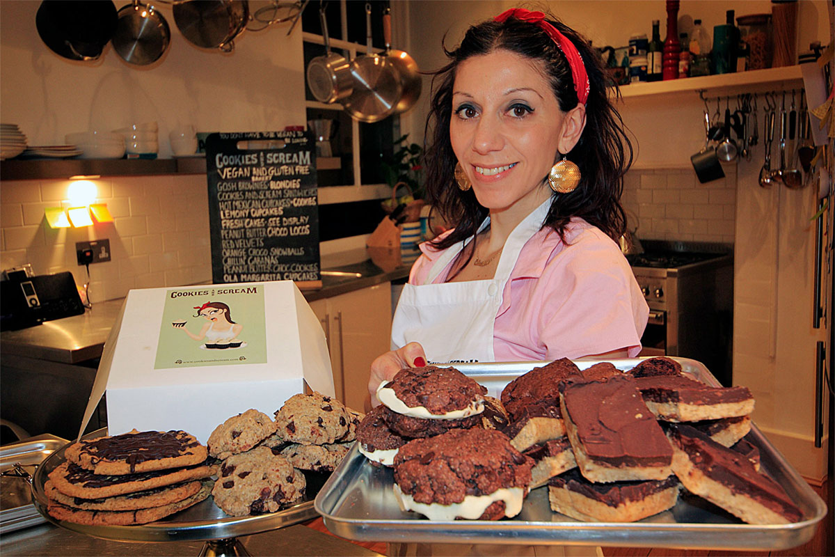
An early press shoot after baking at home
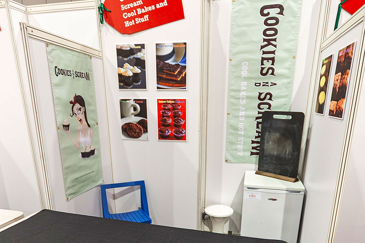
Setting up at the Taste of London in the Excel exhibition centre
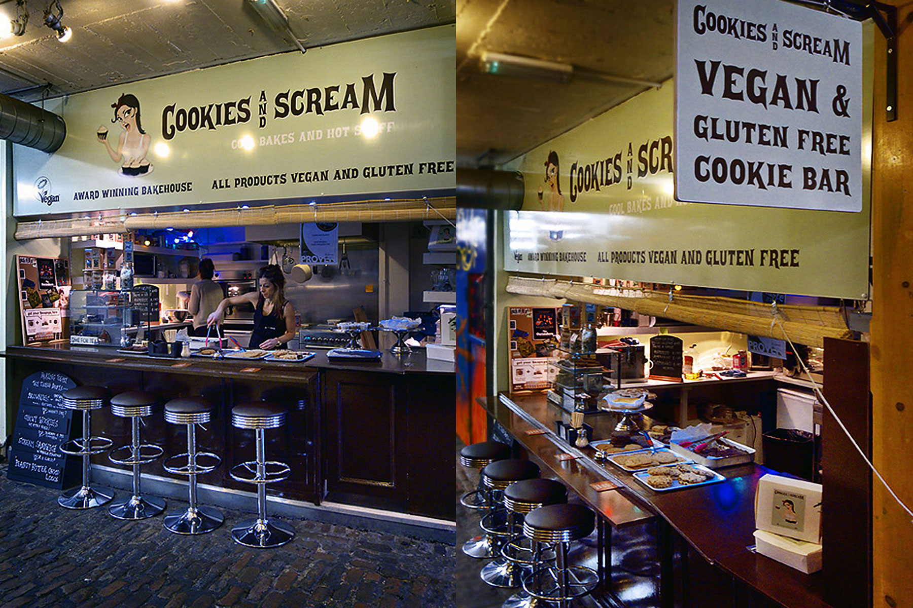
With Chrissie working incredibly long hours, the opportunity to move into a market unit with its own kitchen was a game-changer. As Cookies and Scream's customer base grew, we jumped at the chance to create a more sustainable setup.
Working with a tight budget I handled the work myself, installing our branding and decorating the space to stay true to our signature aesthetic.
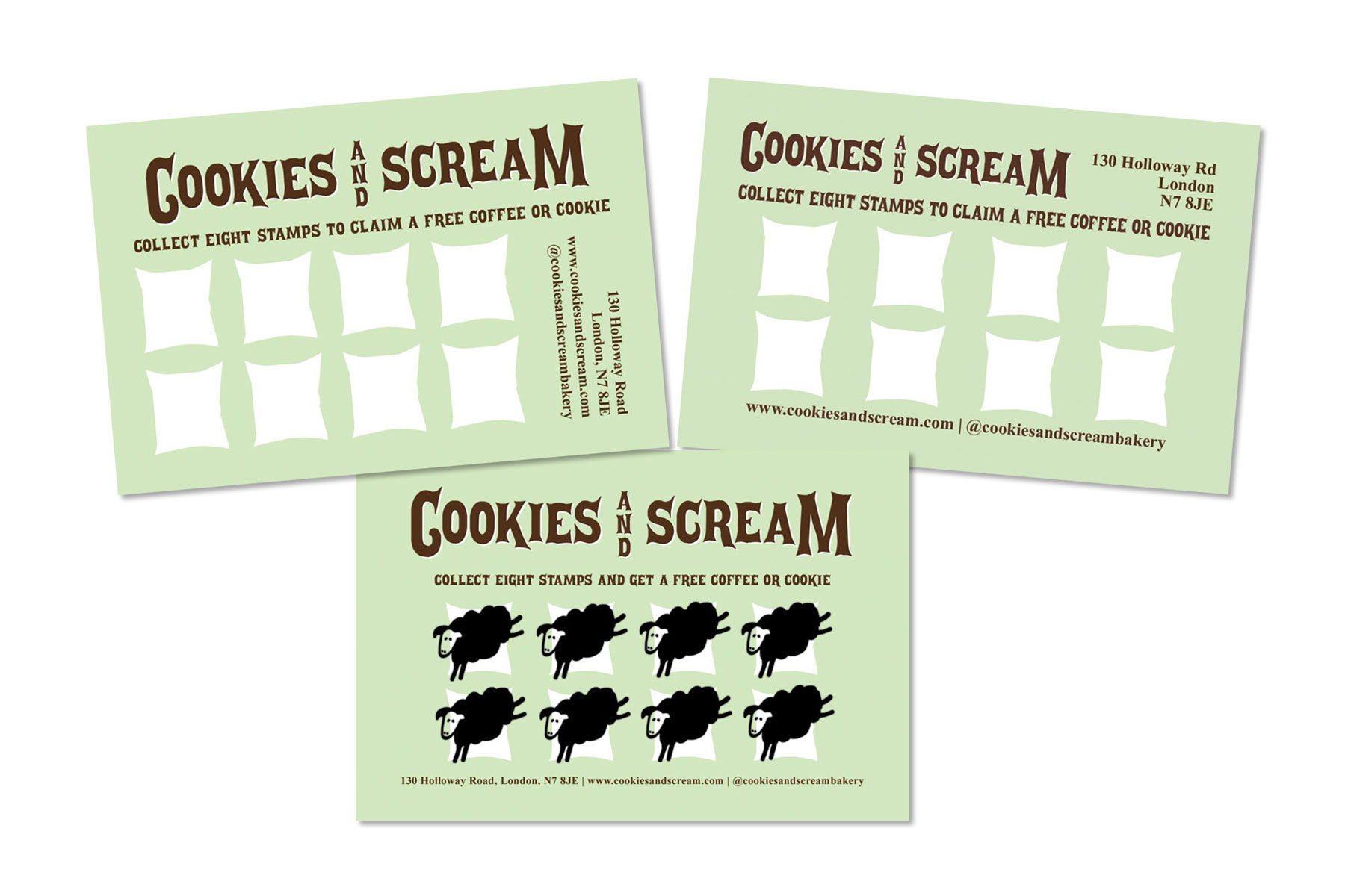
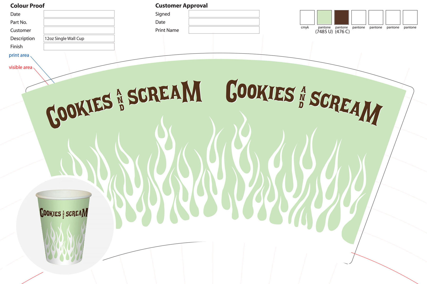
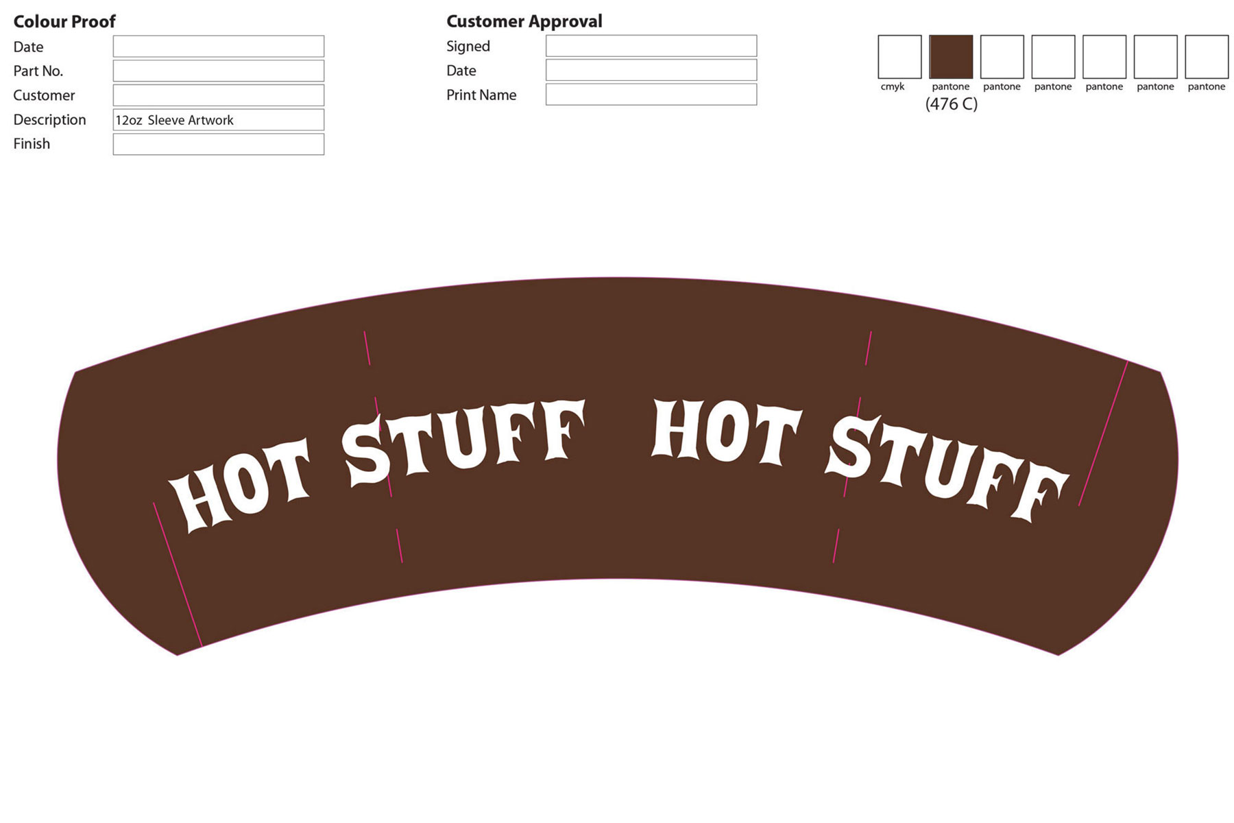
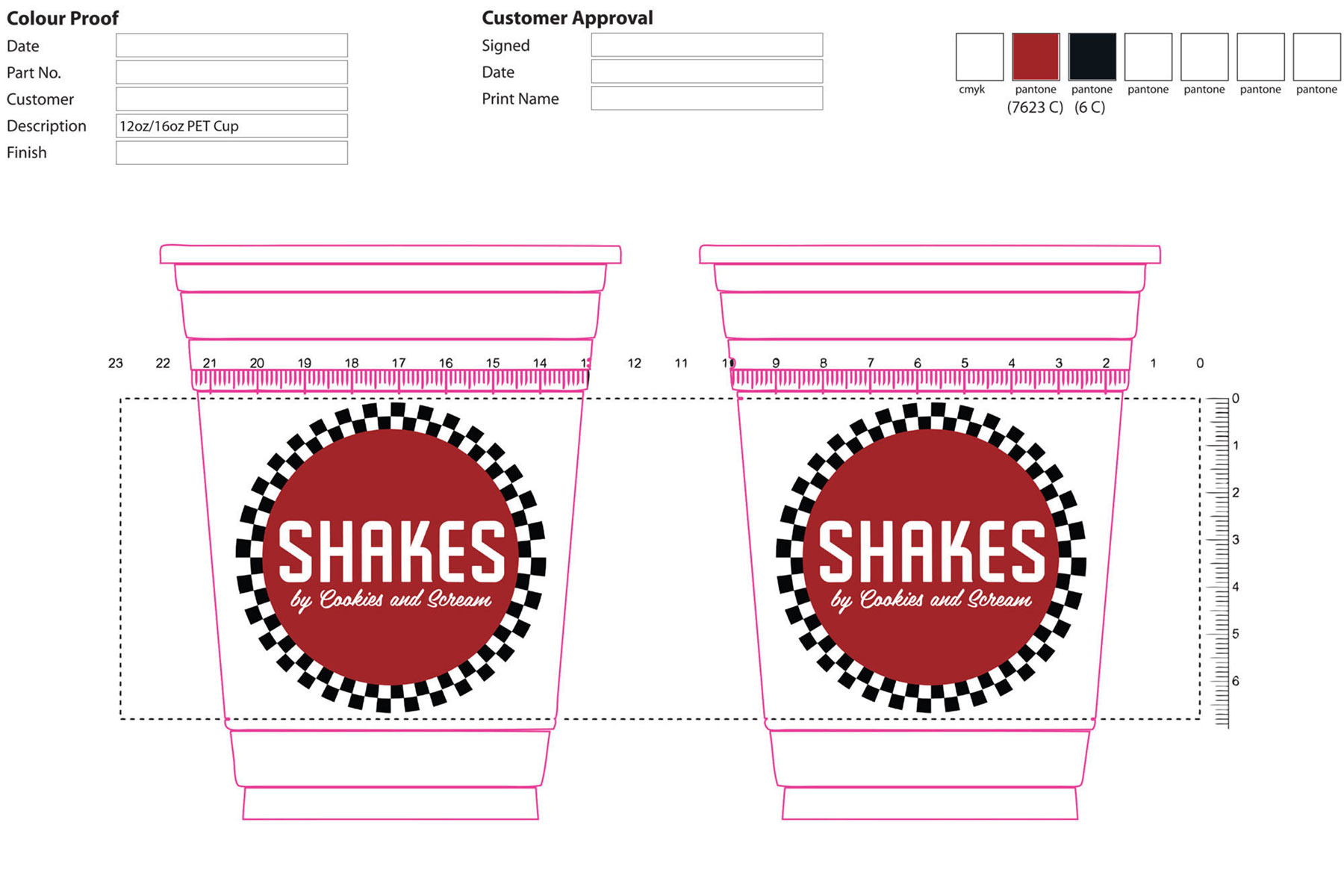
Printing and Further Design Work
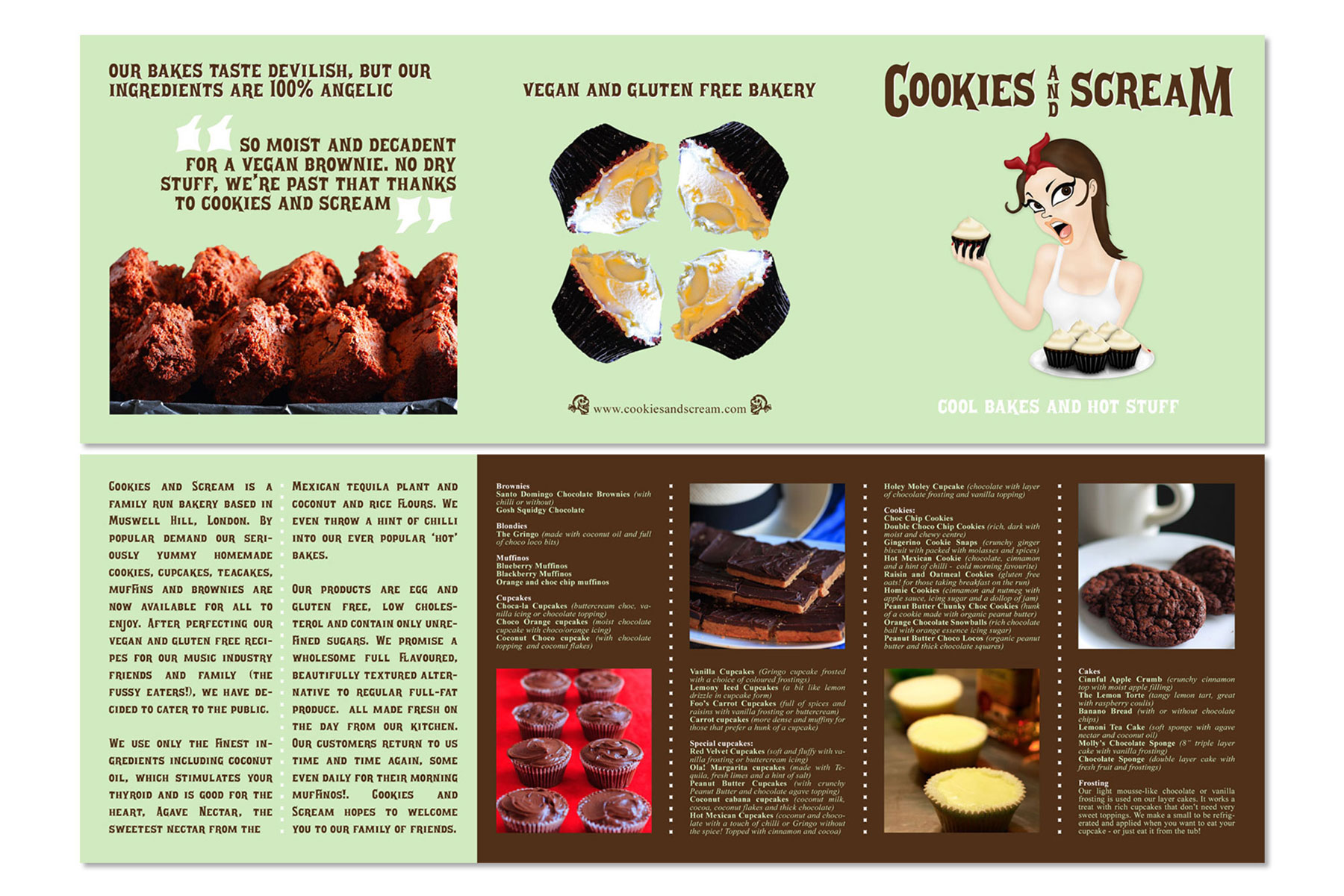
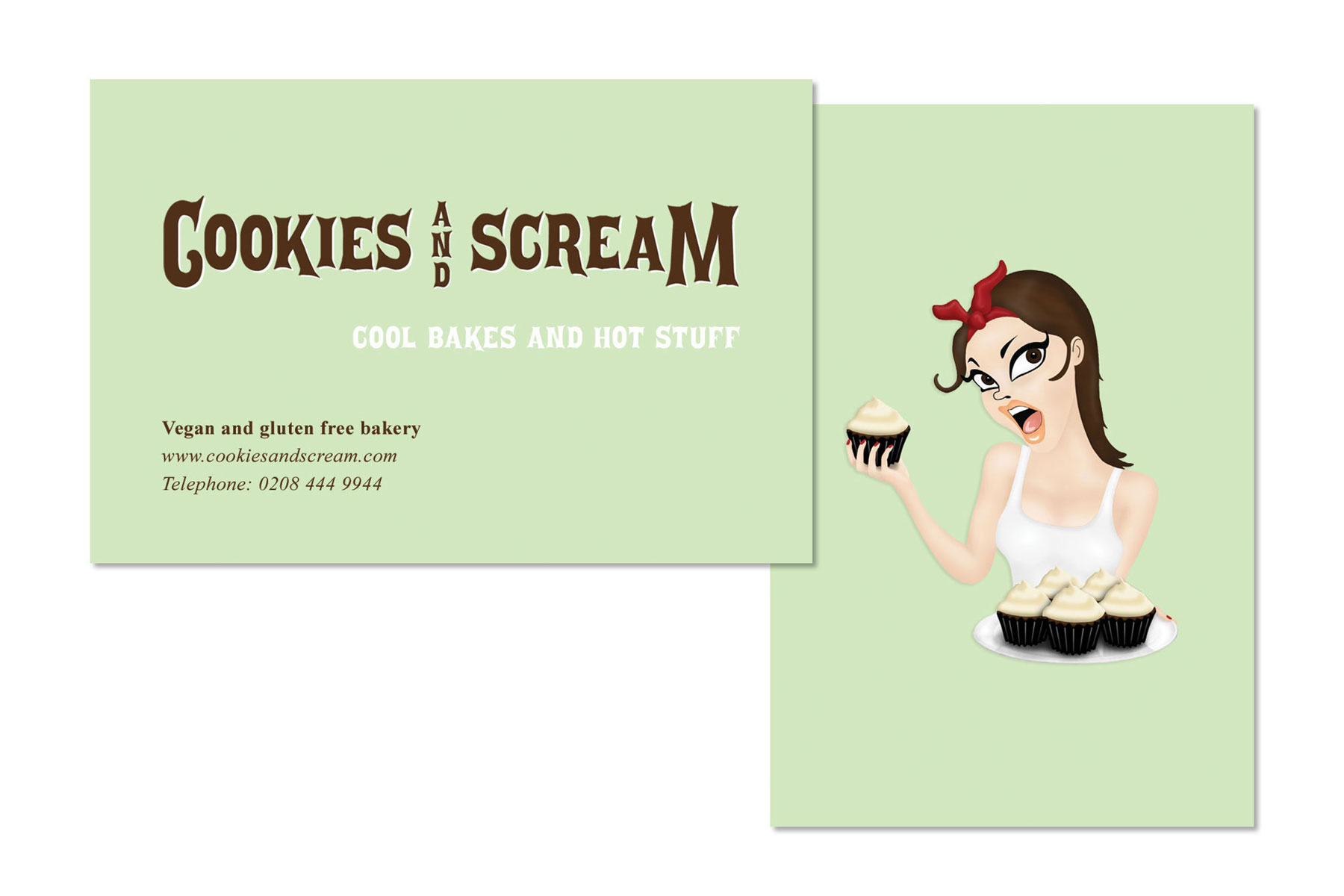
The first printed piece I designed was a leaflet styled like a fold-out CD jewel case insert, reflecting our love for music. I also created business cards, loyalty cards, and branded cups for hot and cold drinks. I handled photography for advertising and the Cookies and Scream Instagram account, which grew to a community of 28,000 followers.
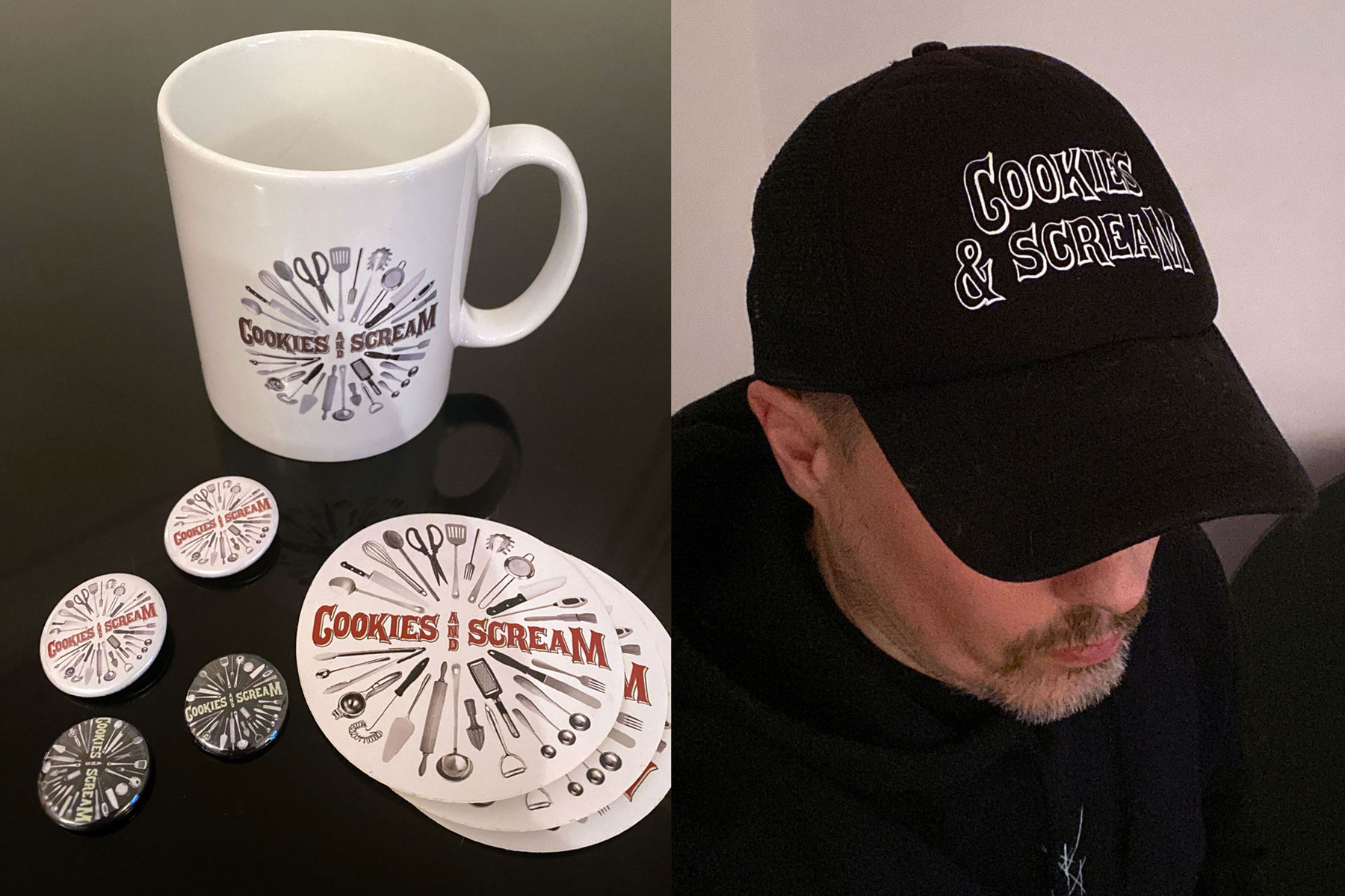
Merchandise
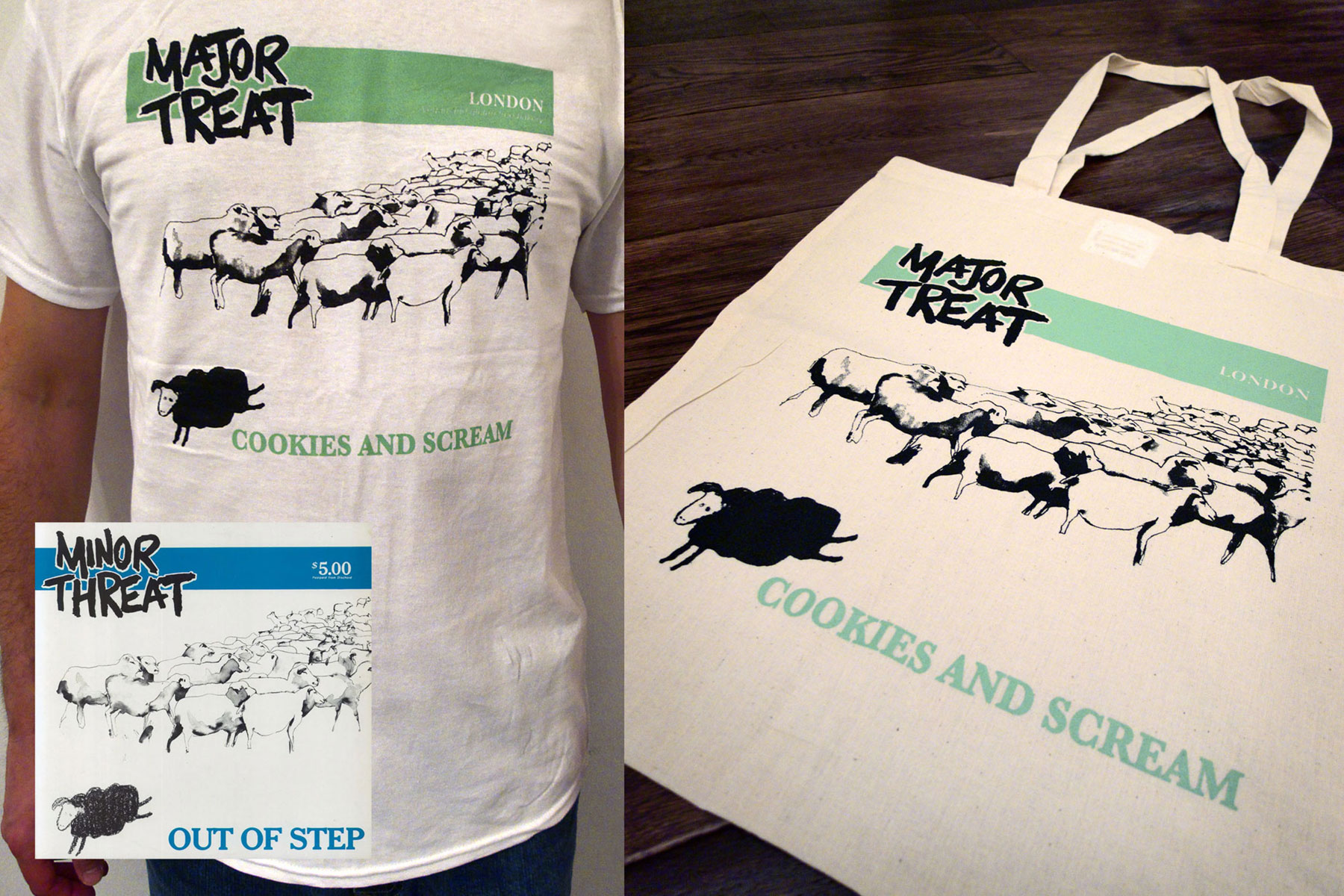
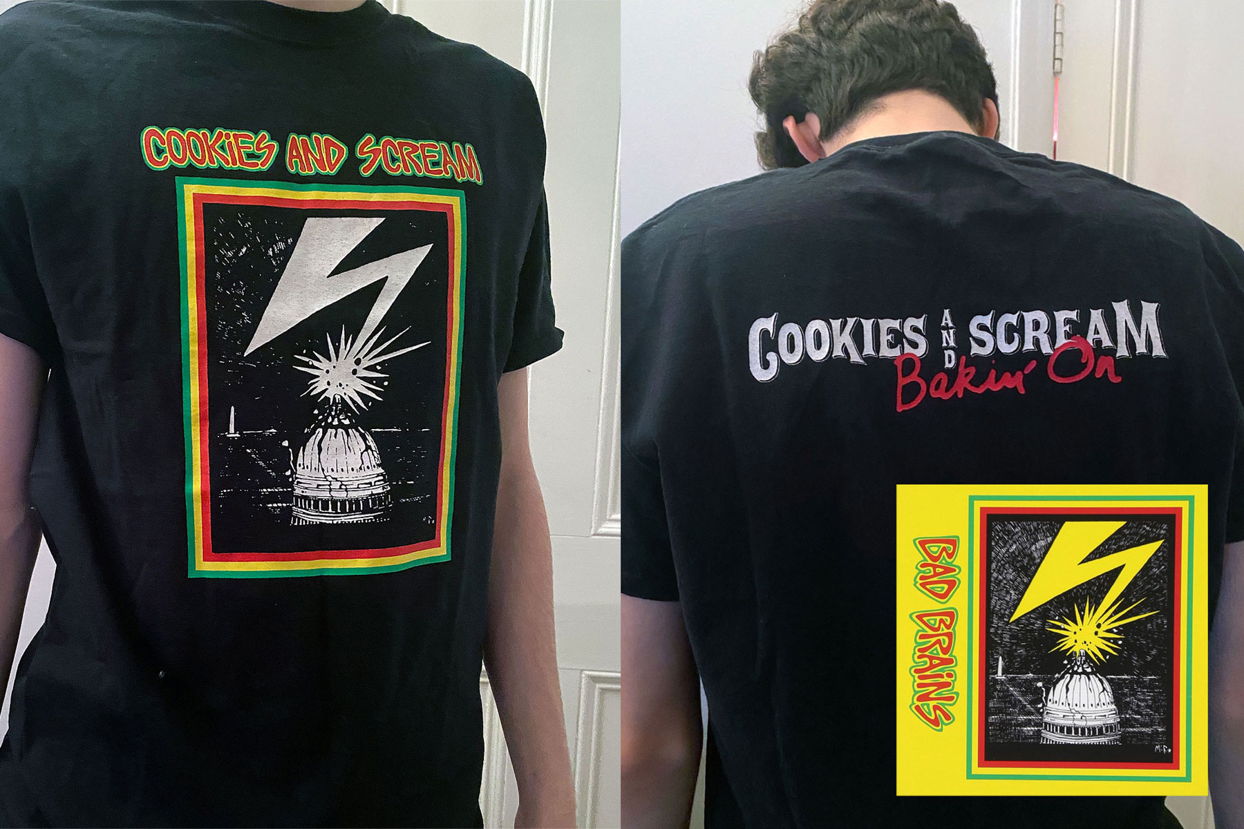
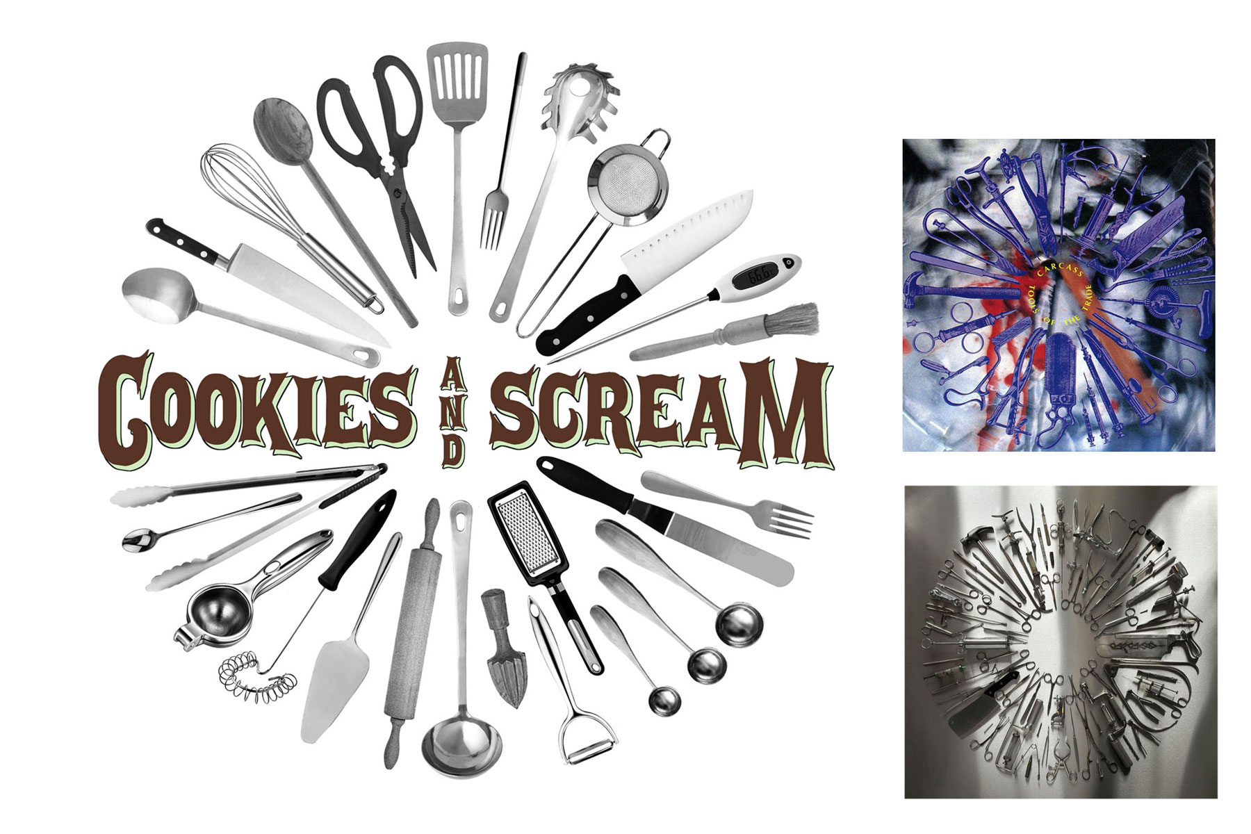
A few years earlier, I’d played guitar in several bands and toured the UK and Europe. In that world, designing and selling merchandise is vital. Without it you simply can't survive a tour financially. Having always loved creating merch for my own bands, doing the same for Cookies and Scream felt like a natural extension. Some pieces simply featured our logo, while others were less-than-subtle nods to our alternative music tastes. Over the years, I designed a range of T-shirts that paid homage to the staff’s favorite punk and metal bands.
Second Location: Holloway Road
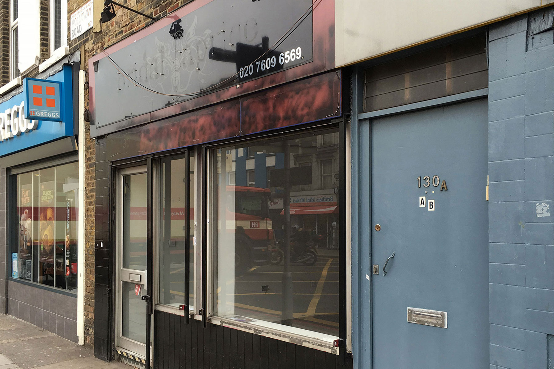
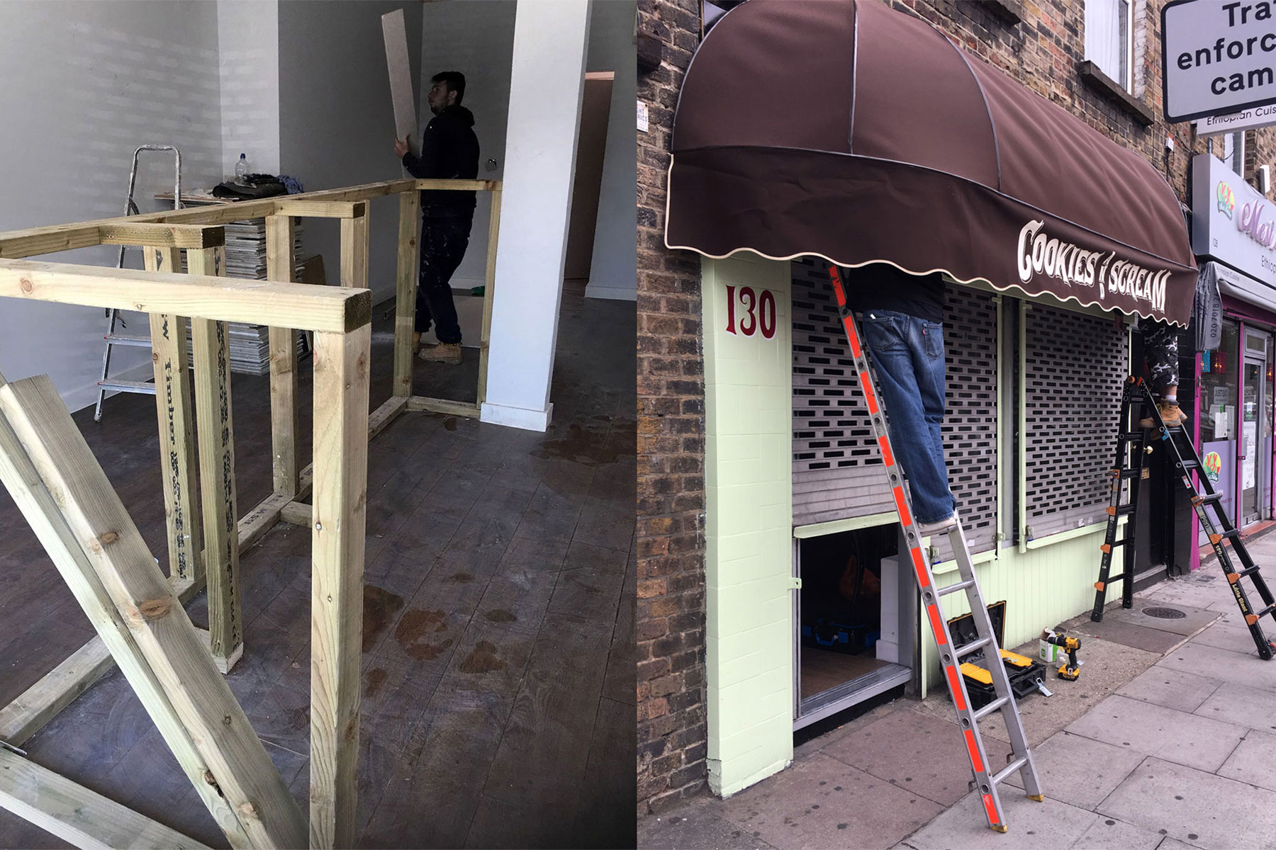
After several successful years in Camden Town, Cookies and Scream was strong enough to expand. The original shop was too small to comfortably handle both baking and serving. We began searching for a larger space, ideally close by, but capable of attracting a new audience.
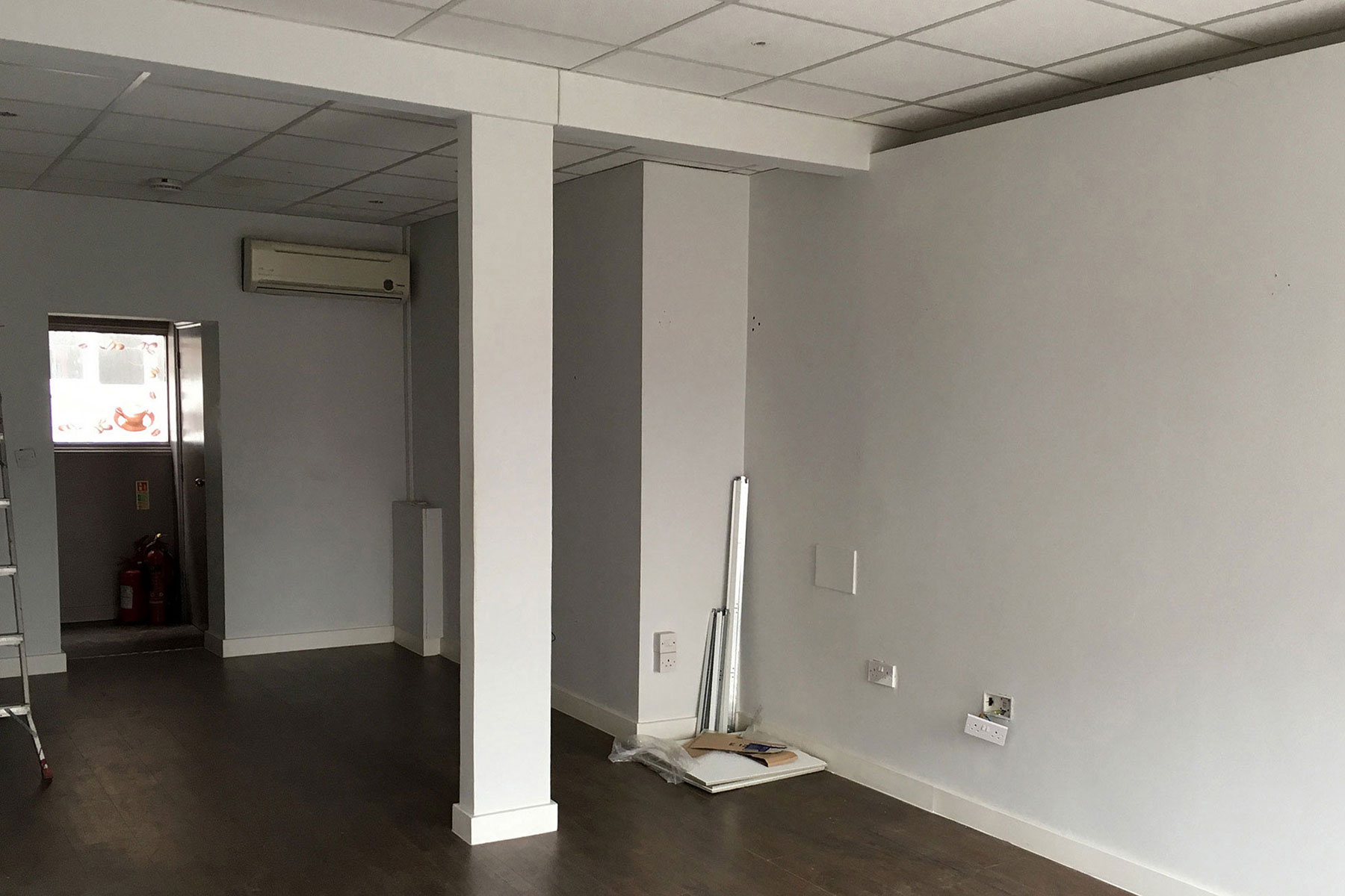
We found a former bridal shop on Holloway Road but it required a complete transformation. Chrissie and I took on the challenge of planning and designing the entire interior ourselves.
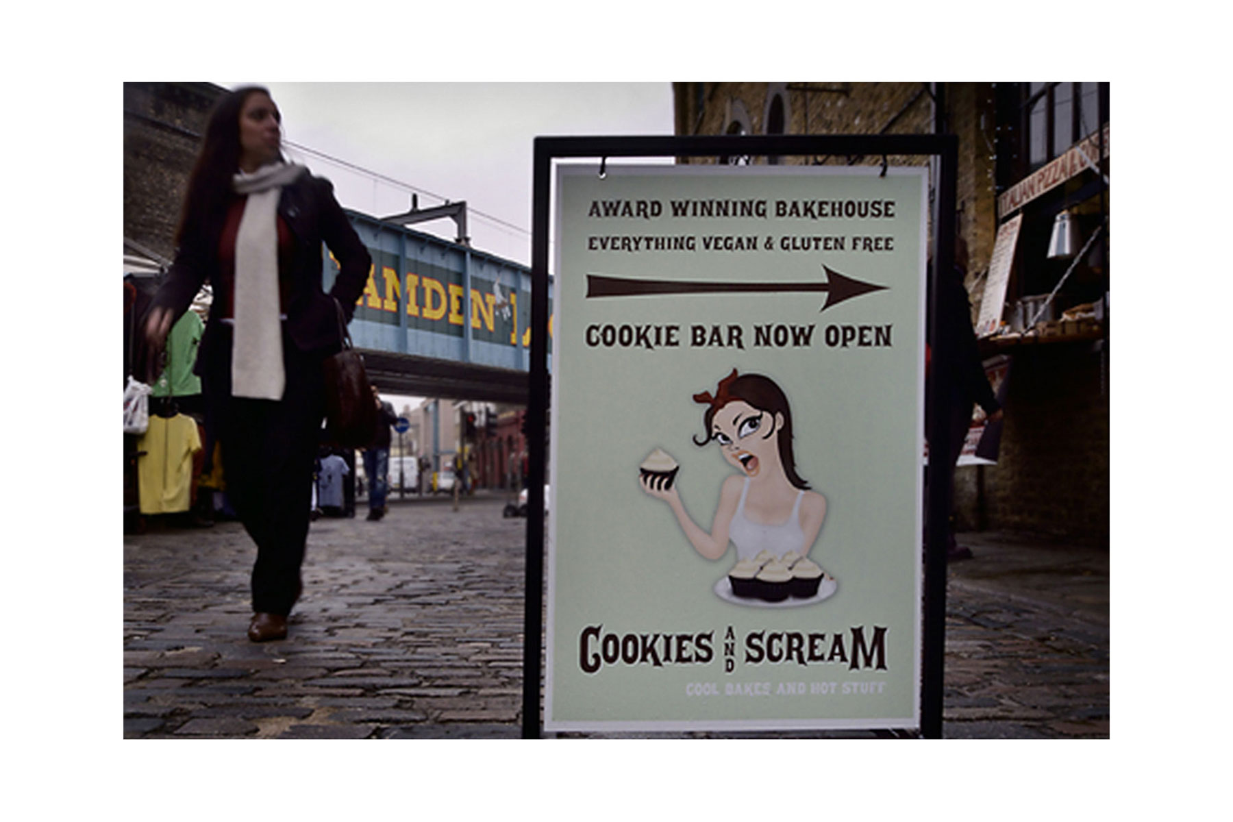
Social Media advertising for the new location
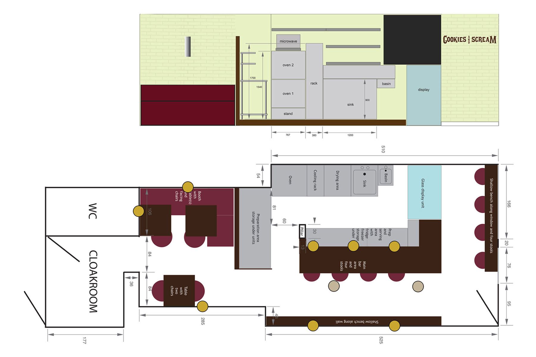
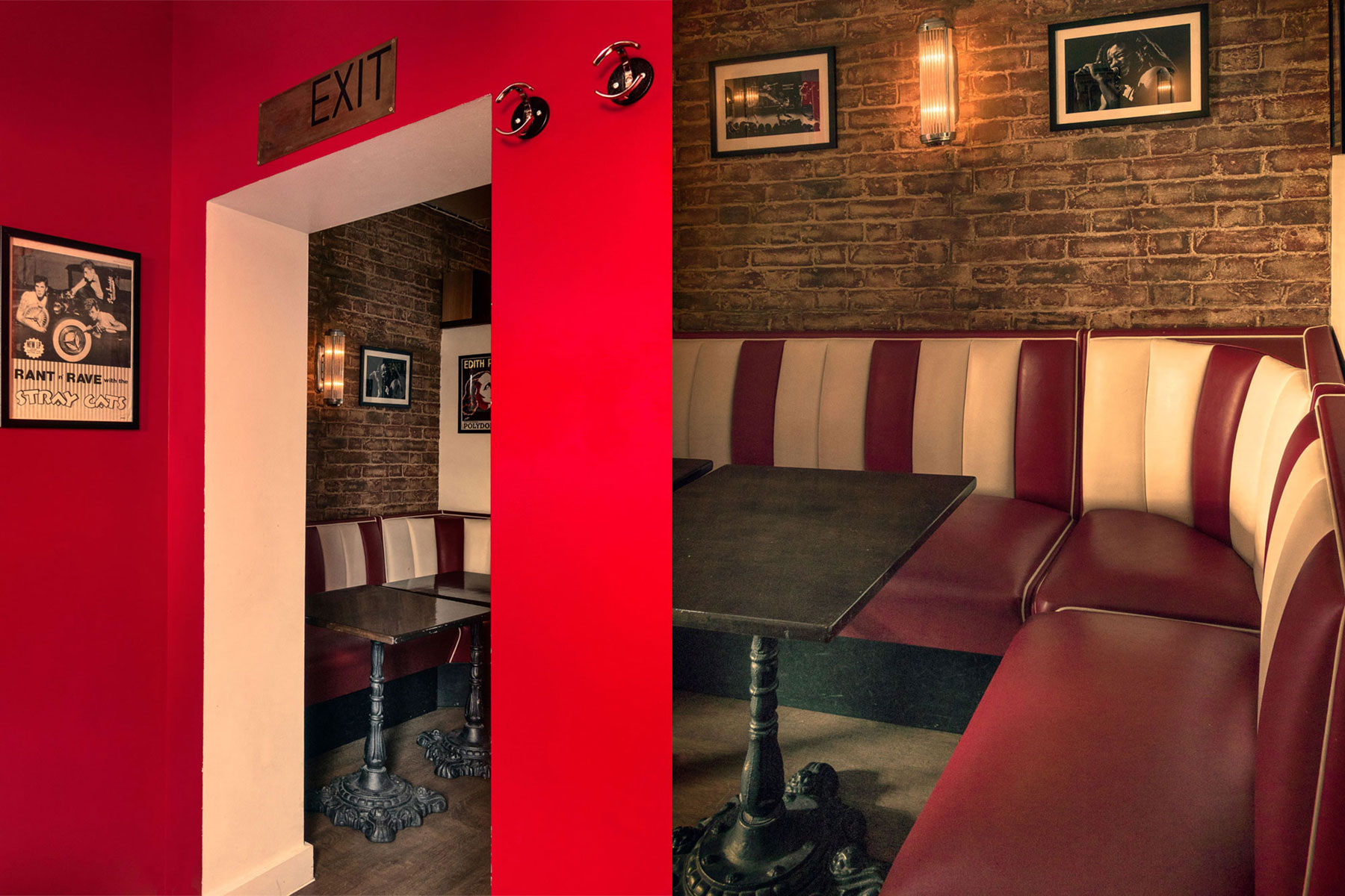
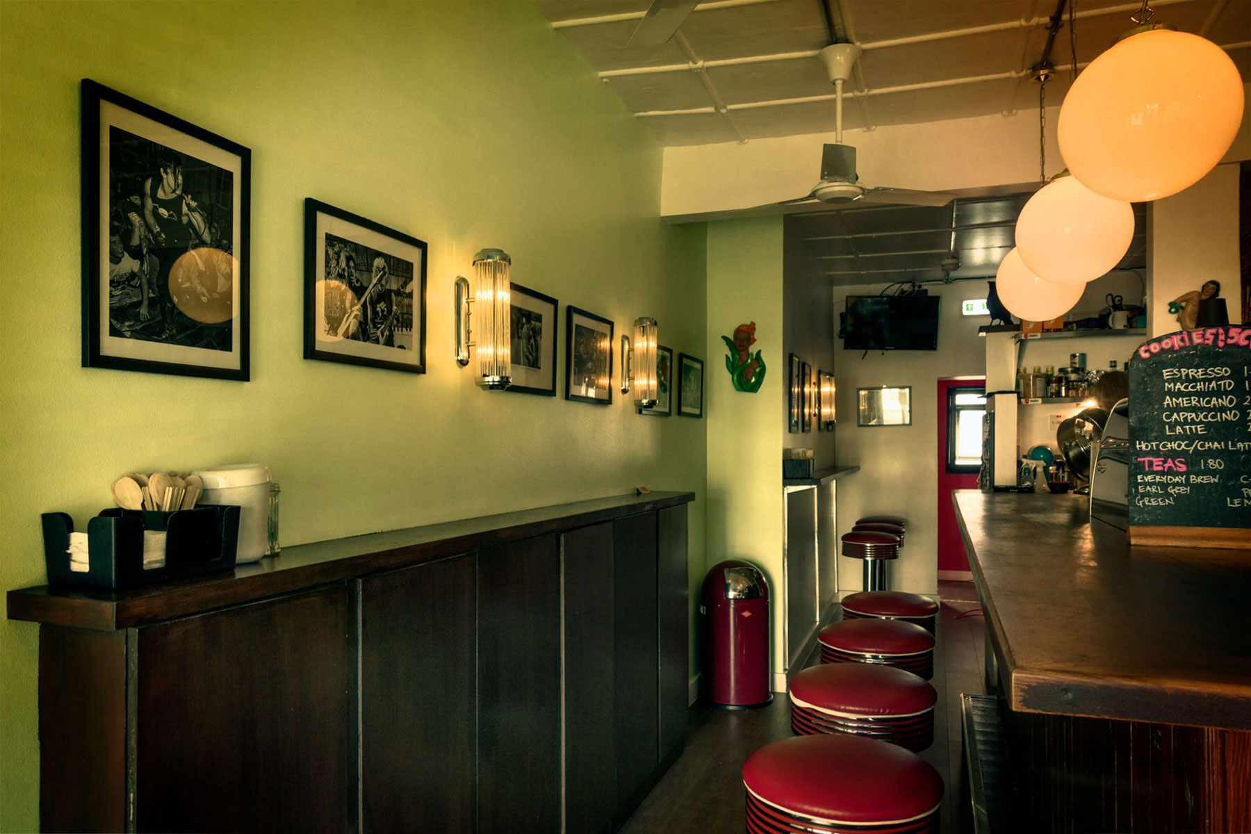
We designed the interior around a bar-style serving counter with retro stools, a raised footrest, low-hanging lights, and a 1950s-style booth at the back. Getting the workflow right was crucial, and our layout worked so well it remained unchanged until our final day.
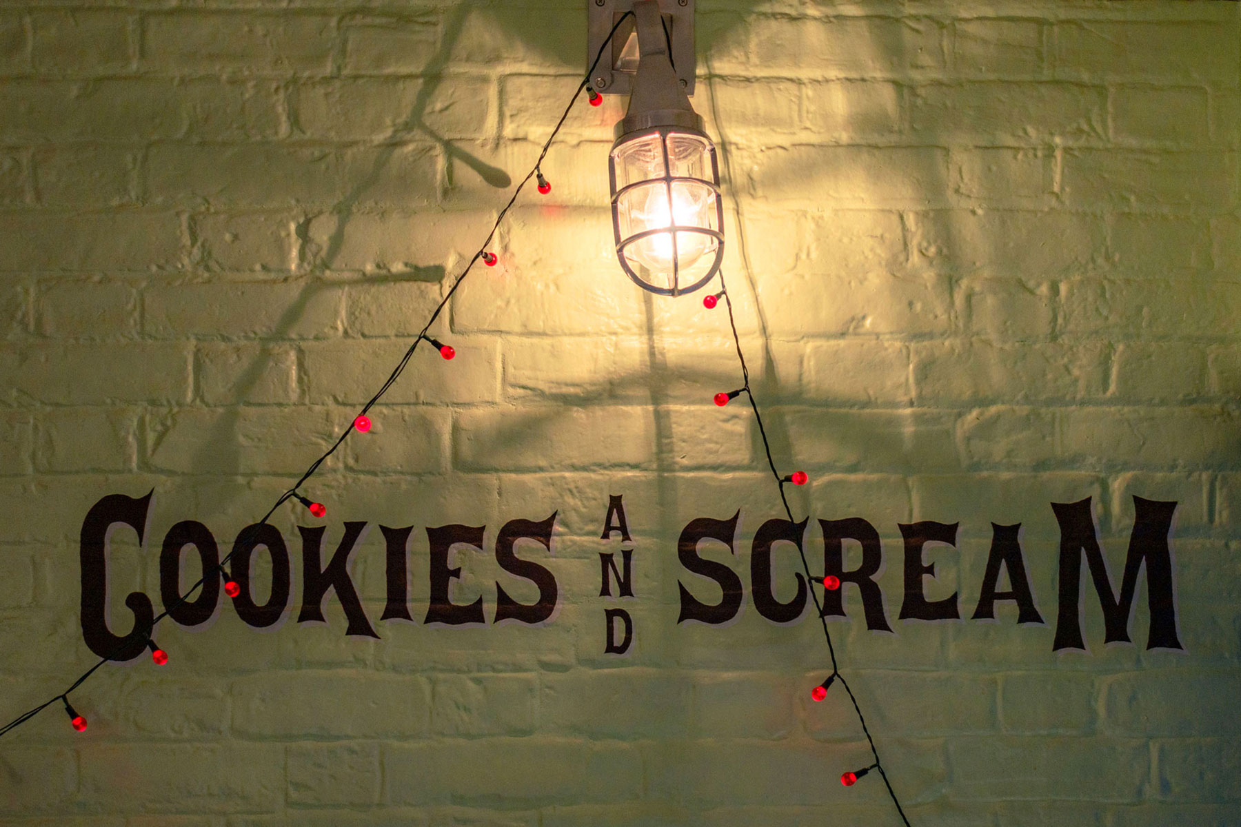
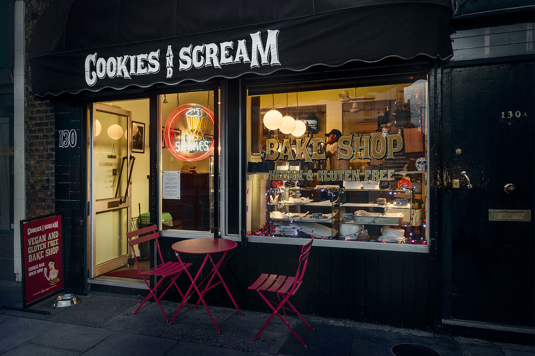
I painted the space in our signature Cookies and Scream green, adding a bold splash of red in the cloakroom. Our love for music was everywhere: alongside framed prints of our favorite bands and comedians, I designed a front awning inspired by the legendary New York venue CBGB. I hand-painted a gold, green, and black sign directly onto the front window.
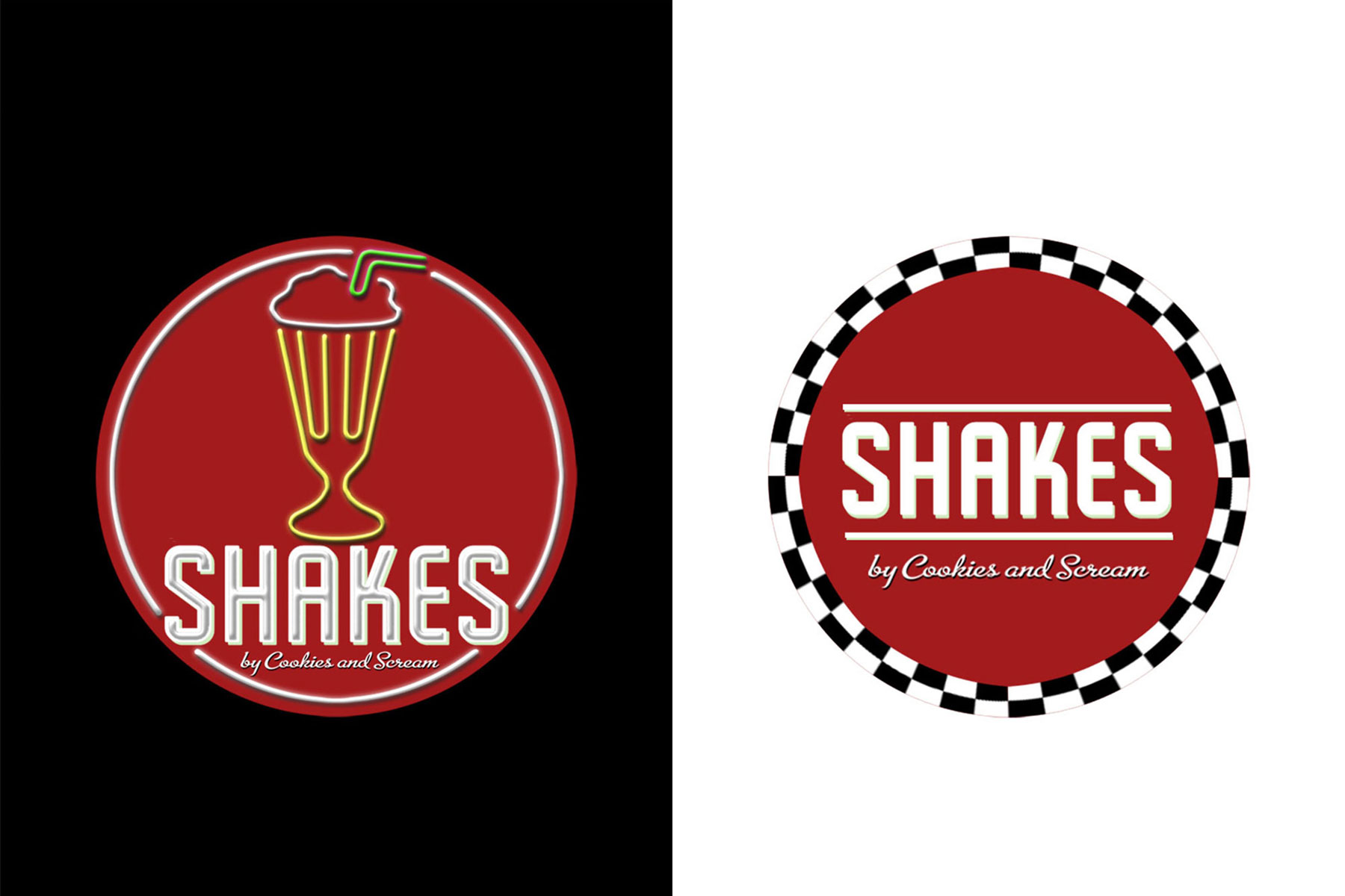
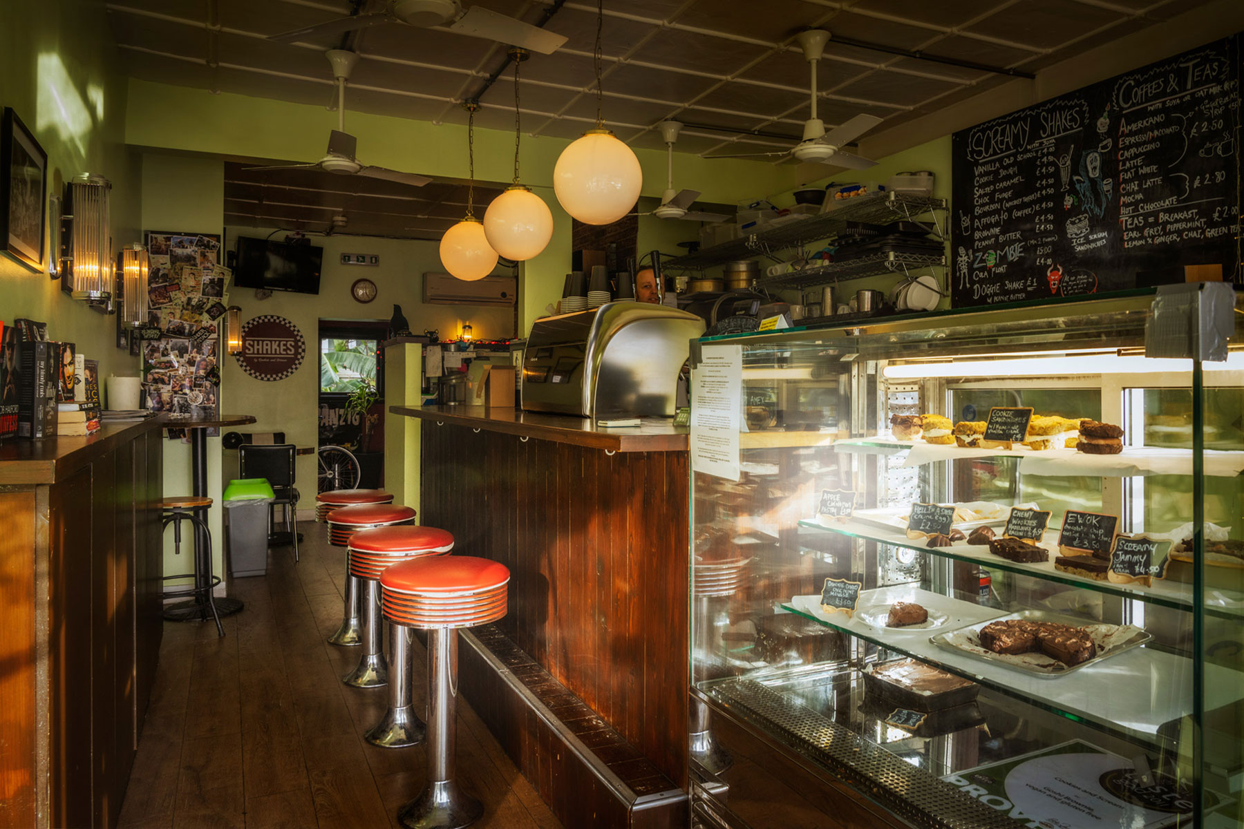
Complete with cinema-style lights, a neon "shakes" sign, and a small tropical garden out back, the shop was a true labour of love. After three months of balancing the build with my day job, we opened the doors in October 2016.
Website
Soon after opening in Camden, I built the first Cookies and Scream website using HTML and CSS. I had no formal training in web design or UI, but it did the job and stayed live for several years.
The main drawback was that it wasn't responsive. To fix this, I built a second version optimised for mobile devices. This redesign used clean, straightforward product lists. Since Instagram was our primary way of connecting with customers, we kept the website intentionally streamlined rather than overcomplicating it.
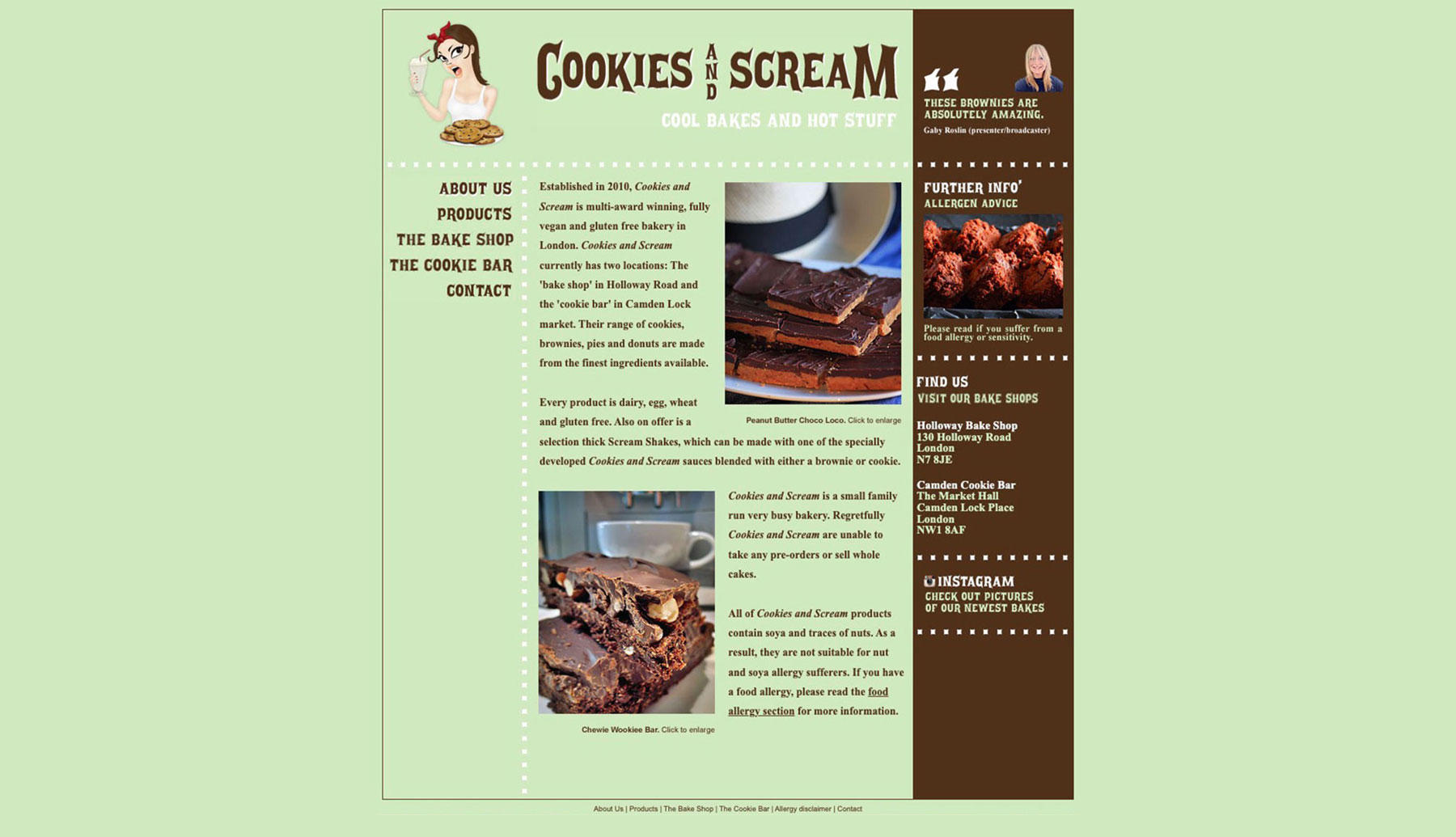
The first Cookies and Scream website
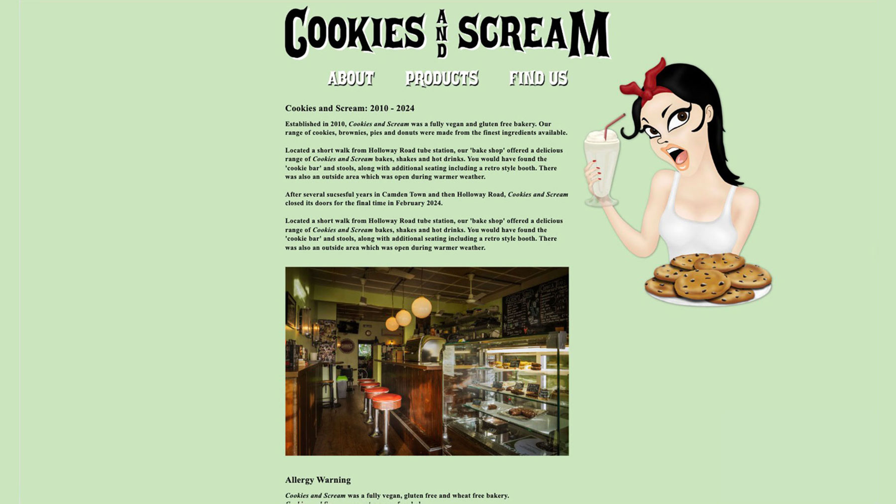
The second, simplified design
The End
Sixteen years after our Camden debut, we made the heartbreaking decision to close our doors. Our footprint had shrunk five years prior, when a suspicious fire devastated several Camden premises. Although the flames missed us, the resulting water damage destroyed our shop beyond repair, leaving Holloway Road as our sole location.
The modern high street is incredibly hostile to independent businesses, driven by factors that often boil down to corporate greed. We felt this firsthand during our exit, when our landlord levied substantial, fabricated financial claims against us. We successfully fought and disproved these accusations, but it was a sobering reminder of why small businesses face such an uphill battle.
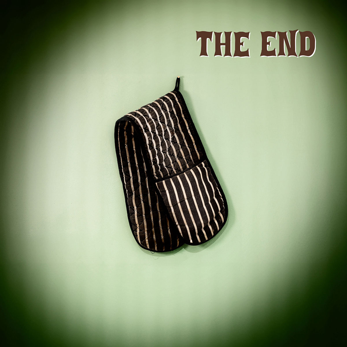
The image that accompanied our farewell message on social media
We are extremely grateful to everyone who visited Cookies and Scream or supported us along the way. It was an incredible experience and we made many wonderful friends through the business.
We were also incredibly fortunate to work alongside an outstanding team of staff, many of whom we are proud to still call close friends today.
Thank you all.