Banking Website
A UI project focused on developing a responsive website and app that delivers a consistent, user-friendly experience across all platforms.
Stages of the design process
Scenario
Design a new responsive website for Bolt, an emerging bank aiming to challenge established players in a competitive market. The brand’s core values of clarity, playfulness, and trust will guide the approach. The interface will include designs for the following:
- An accounts overview screen/homepage
- Current account screen including day to day spending
- A "My Spending" screen
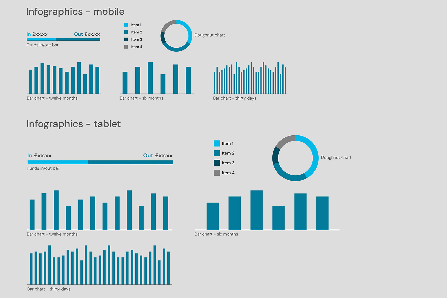
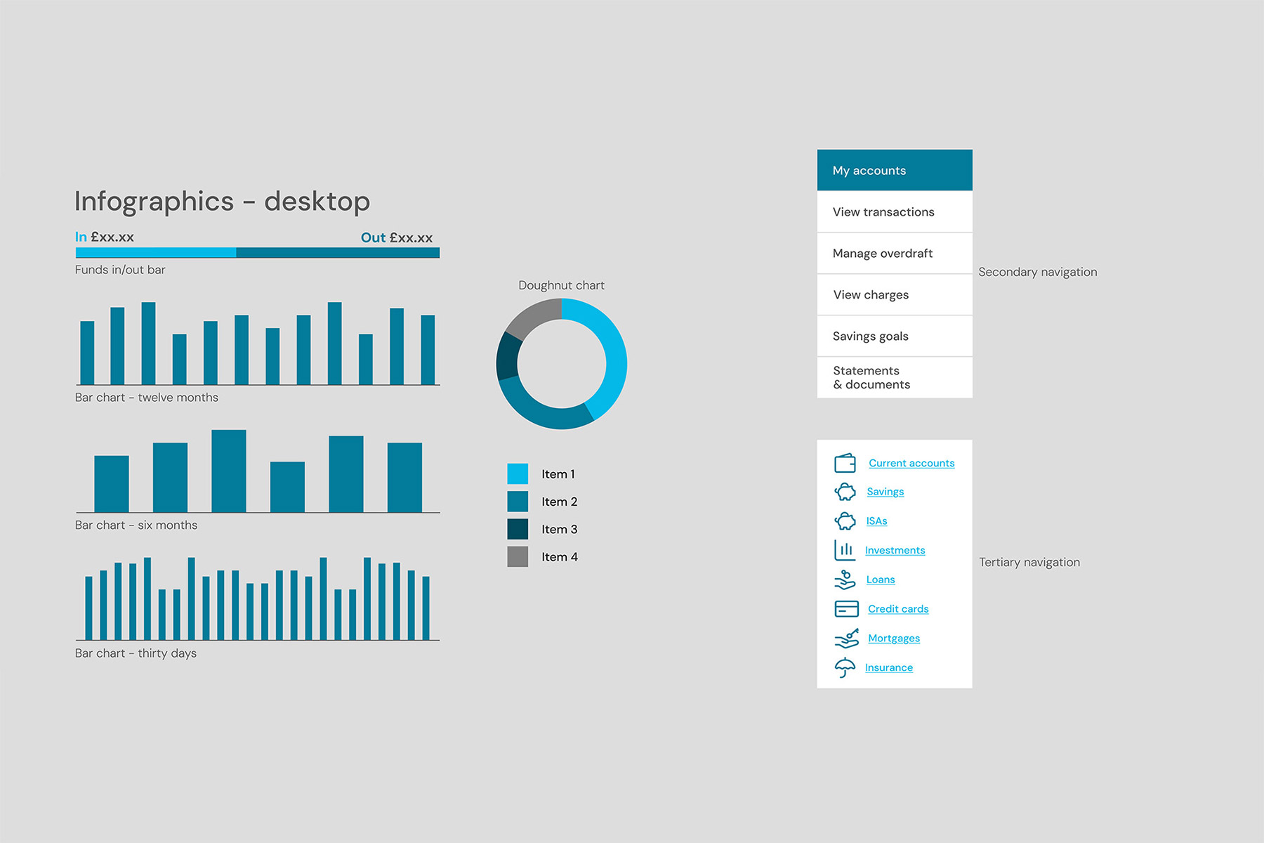
- Liberal use of data visualisation to aid inforamtion on spending over time and savings goals
Stage one: mood boards
Creating mood boards is a key practice in the early design stages. They help define and inspire a project’s creative direction before detailed design begins.
Three mood boards were developed: one for each of the bank’s core values. Visual inspiration was drawn from a wide range of sources, extending beyond the banking sector.
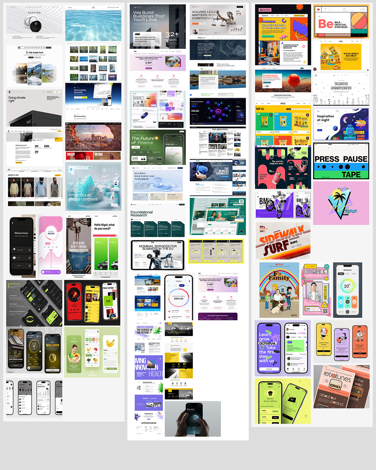
Mood board examples for clear, left, trustworthy, centre and playful, right
Stage two: grids, colours, fonts and components
Grids
I applied an eight-point grid system across all designs to ensure visual consistency, alignment, and scalability. Separate column structures were defined for mobile, tablet, and desktop to accommodate the three device sizes.
Colour Palette
One of the bank’s core values, playfulness, was chosen as the starting point for the colour palette development. A refined mood board, featuring references from a variety of sources, was created to explore potential colour direction. Among these were several pieces of 1980s furniture by Memphis Group designer Ettore Sottsass.
One piece in particular stood out: a design combining bold blue and yellow tones with a striking black-and-white, zebra-like pattern. This became the inspiration for the entire colour palette. It offered a balance between vibrant colours that reflect the brand’s personality and a restrained monochrome base to support clarity and usability.
Adapting this palette for a modern UI helps the brand stand out in a market where competitors tend to favour conservative visual identities.
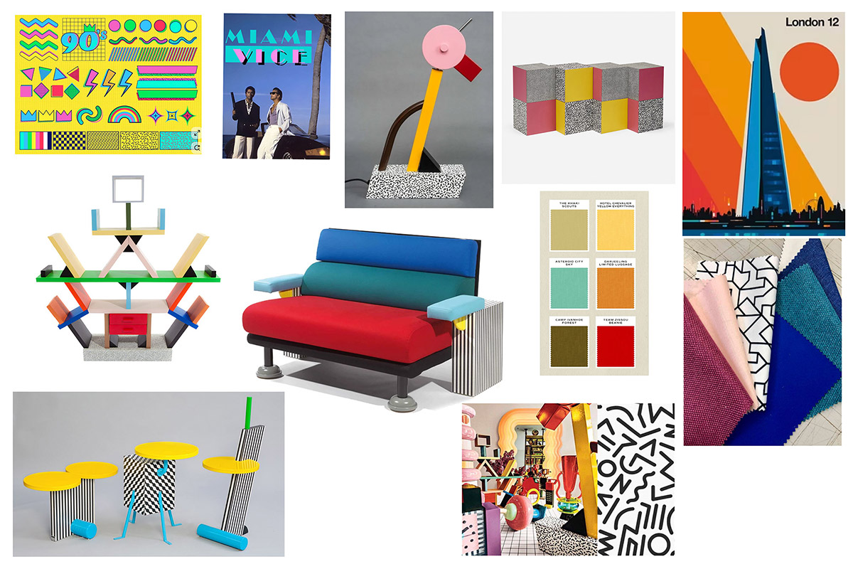
Mood board for colour inspiration
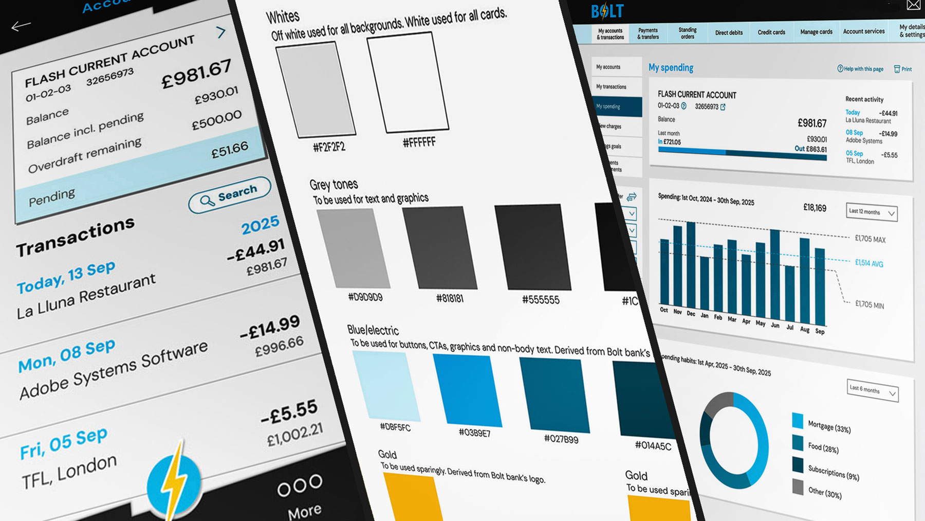
A colour reference document was created which includes usage guidelines and corresponding HEX values for all RGB colours. This document was refined throughout the development stage and defines the following palette:
- An off-white for primary backgrounds, complemented by pure white for cards and content surfaces
- Grey tones for headings and body text, ensuring clear hierarchy and readability
- Four variations of blue for use in graphics, CTAs, and interactive elements
- A gold accent, used sparingly to create highlights and visual contrast
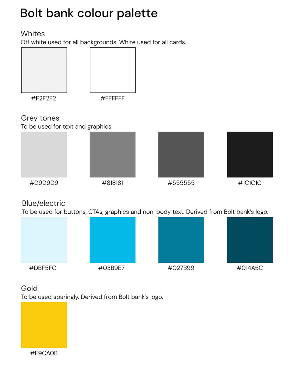
The final colour palatte used across the page designs
Typography
Following research into font usage across banking and banking-adjacent applications, a clear typographic system was established to ensure consistency across different screen sizes and resolutions.
DM Sans was selected as the primary typeface for its modern, clean, and highly legible qualities. Defined styles for headings, body text, and labels were created and optimised for mobile, tablet, and desktop experiences.
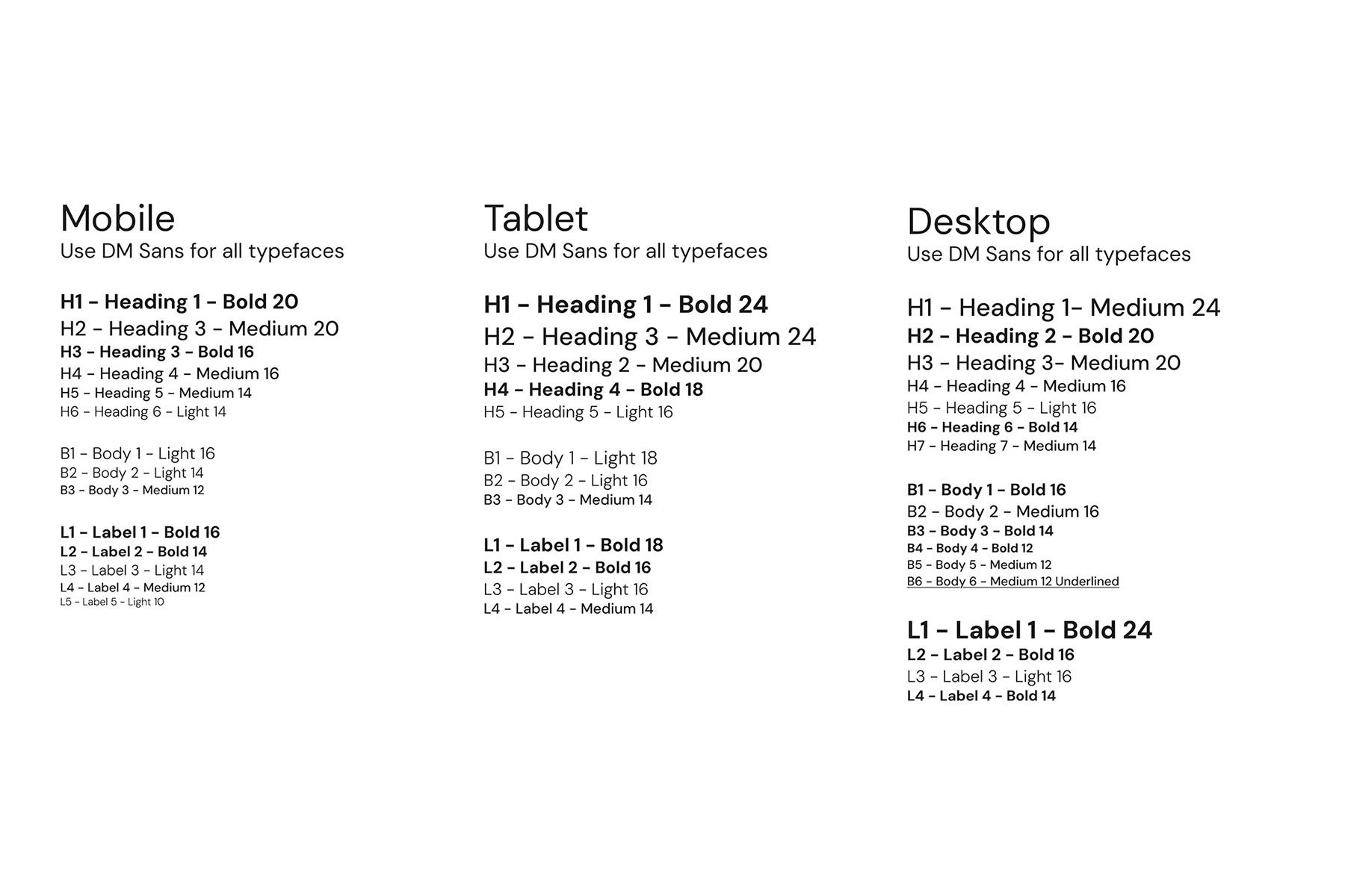
The final style guide deployed for all required typeface scenarios.
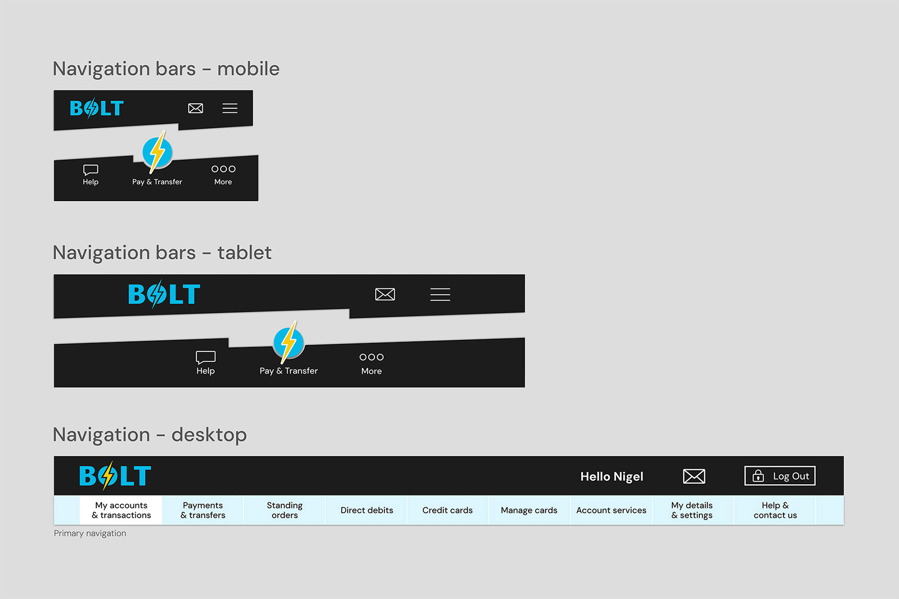
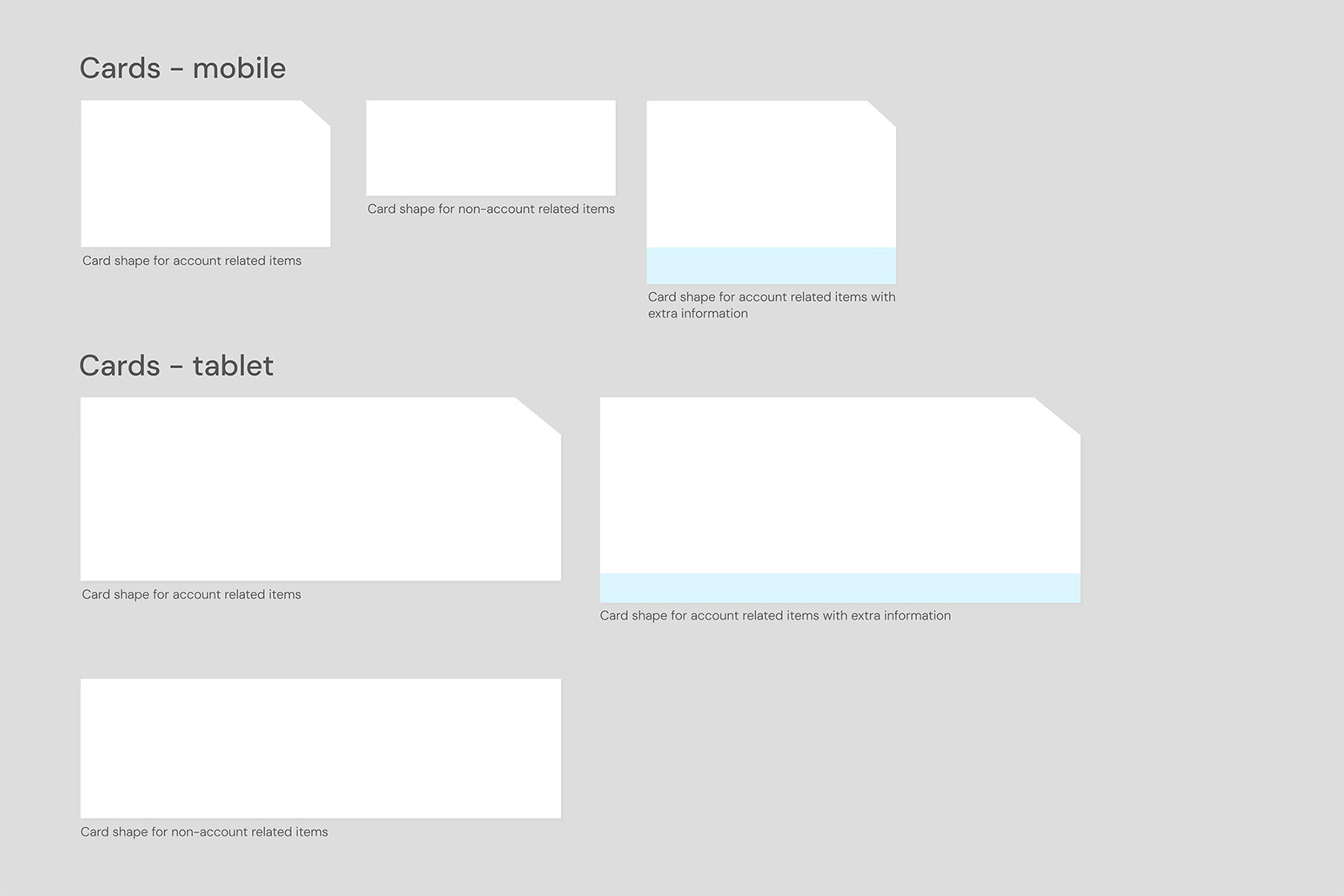
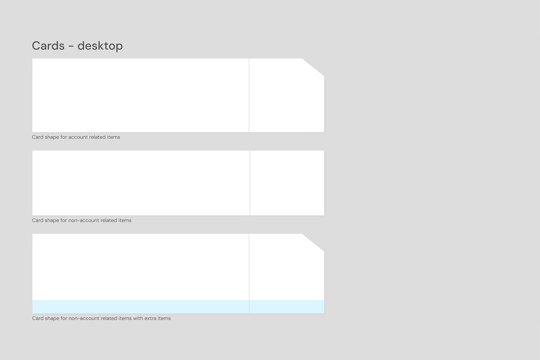
Components
Core UI components, such as buttons, navigation, and cards, were designed using the established typography and colour palette. These elements were refined and enhanced as the final screens evolved. They played a crucial role in shaping early page iterations and ensuring consistency from the outset.
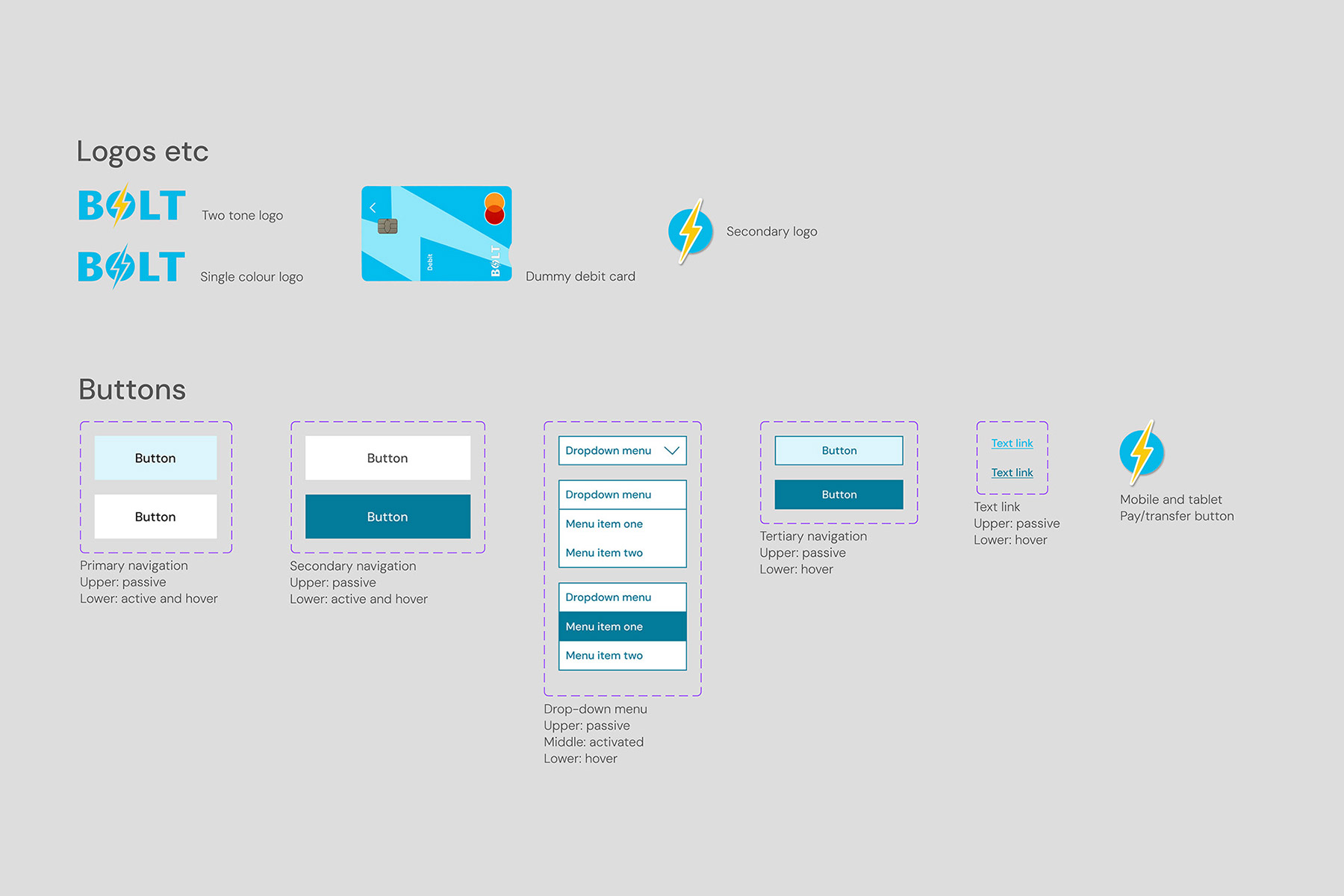
Icons
An existing icon library was adapted to align with the bank’s colour palette. As the project evolved, additional bespoke icons were designed to address specific needs and maintain visual consistency.
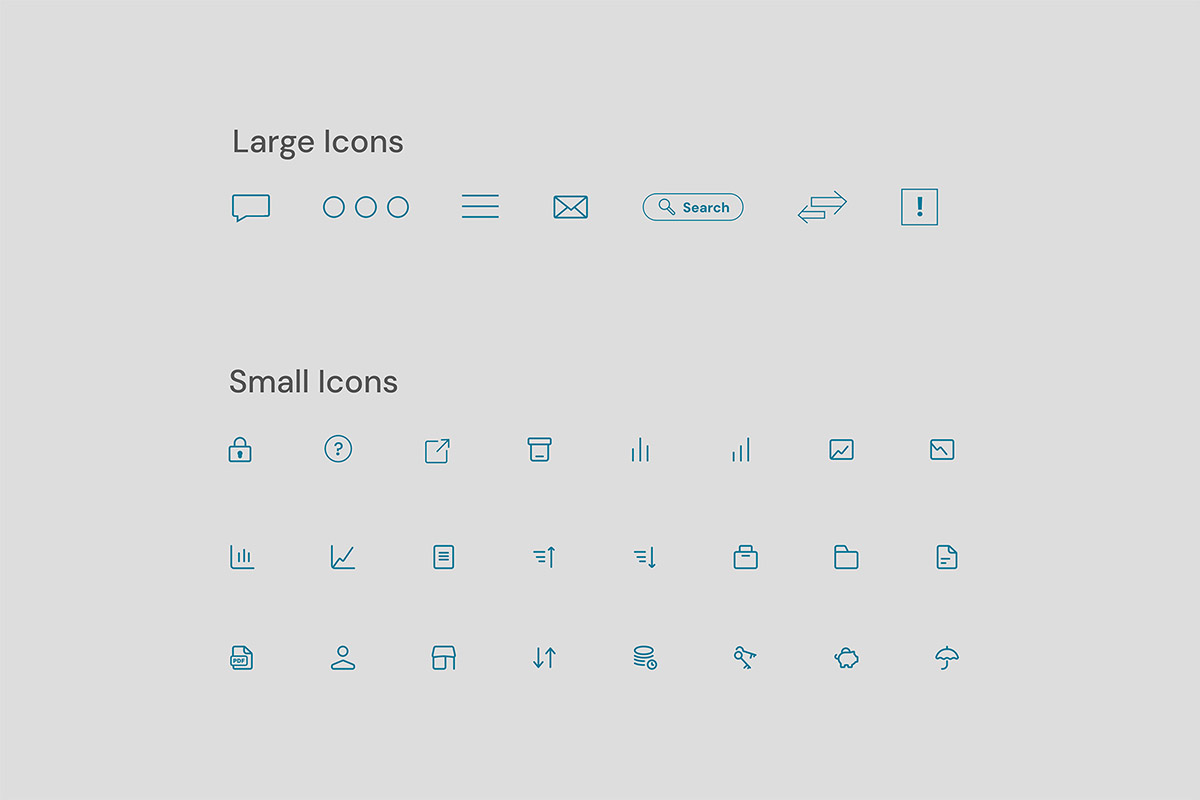
The initial set of icons that were created
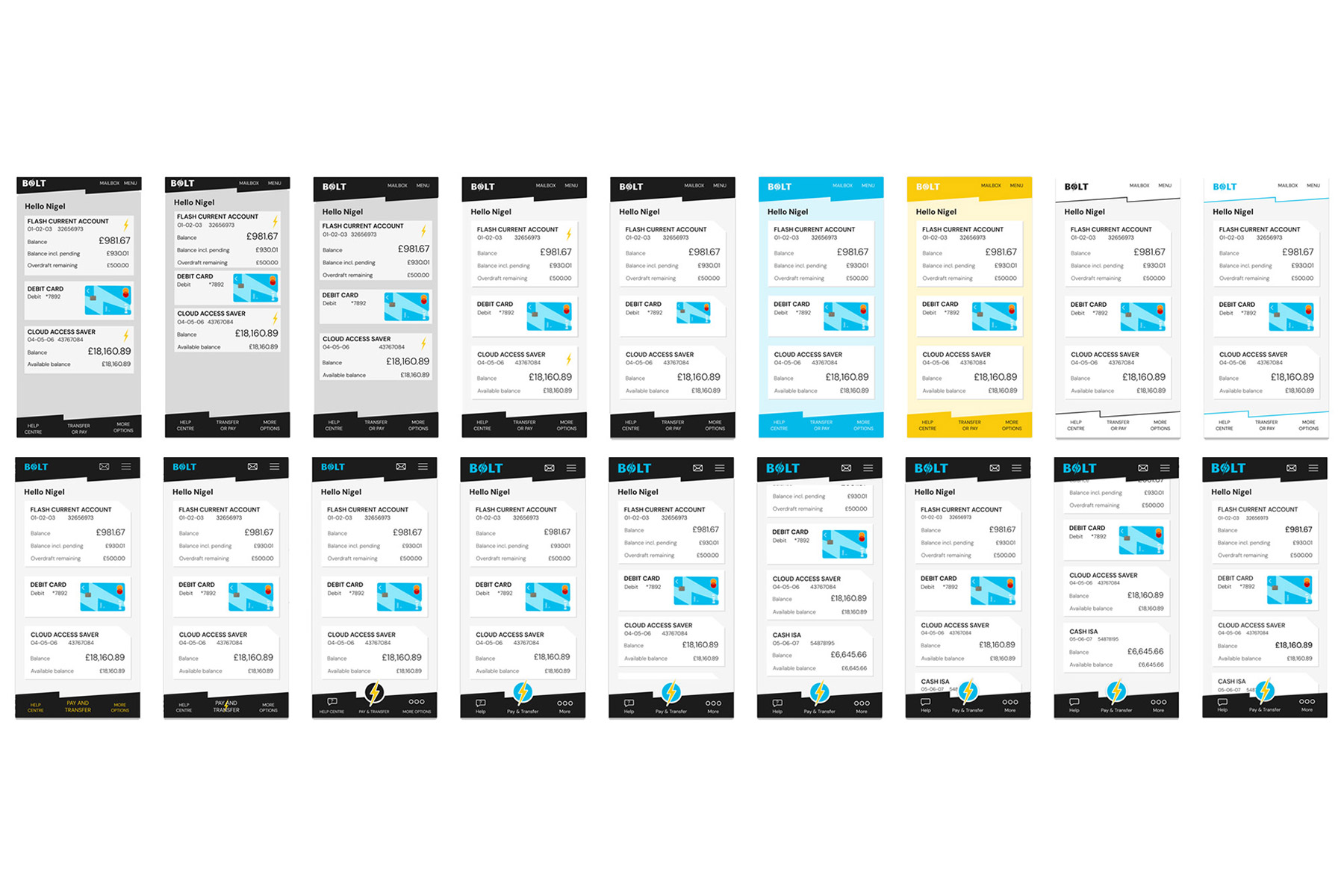
Stage three: screen design iterations
After sketches and concepts were developed on paper, the design process moved into Figma for refinement. Typography, colour, icons, and other UI components were progressively adjusted and improved. Each screen iteration was duplicated and evolved, creating a clear record of the design’s progression.
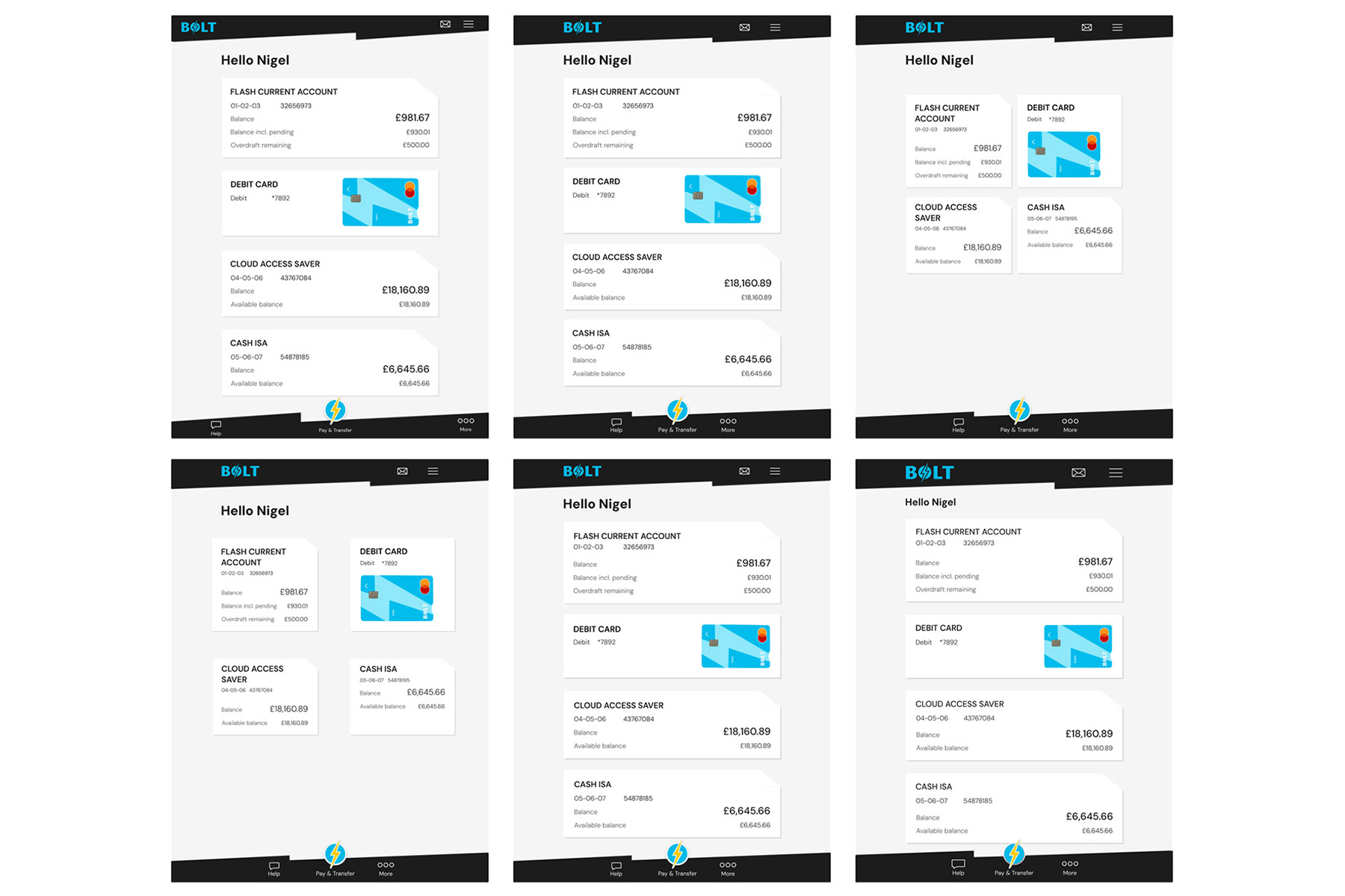
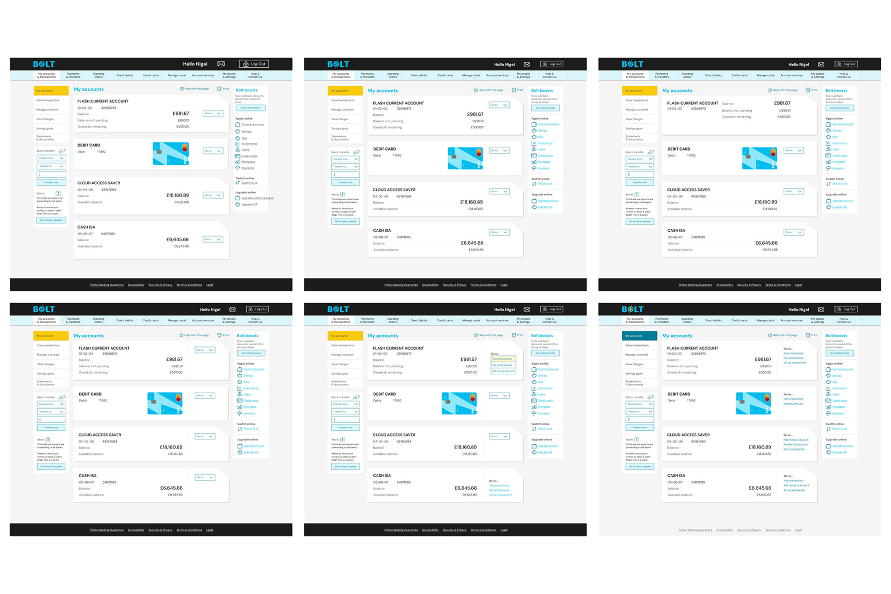
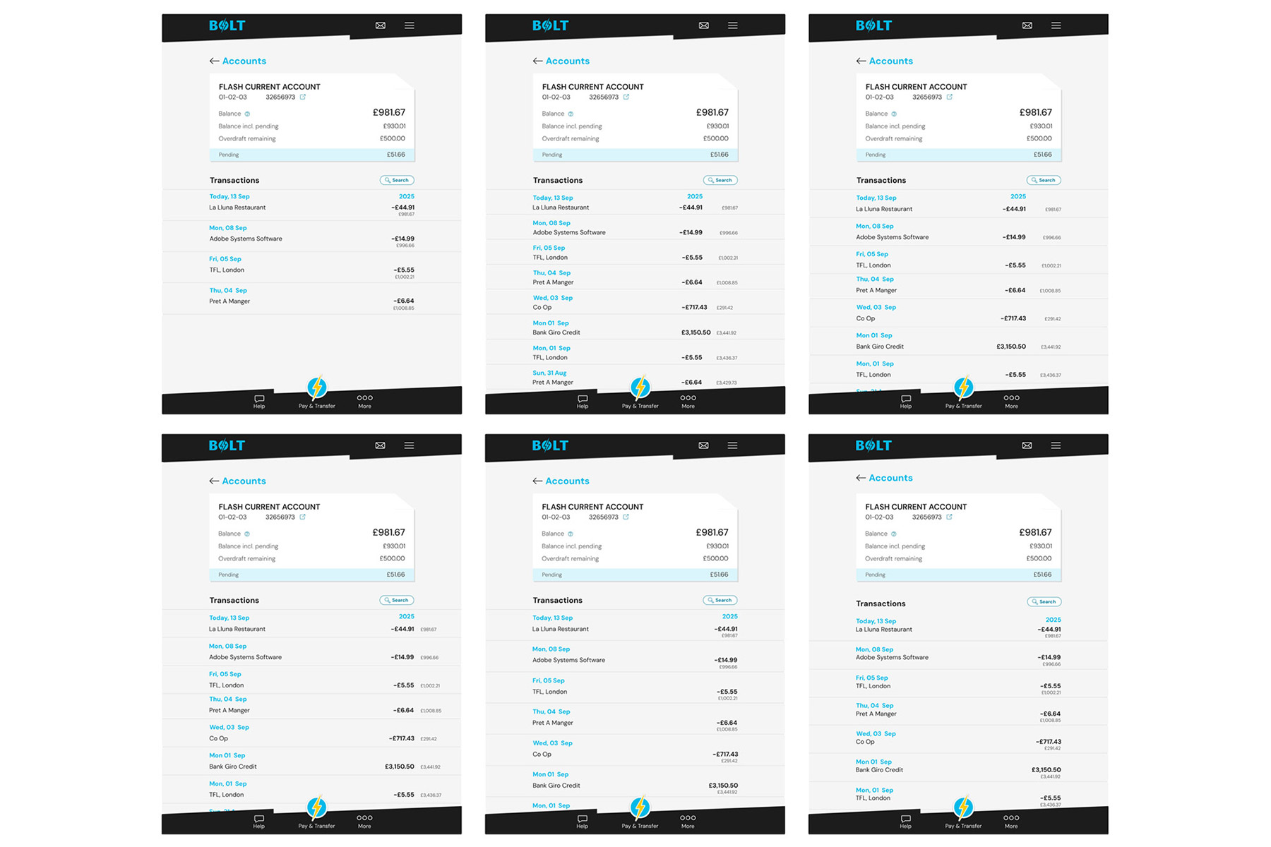
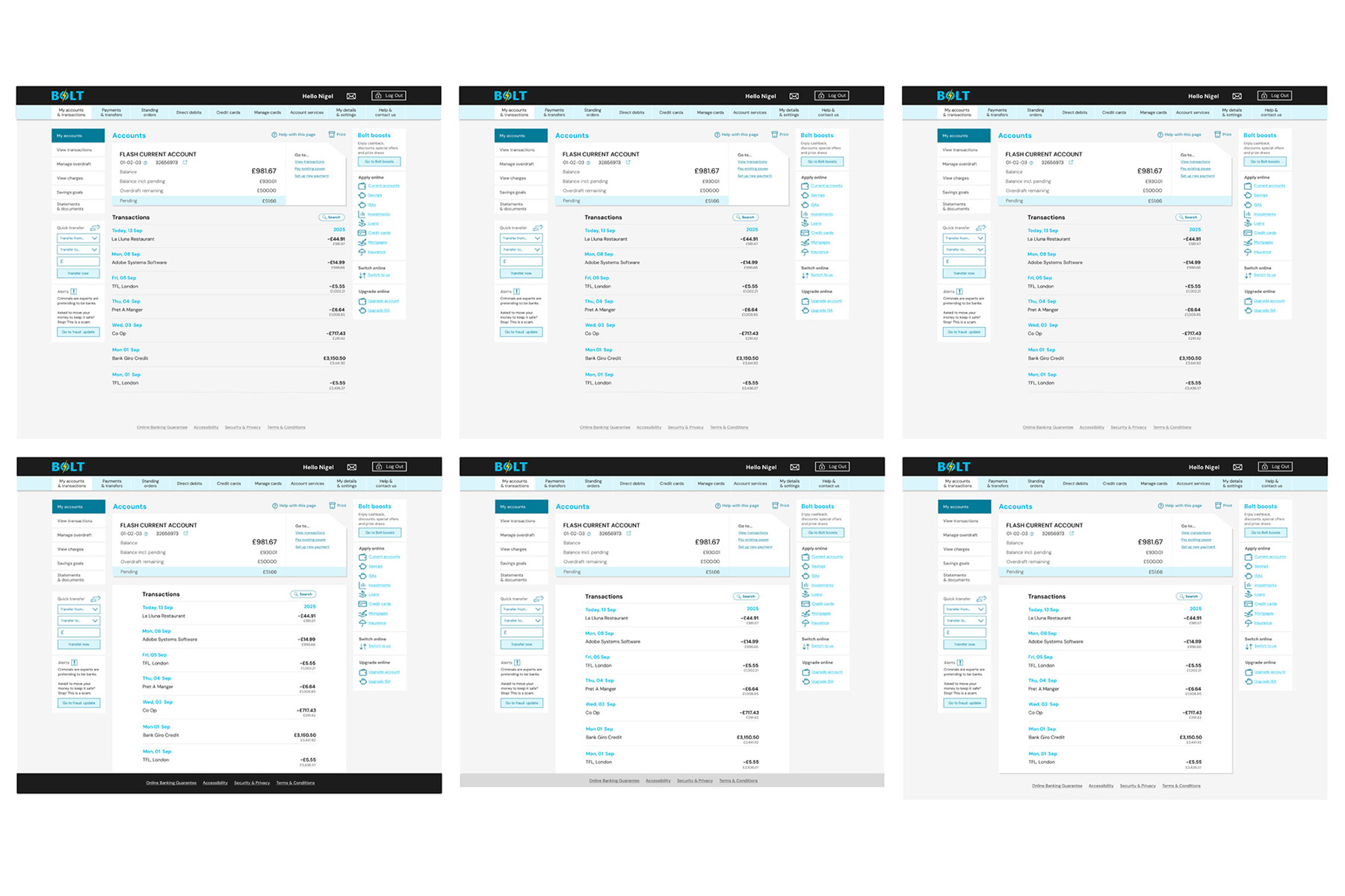
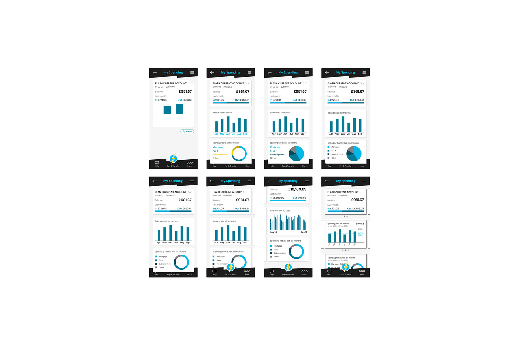
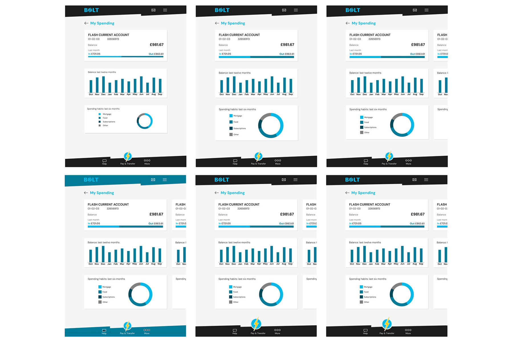
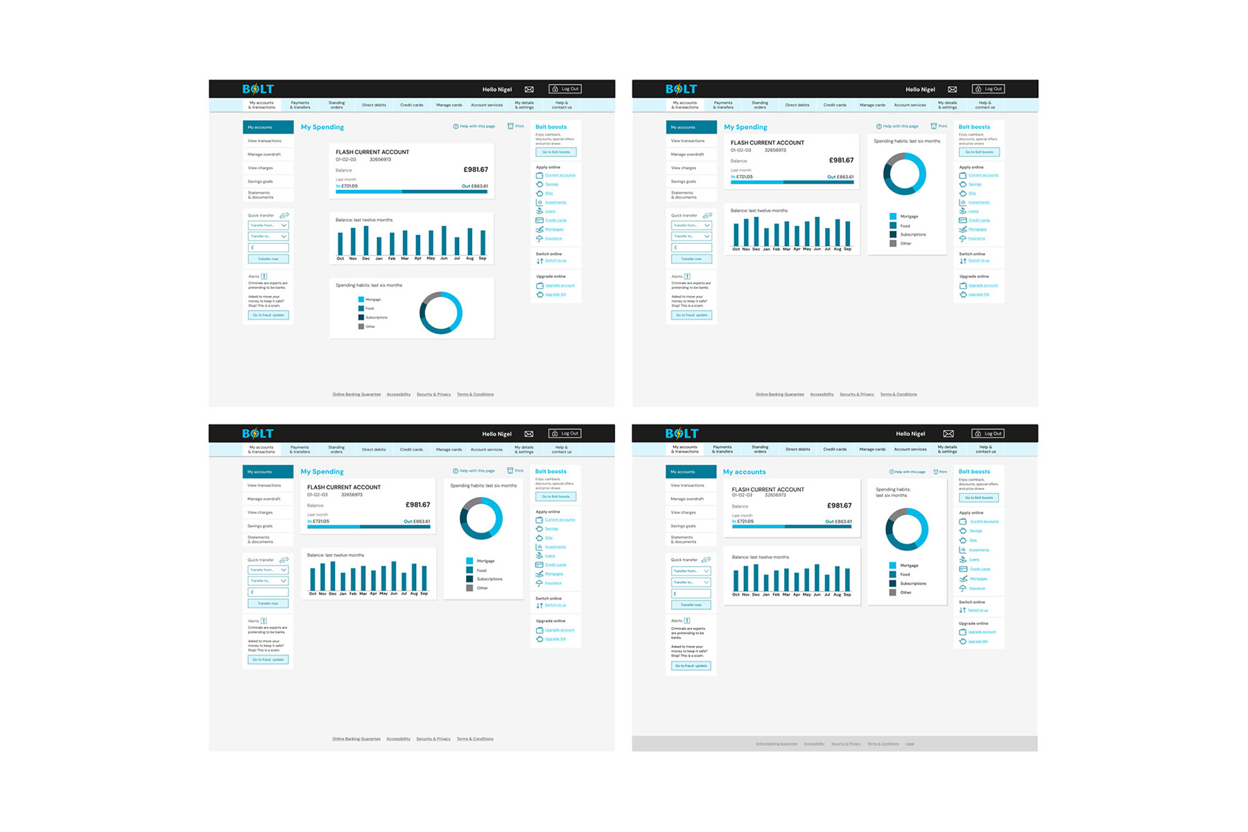
I created nine screens in total, developing mobile, tablet, and desktop layouts for the My Accounts, Current Account, and My Spending pages.
Stage four: final designs
The Screens
The iterations were rigorously tested, reviewed, and refined until all nine screens were ready for handover. Typography, graphical elements, and UI components were continuously improved, resulting in the final designs below.
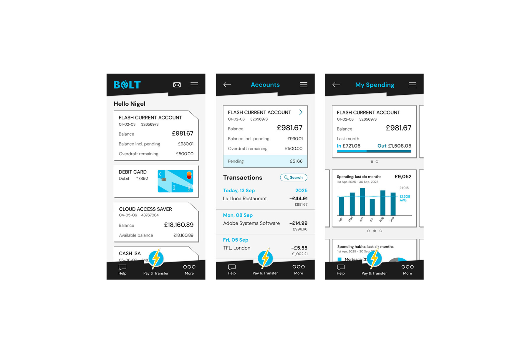
The three final screen designs for mobile phones: My Accounts, left, Current Account, centre, and My Spending
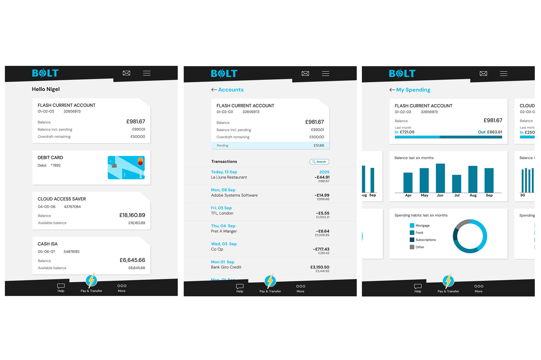
The three final screen designs for tablet devices: My Accounts, left, Current Account, centre, and My Spending
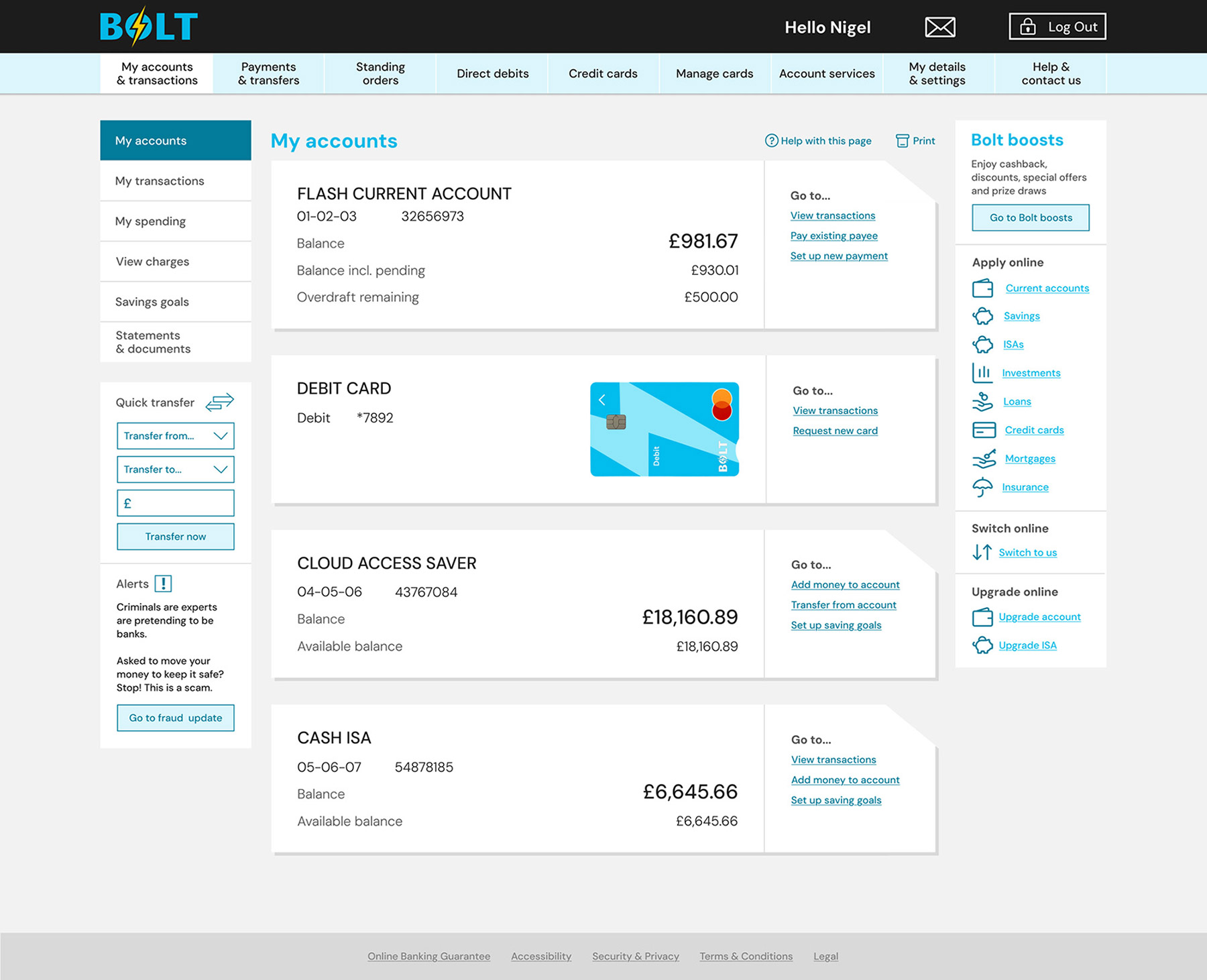
The final My Accounts screen design for desktop devices
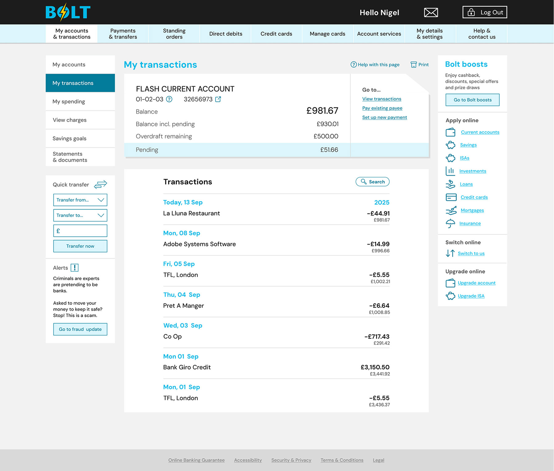
The final Current Account screen design for desktop devices
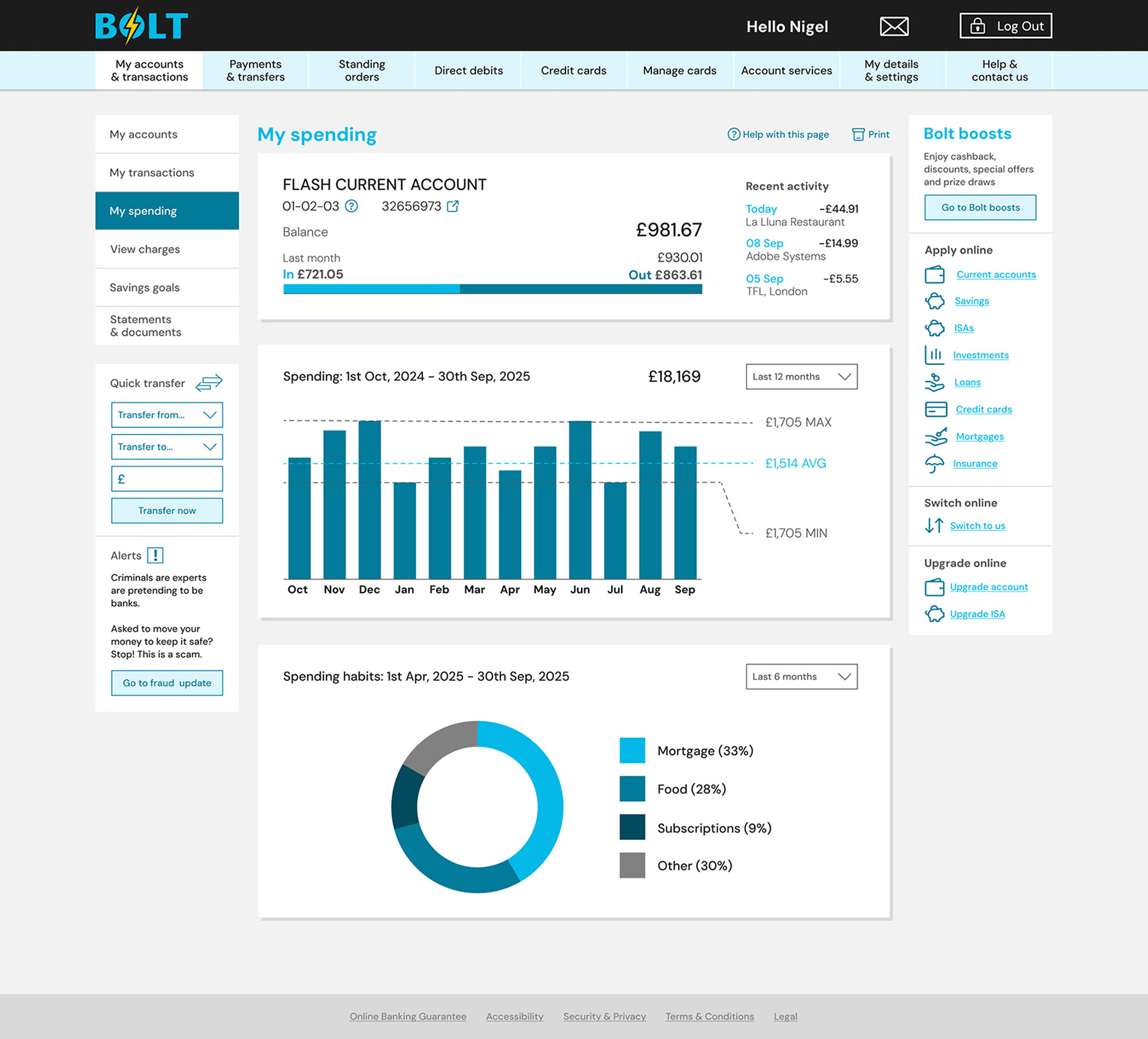
The final My Spending screen design for desktop devices
Prototyping
Figma's prototyping tools were used to create seamless transitions between screens, providing a clear representation of how the application should feel in use. This proved highly effective in communicating the intended user experience.
Interactive elements such as a loading screen, dropdown navigation, and other additional features were incorporated into the mobile prototype. The video below demonstrates the final design, showcasing mobile and desktop interactions.