Hotel Booking System
A UX project focused on developing a new booking system, aimed at creating a seamless, user-friendly experience from search to payment.
Stages of the design process
Scenario
Design a new booking system for Queen’s Hotels London, a small boutique hotel chain. The final outcome will be a high-fidelity prototype, fully prepared for handover to the development team. The project covers the following stages:
- Research
- Analysis
- Concept development
- Final design development
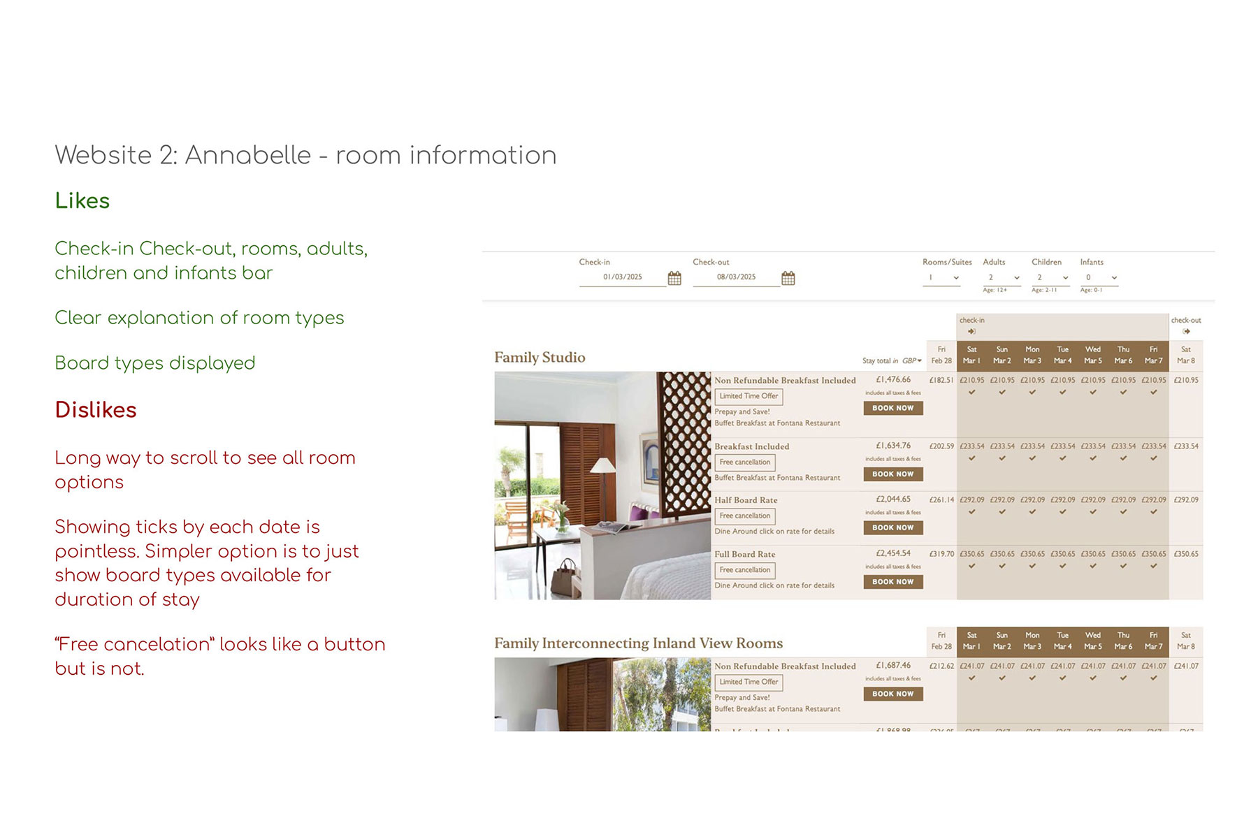
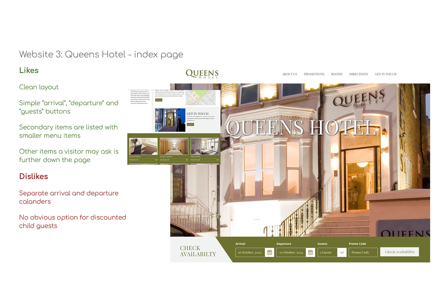
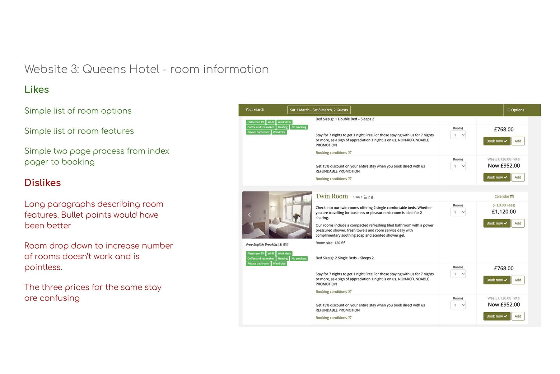
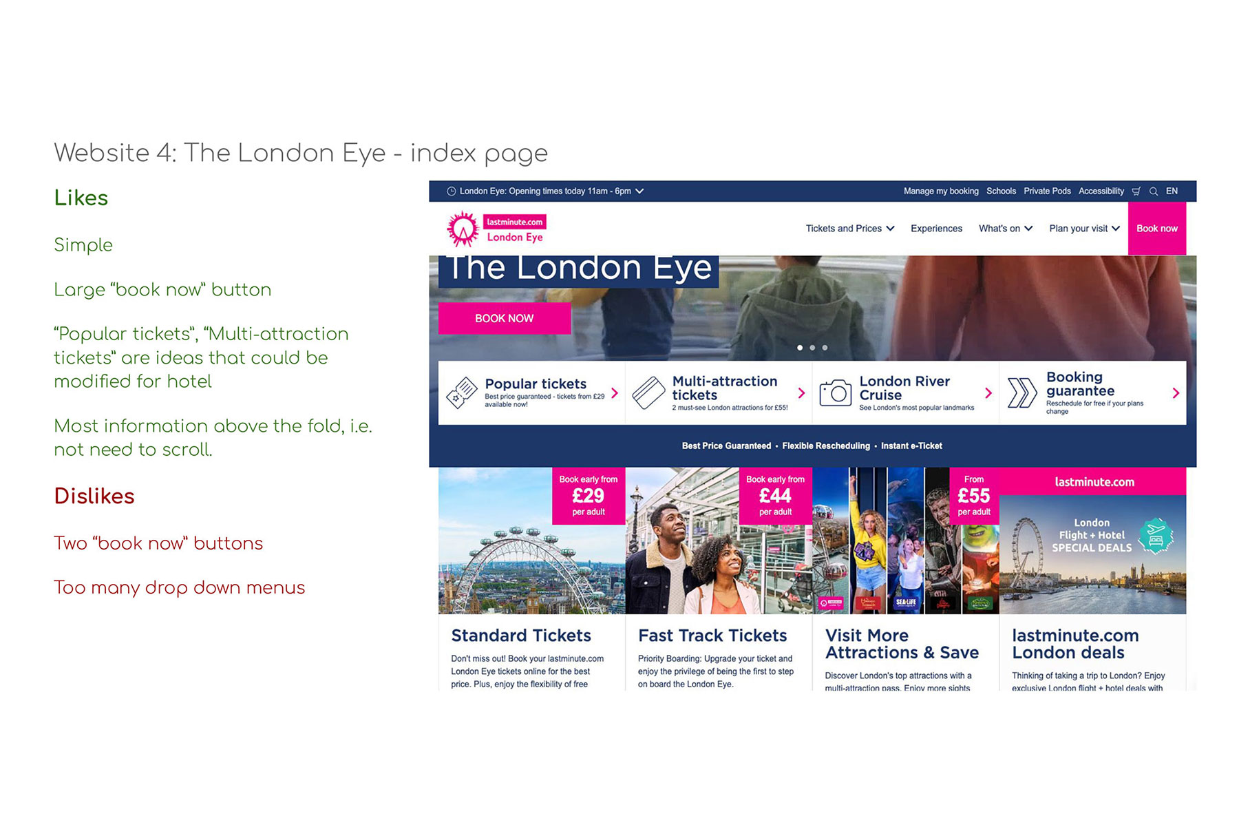
Stage one: research
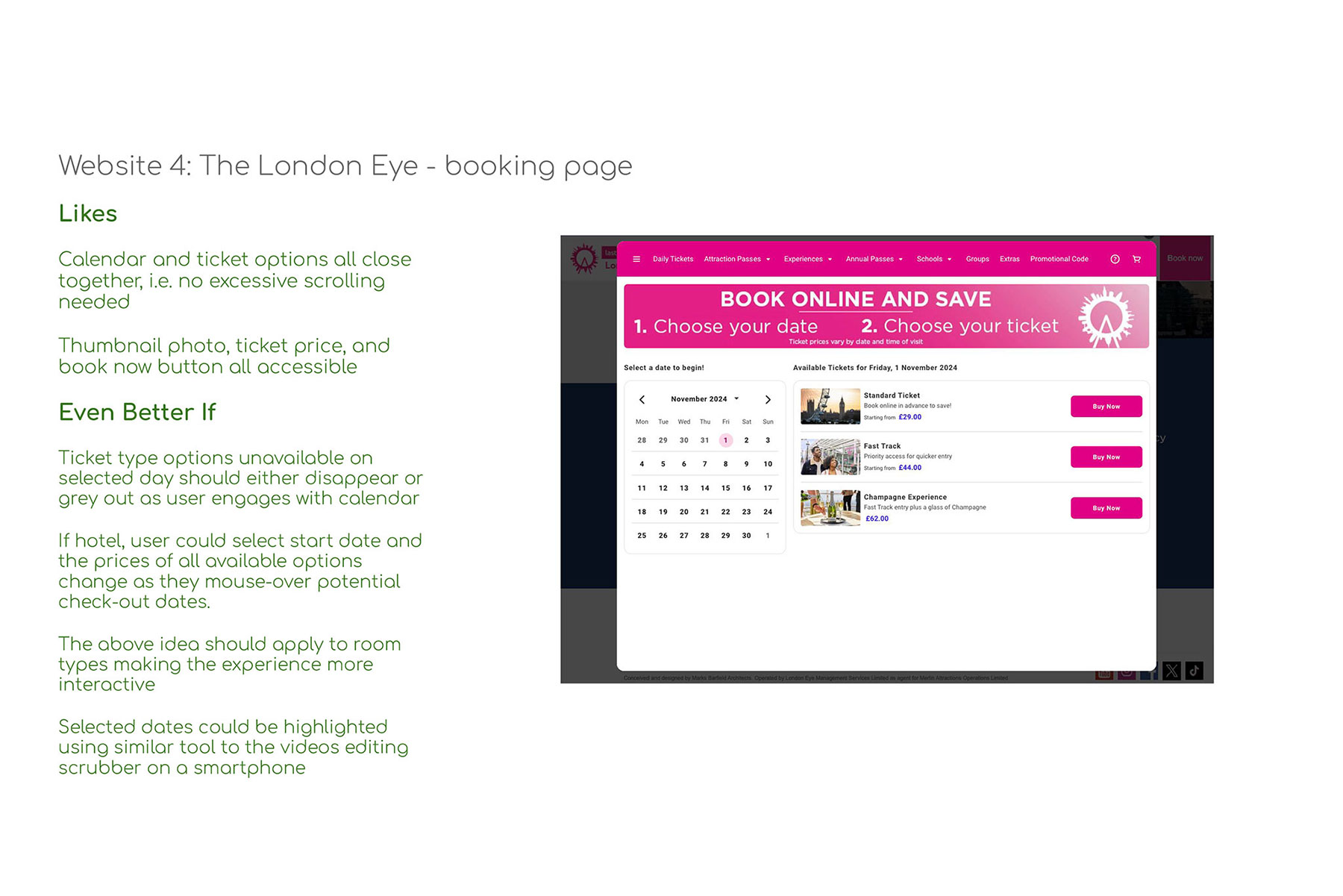
Competitive Benchmarking
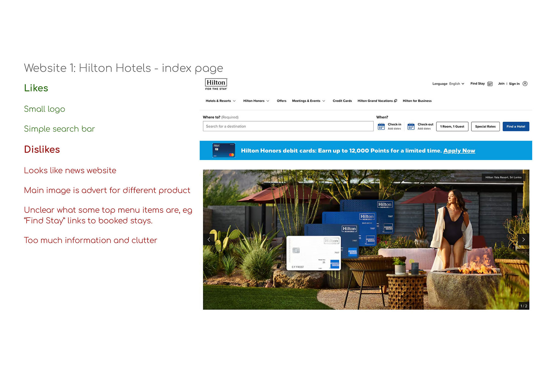
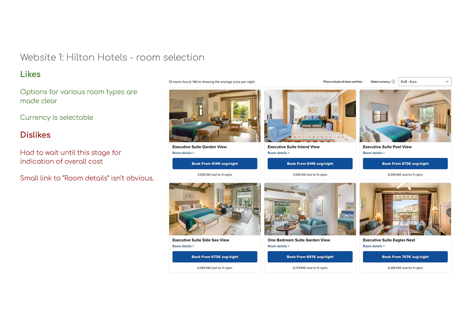
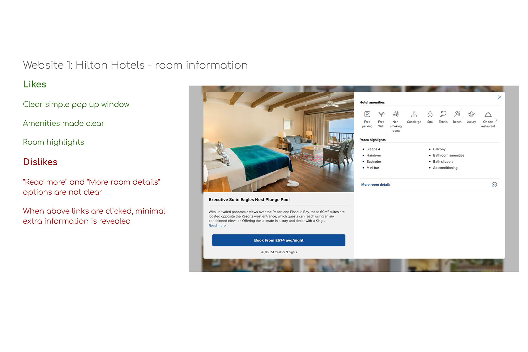
The project began with the selection and analysis of competitor websites. These included businesses of a similar size, well-established household-name chains, and organisations outside the hotel industry that utilise comparable booking systems.
Each platform was reviewed, with detailed notes recorded to identify features that performed effectively and those that presented usability issues.
Usability Testing
Volunteers were recruited to provide valuable insights into room booking processes across a range of hotels. The participants were selected from a broad demographic spectrum, helping to minimise potential bias related to age, background, or prior experiences.
The research involved recording participants as they navigated booking tasks based on predefined scenarios. The volunteers were given minimal guidance and asked very few questions, ensuring their behaviour remained as natural as possible. This enabled the collection of authentic, unbiased data.
The testing facilitated the gathering of information on:
- The primary goals of the user
- Secondary and tertiary goals
- How the user achieves their goals
- Behaviours
- Context of use
- Pain points
- Product desirability and functionality
Stage two: analysis
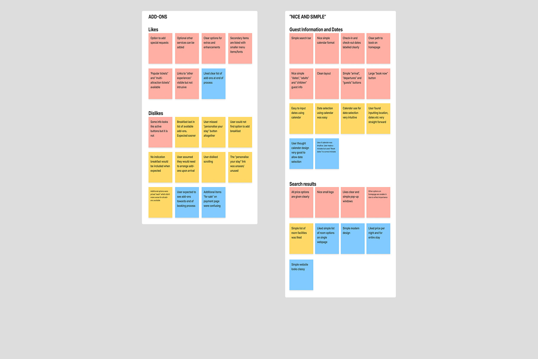
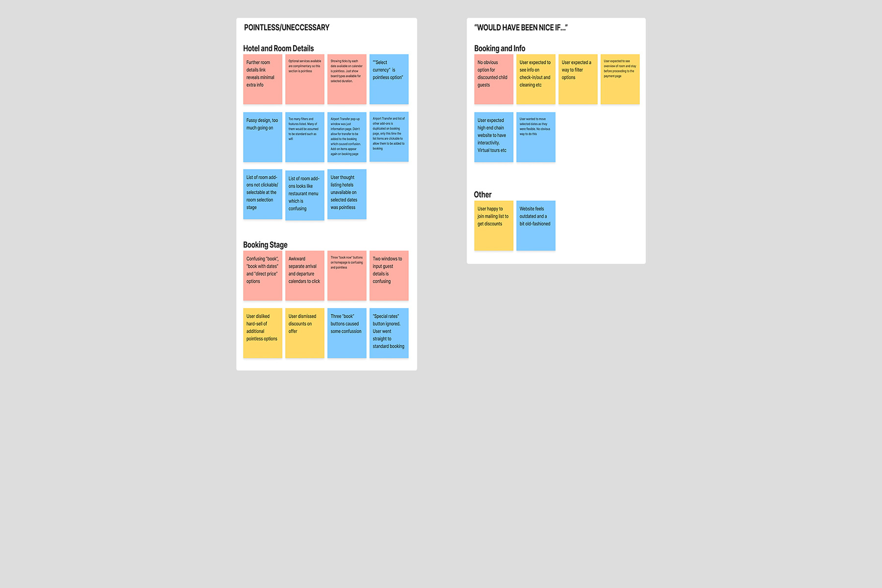
Affinity Diagram
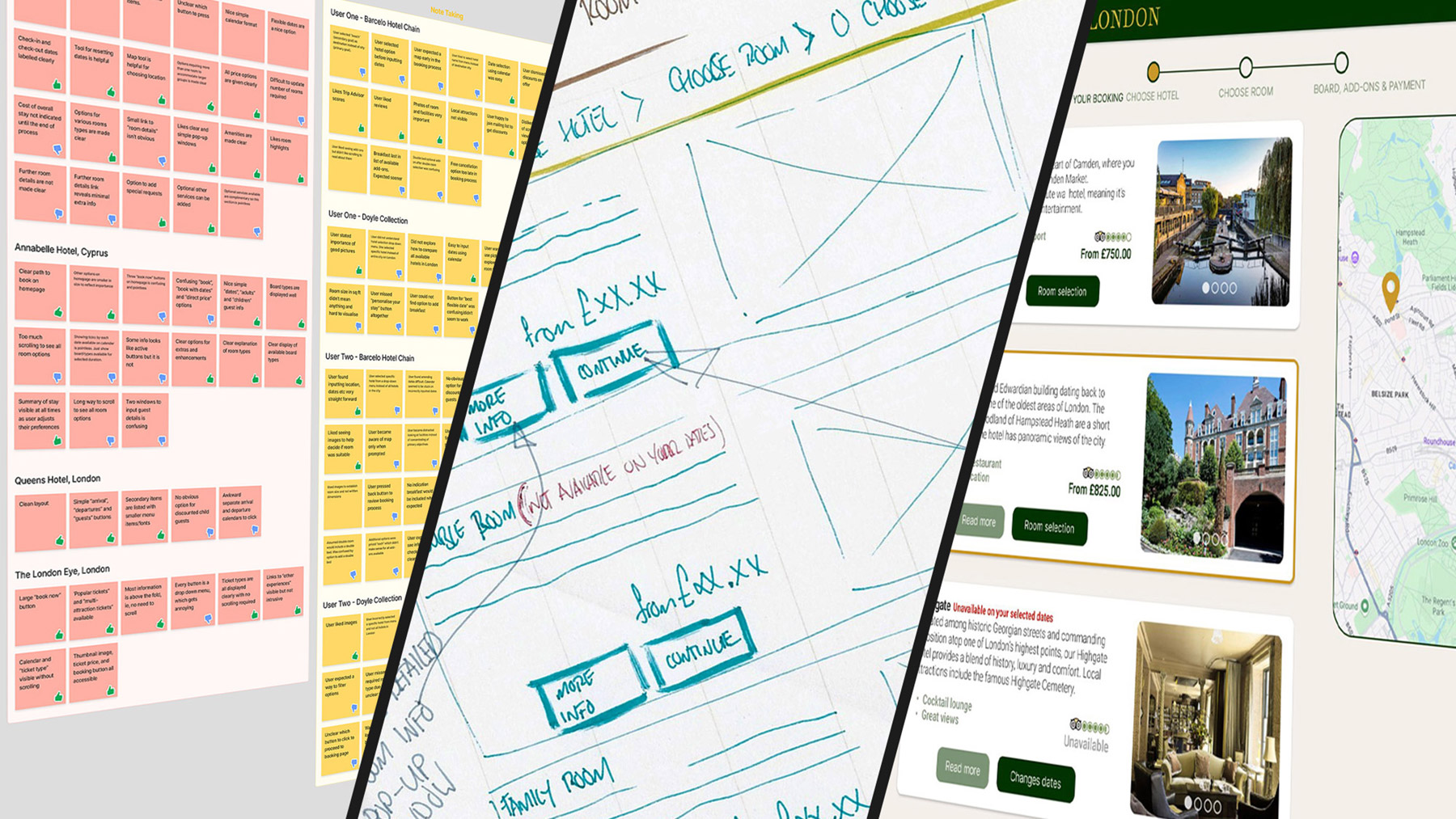
Each observation was distilled into a single point and recorded as a digital “post-it” note using the FigJam application. Dozens of notes were created, with each entry representing an individual insight. Thumbs-up or thumbs-down icons indicate positive or negative experiences.
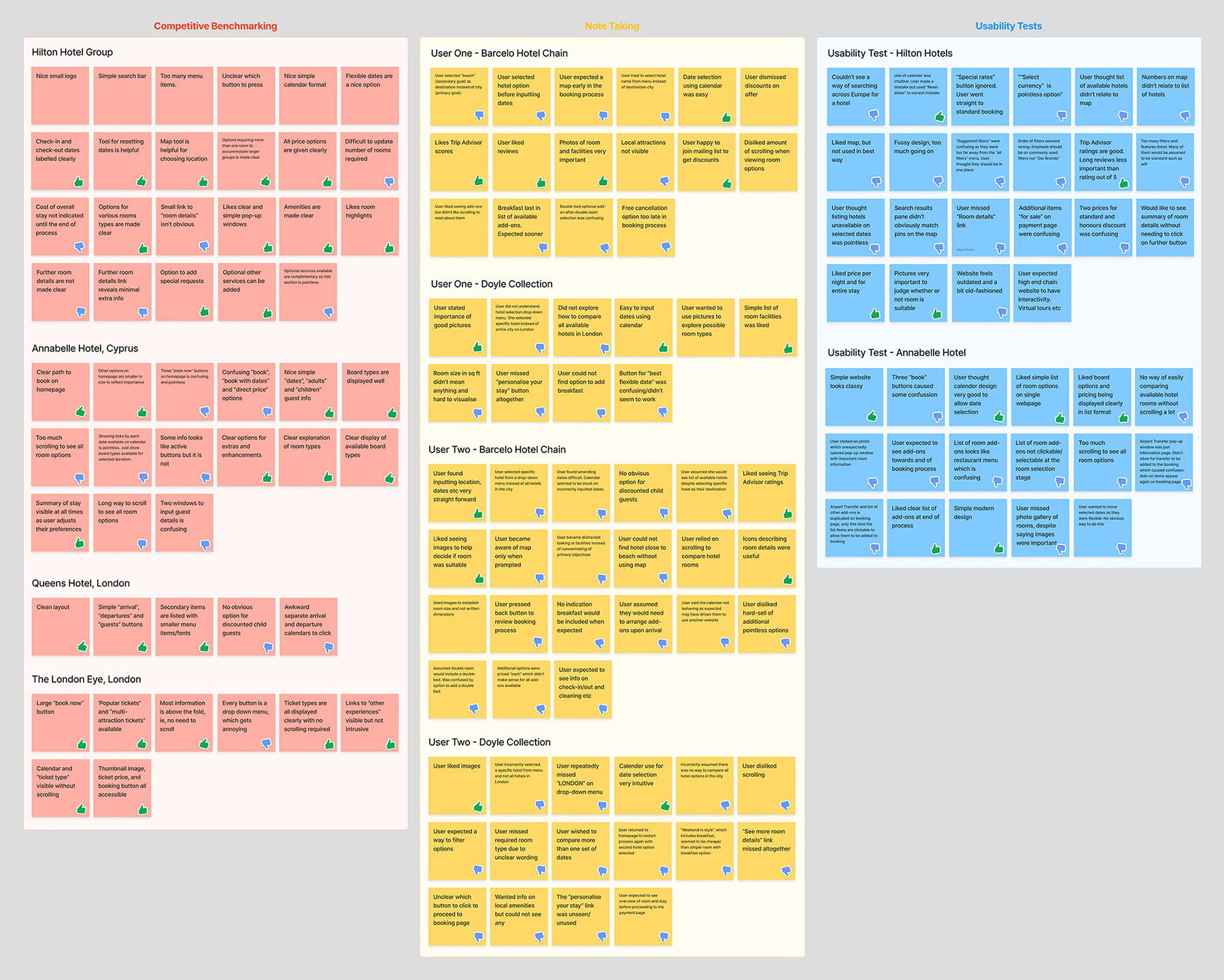
The gathered notes prior to sorting
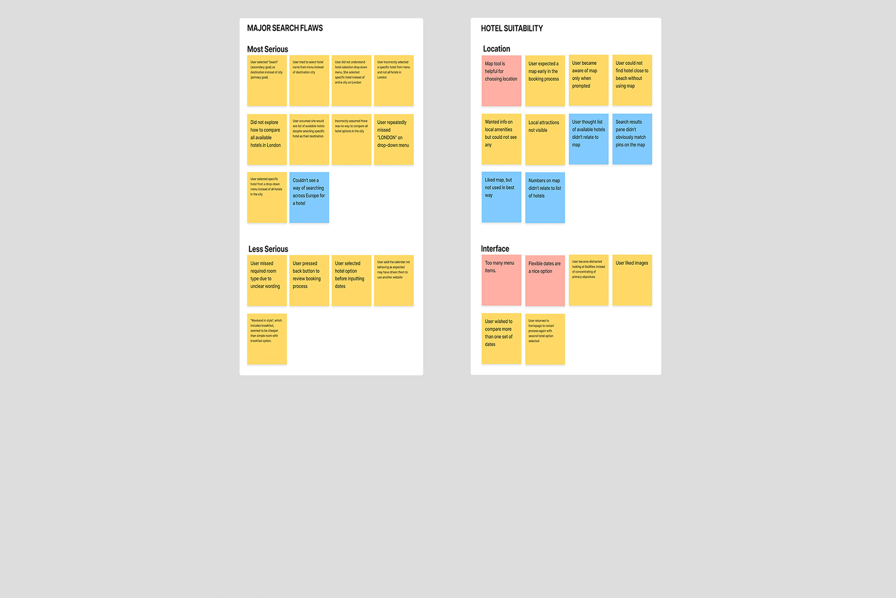
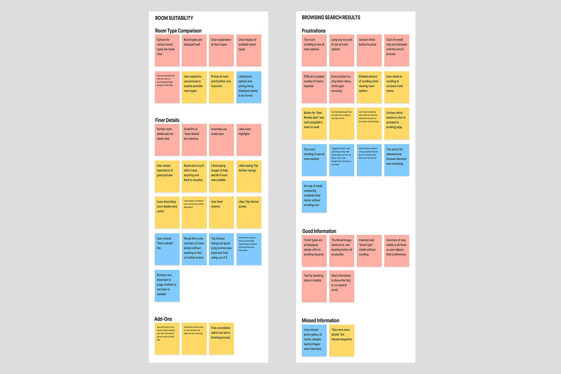
The notes were then organised into cohesive groups, allowing key patterns to emerge. This provided valuable insights and helped identify and prioritise pain points and useful features. Each cluster was labelled to reflect its theme.
The final groupings included a category for major search issues, clusters for each stage of the booking journey, a group for features considered unnecessary, and two categories for general feedback. These were titled "Nice and Simple" and "Would Have Been Nice if…", reflecting phrases frequently used by the participants.
Customer Journey Map
The affinity diagram was used to map the user journey throughout the booking process. Each stage, corresponding to the pages navigated by the user, was clearly defined and separated. Insights for each stage were documented and organised into seven key areas:
- Goals
- Context of Use
- Mental Modes
- Behaviours
- Pain points
- Positives
- User Quotes
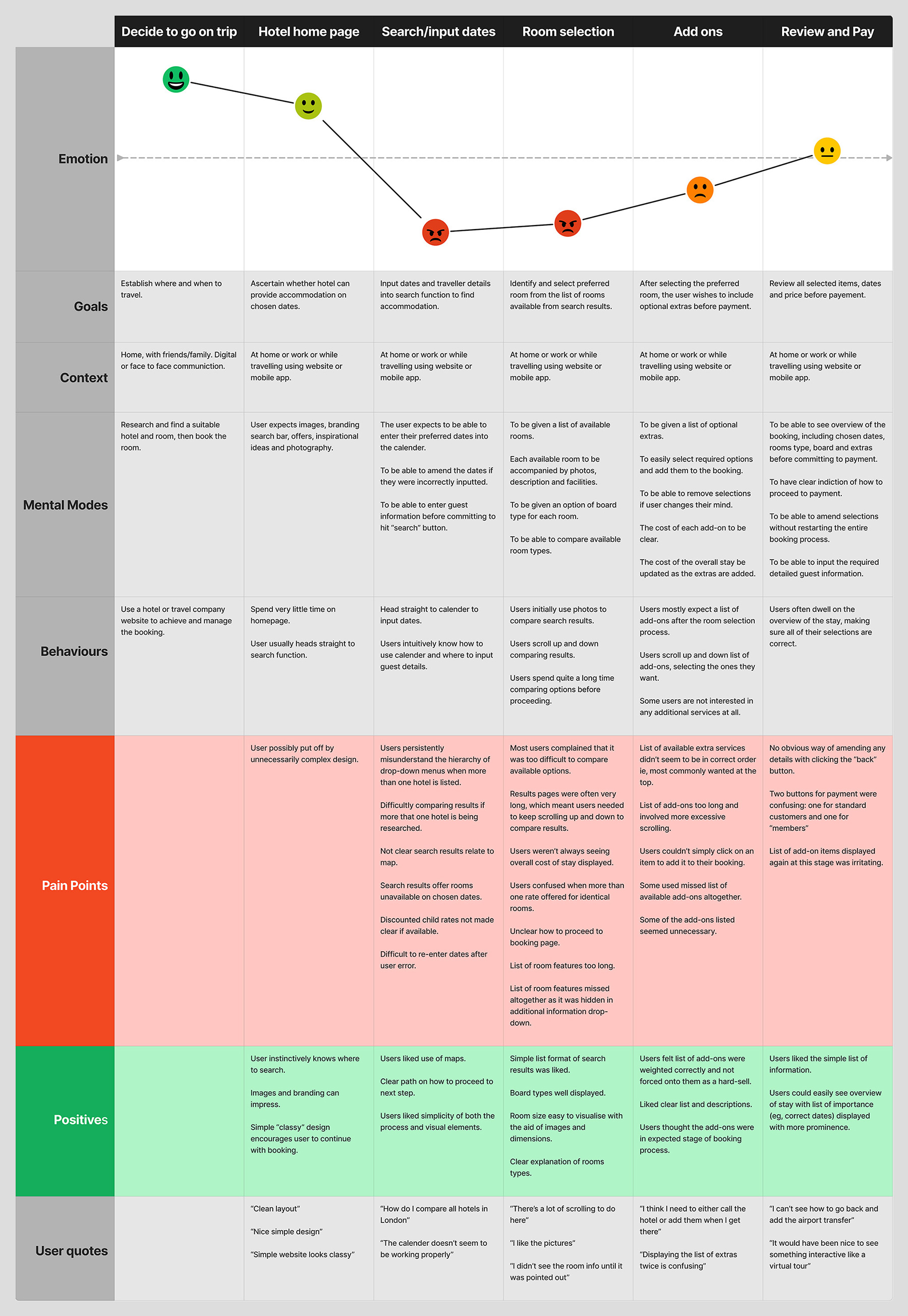
The completed customer journey map
The insights were then used to create a timeline illustrating user emotions throughout the process. This made it easier to identify key areas for improvement. The diagram above highlights three major pain points:
- Search/inputting of dates
- Room selection
- Add ons
Stage three: concept development
Structure and Flow
Addressing the identified pain points became a priority before moving to concept generation. These issues included inconsistent page layouts, an overload of choices for completing single tasks, and too many unnecessary steps and options before users could proceed.
A flow diagram was developed to define an optimal user journey. The diagram incorporated flexible pathways, allowing users either to explore hotel and room options in depth, or to fast-track directly to payment if they wished. Each stage of the process was structured as a similar loop, gradually decreasing in complexity as the user progressed towards the final step.
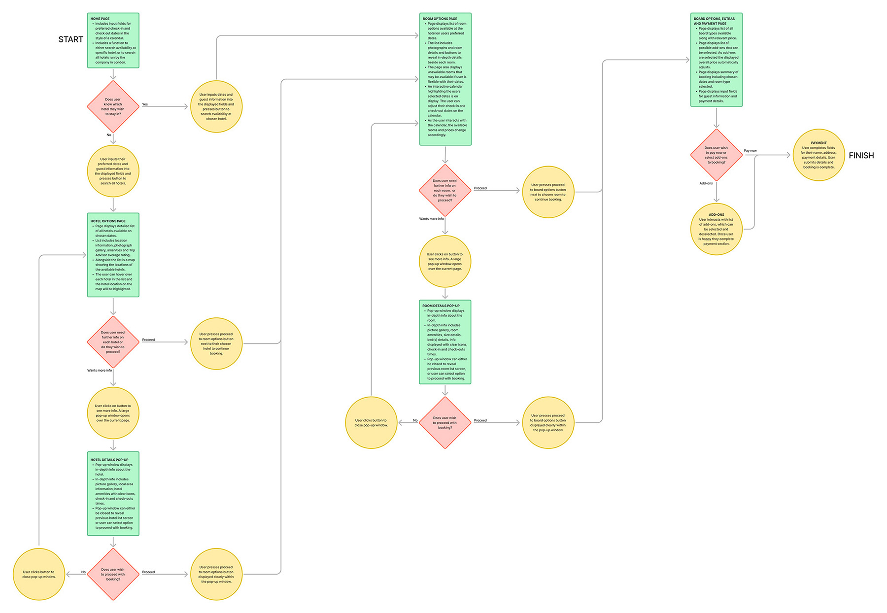
The final flow diagram used for concept generation
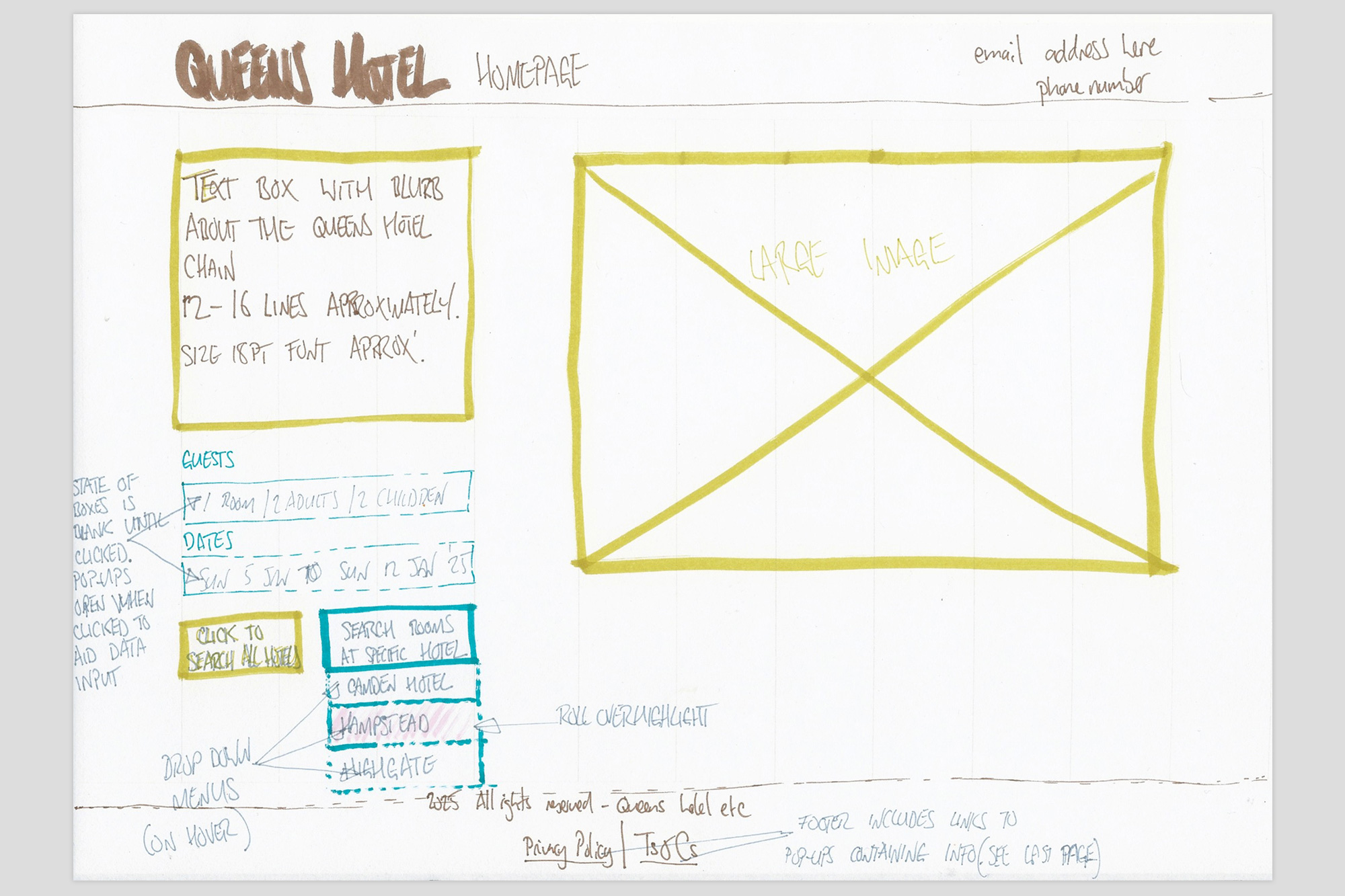
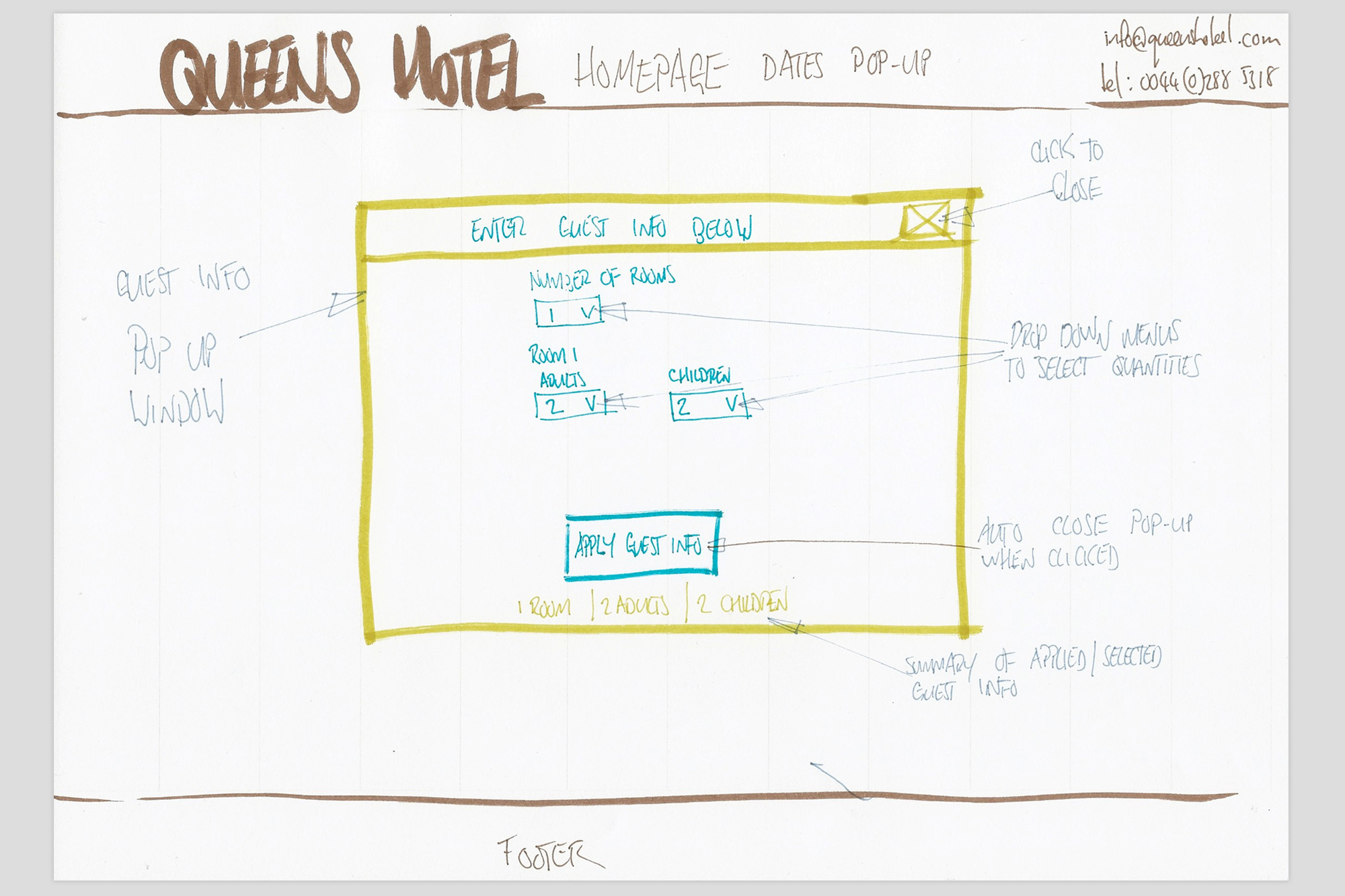
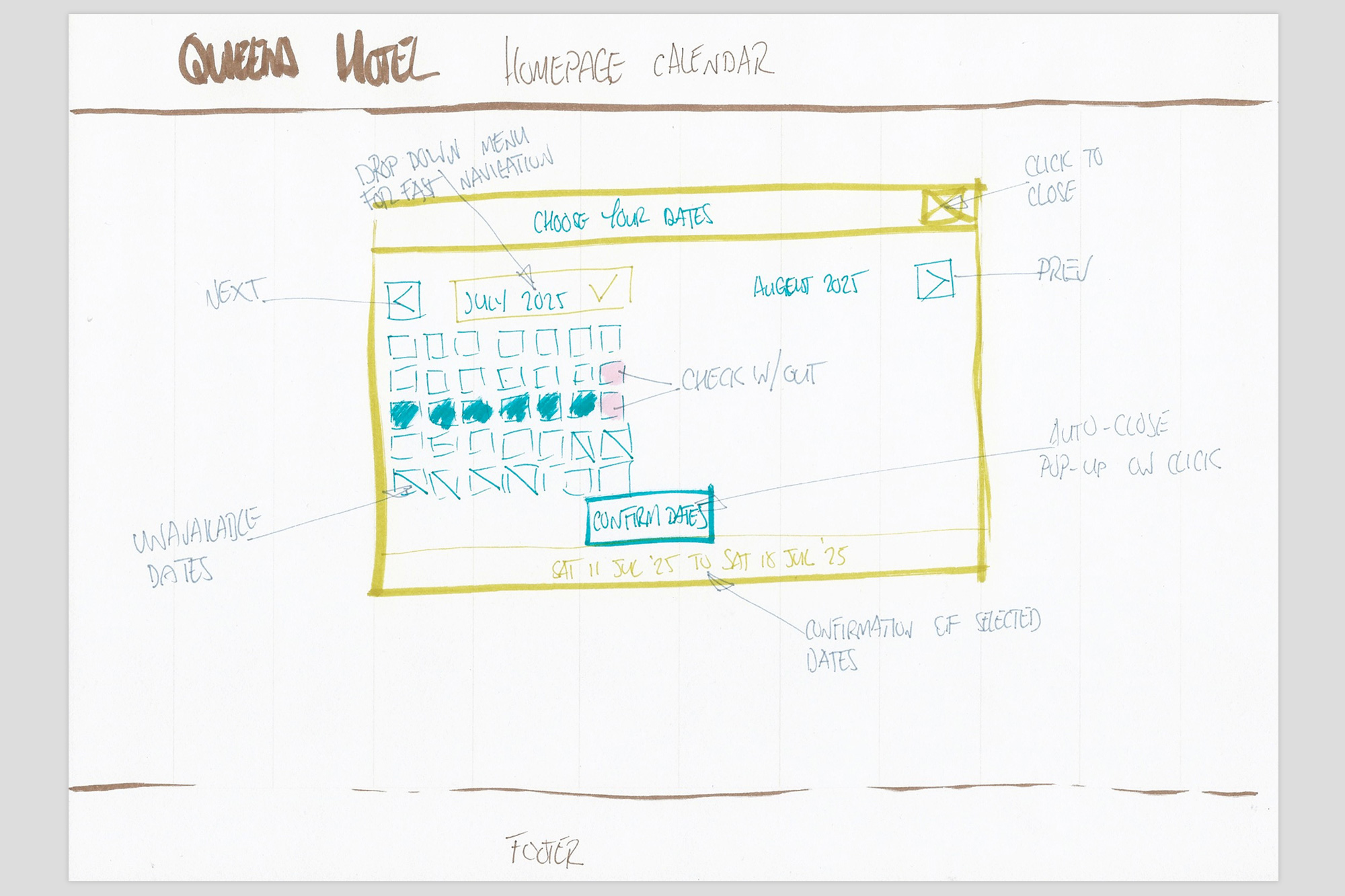
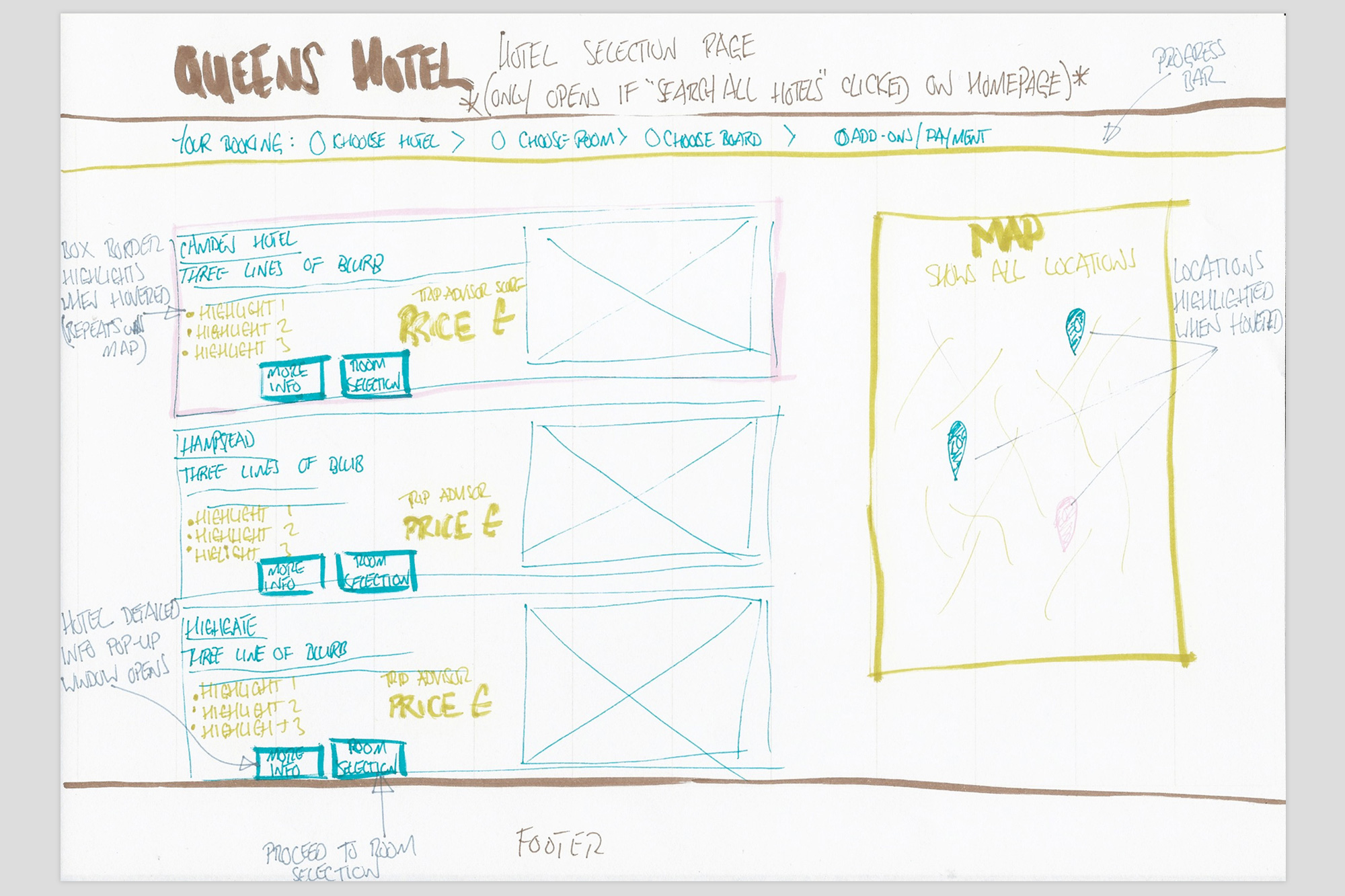
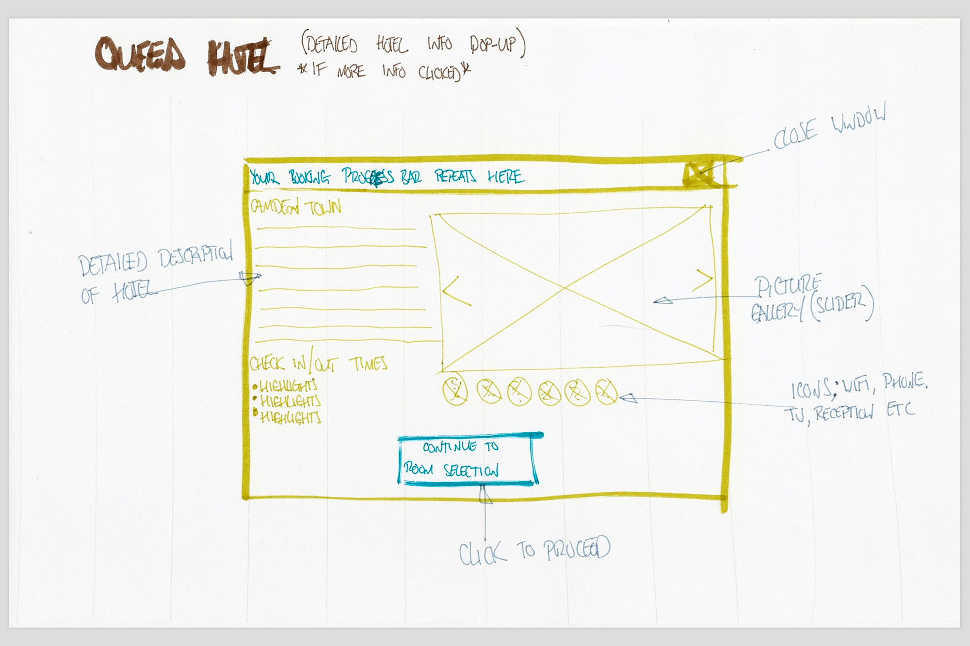
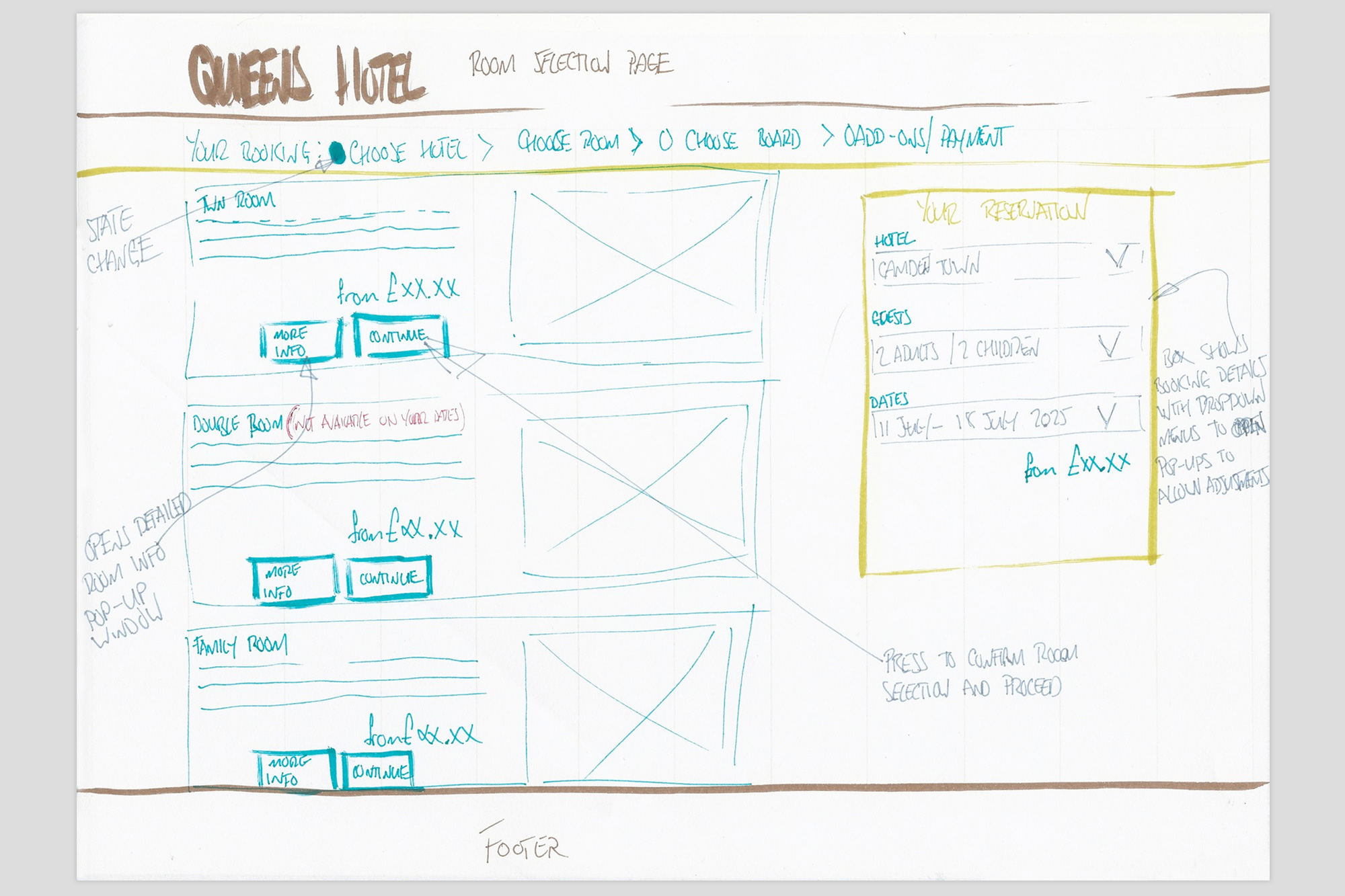
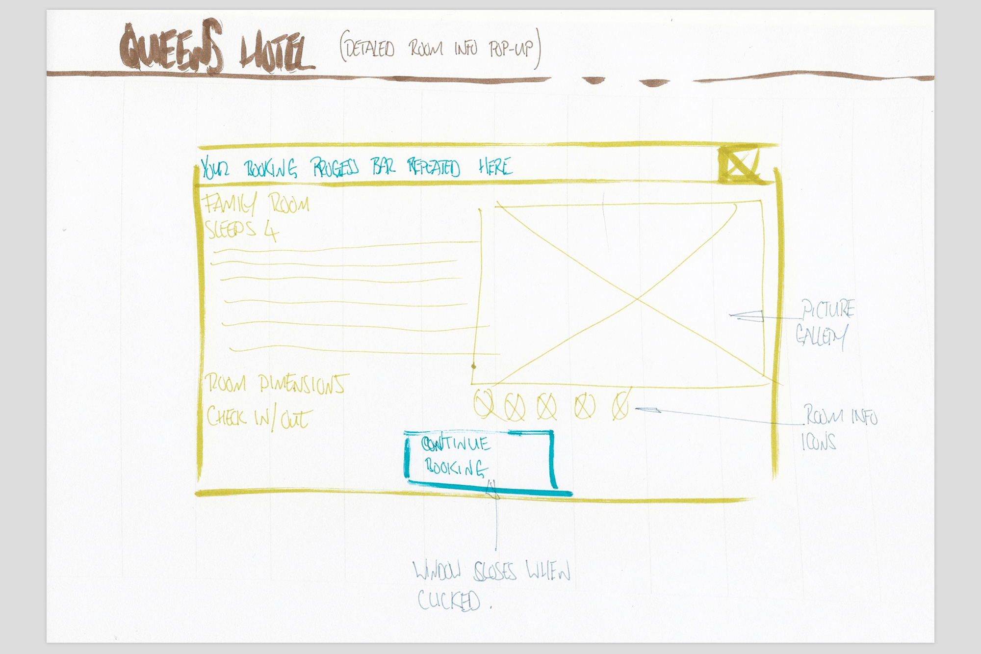
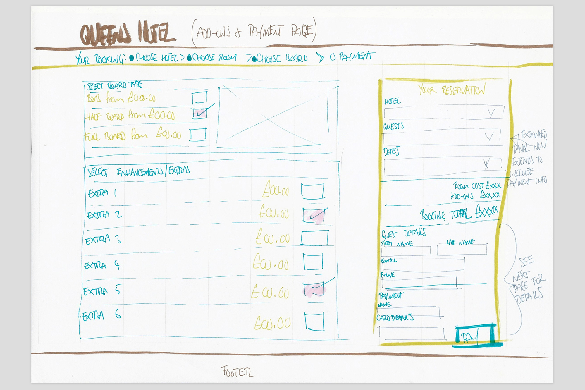
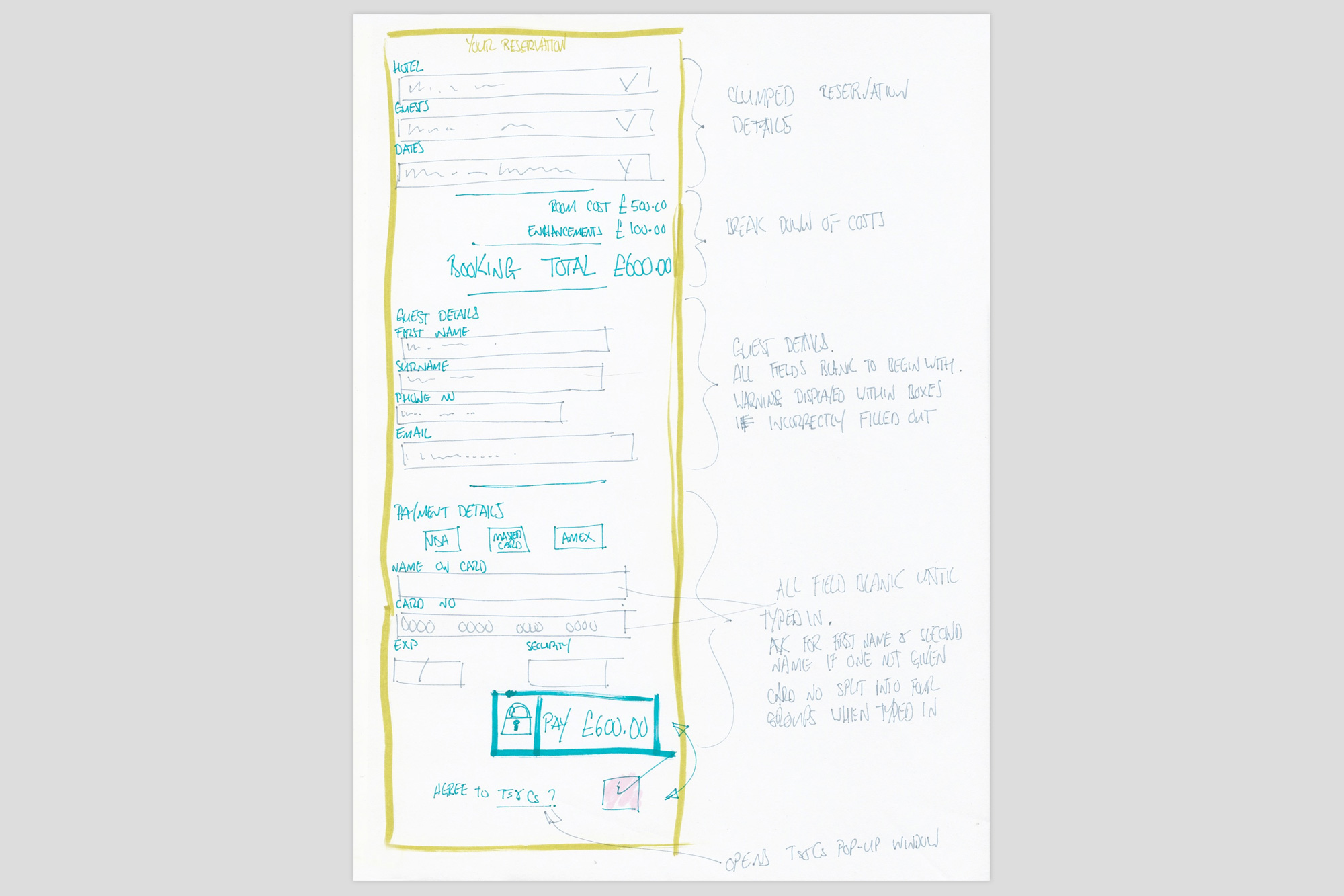
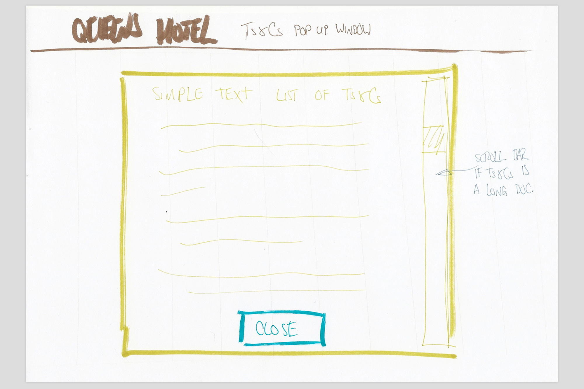
Wireframes and Sketches
Initial design ideas for pages were sketched out using pen and paper. While the sketches were rough and informal, it enabled rapid idea generation and minimised time spent on concepts that were discarded. Concepts were developed for the following features:
- Homepage
- Single vs. multiple hotel search options
- Date picker
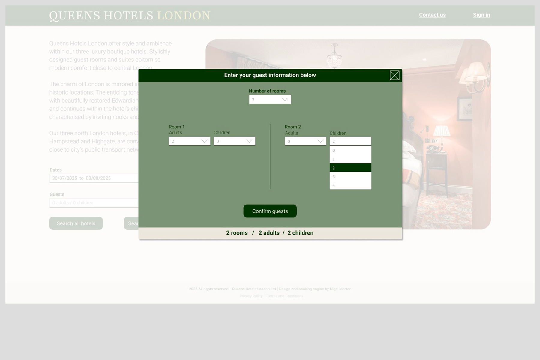
- Guest information input
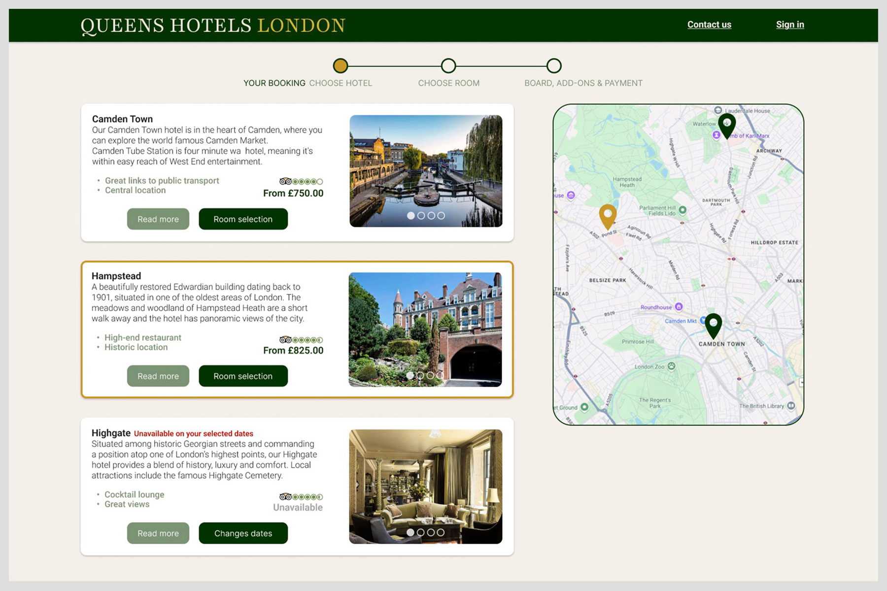
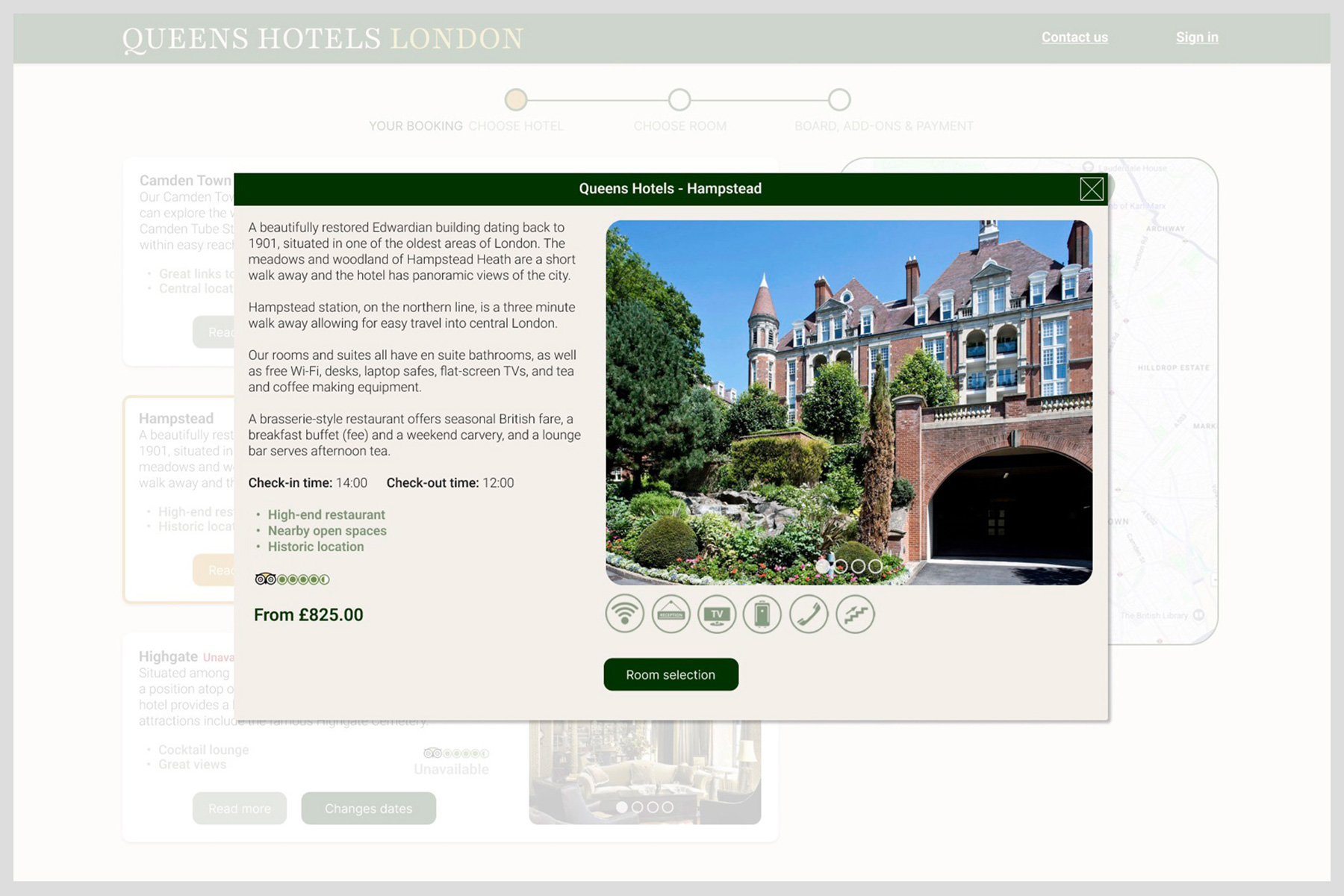
- Available hotel options
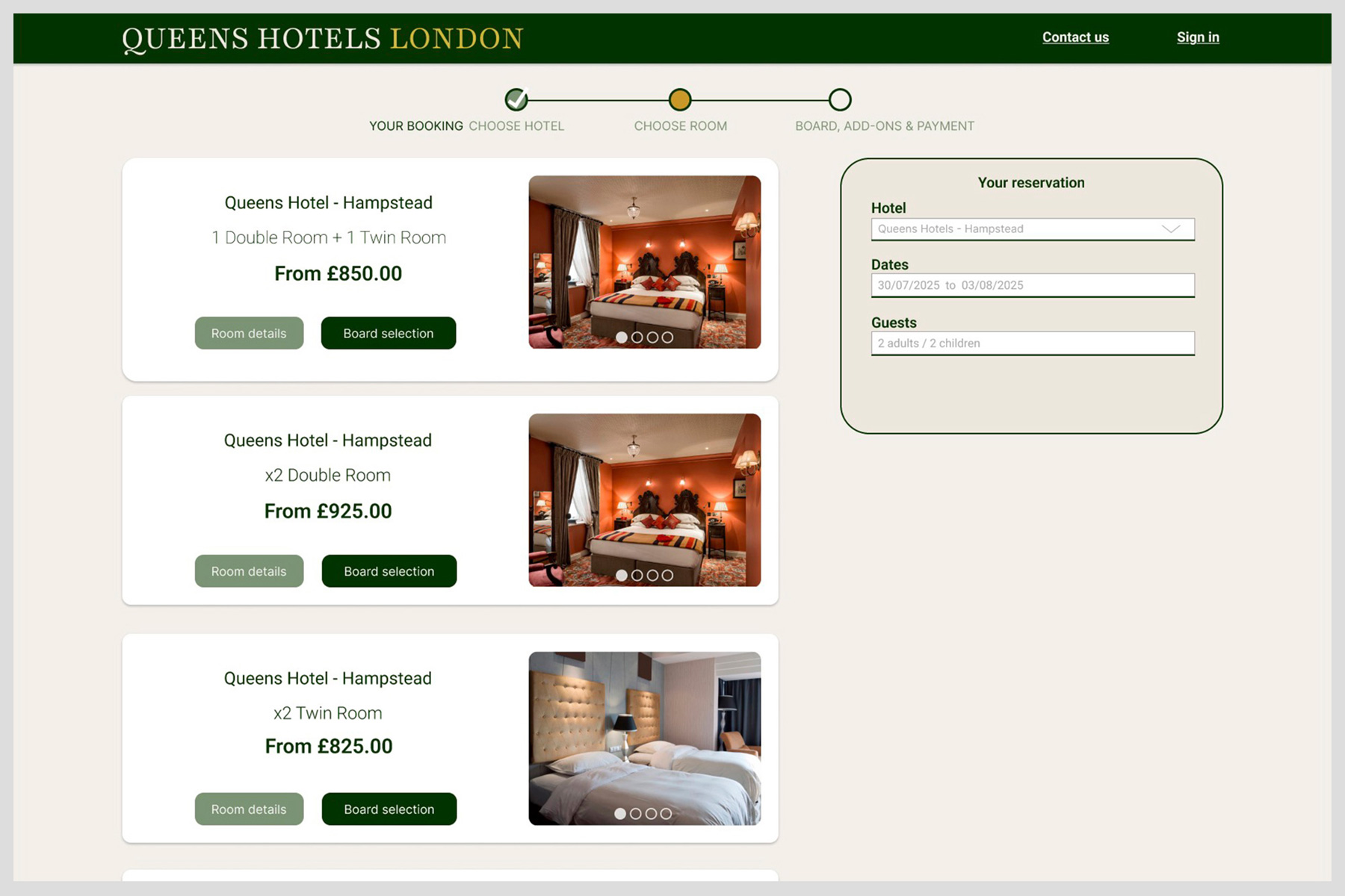
- Available room options
- What to do if a user changes their mind or makes a mistake
- Board selection
- Add ons
- Payment
Stage four: final designs
High Fidelity Prototypes
The final sketches were brought to life using Figma. The designs were refined and iteratively tested until a high-fidelity prototype was ready for handover. Colours, fonts, icons, and button styles were established, forming a design system that can be applied across the company’s online products.
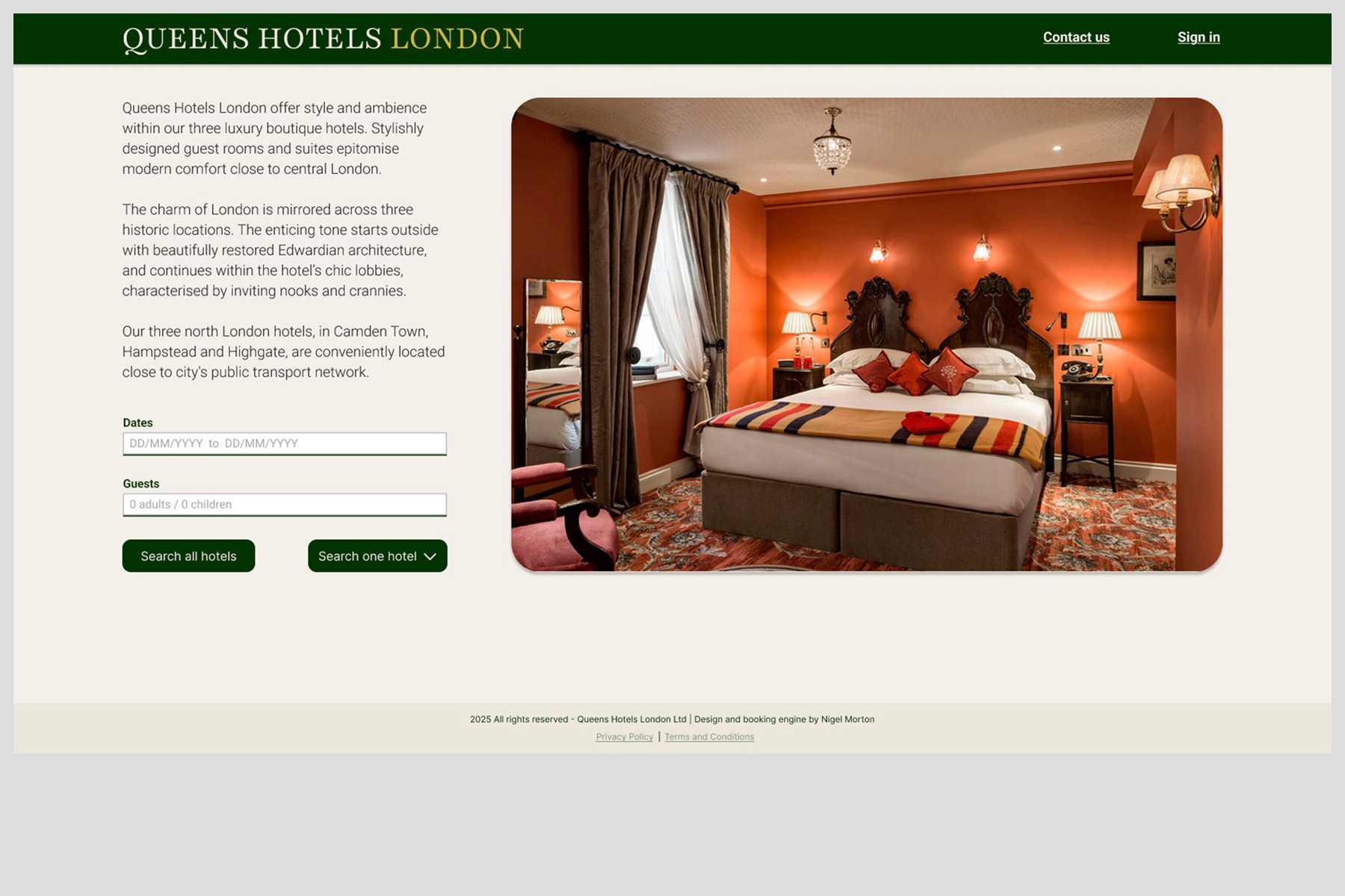
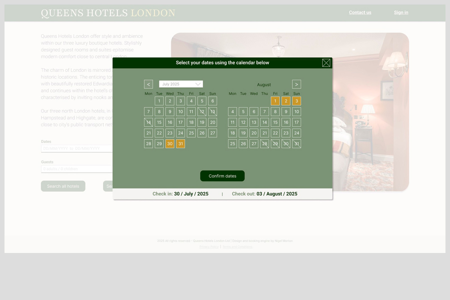
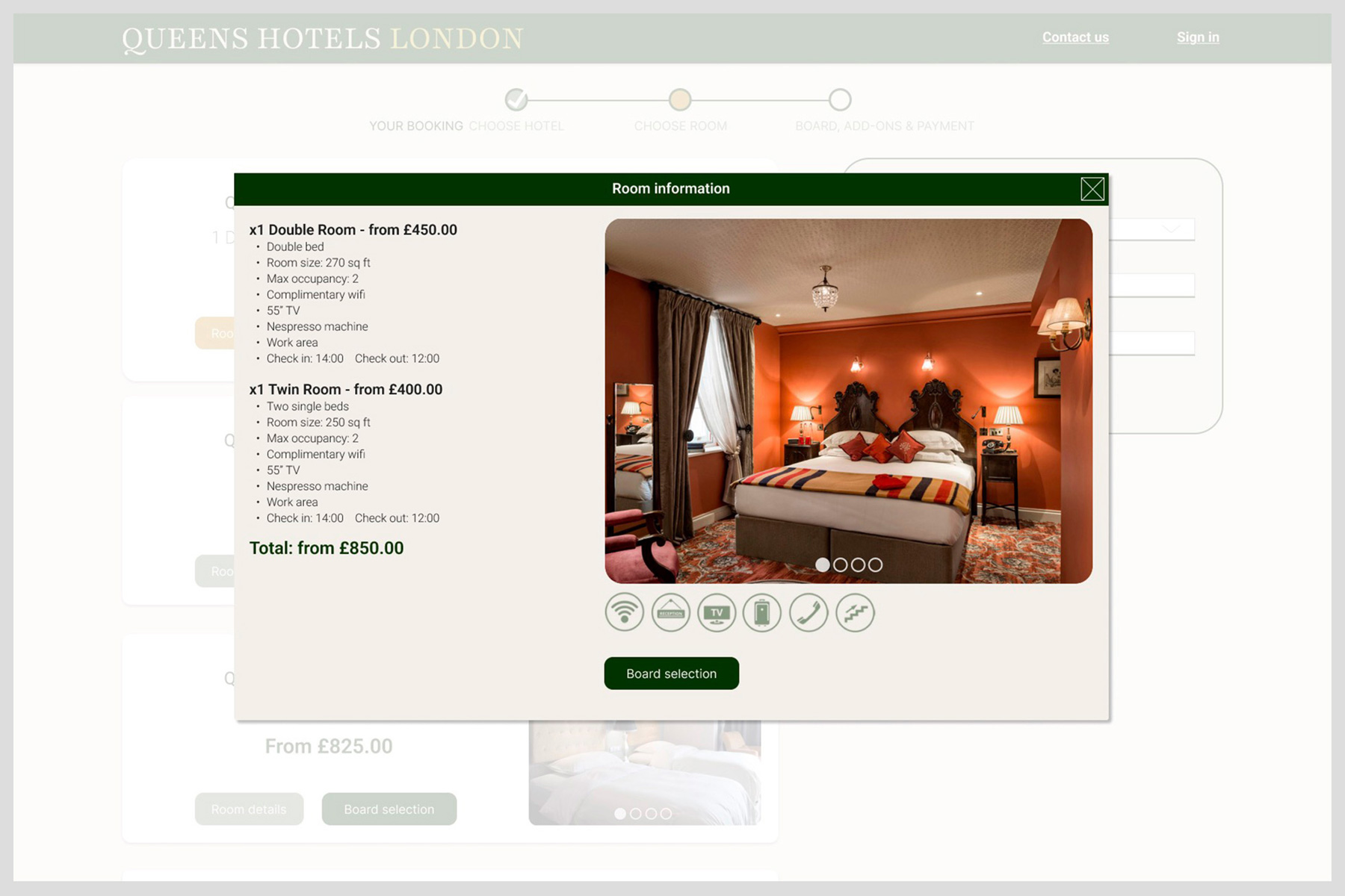
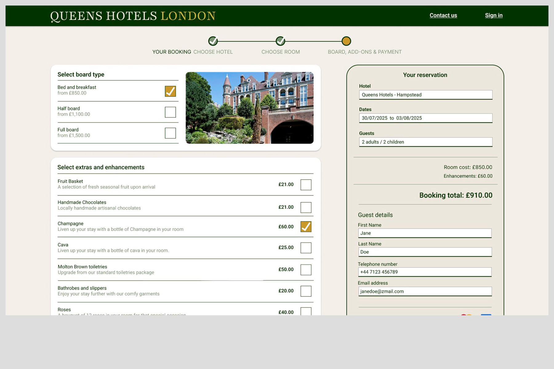
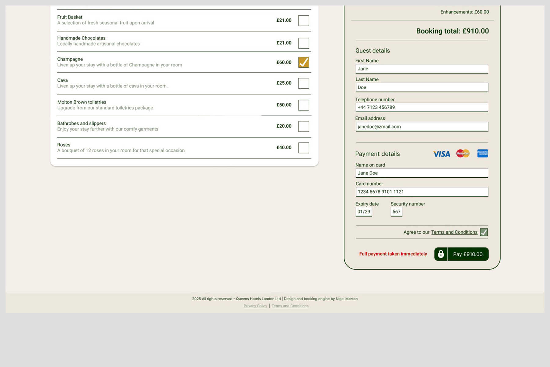
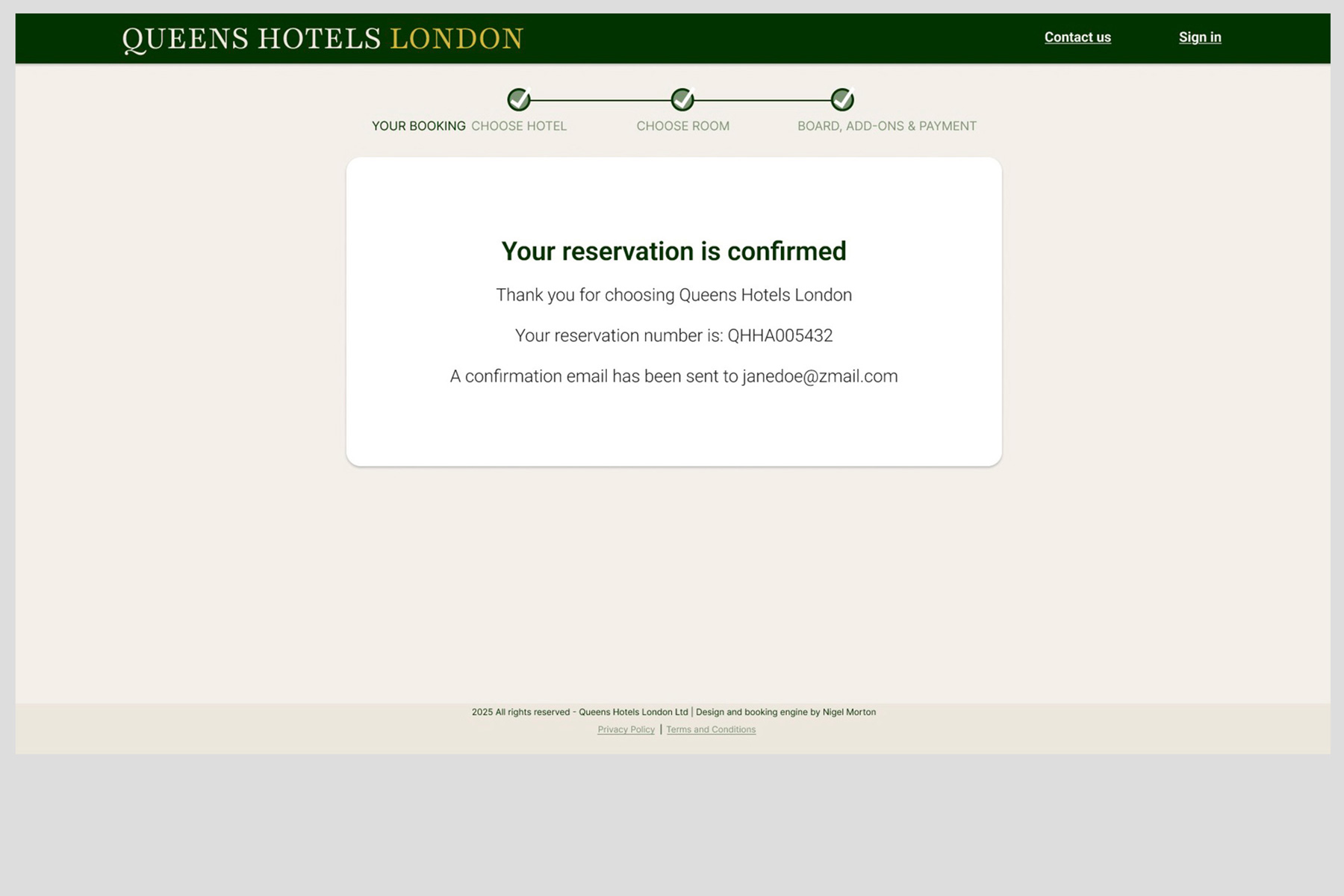
The Final Designs
Once the individual pages were designed and tested, a fully functional prototype was assembled using Figma’s prototyping tools. The video below demonstrates the complete booking process, highlighting the design features that enhance and streamline the user experience.